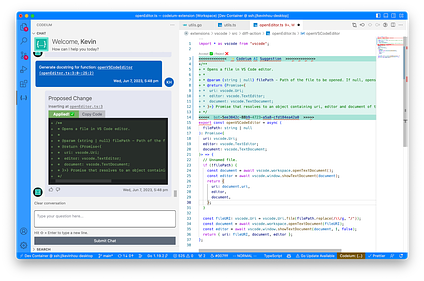
From swyx: I’m glad to welcome back Anshul as our first ever return guest author! His first post was an early hit on Latent Space and he has continued thinking in depth about AI UX since. Codeium is currently at 170k installs with a perfect 5-star rating.
We have crossed 3,000 applications for the AI Engineer Summit in our first week! We can’t invite everyone, but put in your email anyway for the livestream + other events we’ll be running. Thanks!
From Anshul: This is my second guest post on the Latent Space blog, following up on What Building “Copilot for X” Really Takes. I wrote that post hoping it would be the first in a three part series that would use my team’s learnings via building Codeium in order to address the three burning questions in productionizing LLMs, which are in order:
-
How to start an LLM product
-
How to differentiate your LLM product
-
How to make money off your LLM products
However, six months ago when we published that post, all we had done at Codeium was successfully start the product, but weren’t particularly differentiated, and definitely not making money. Fast forward to today, and we have done both of the others, so Shawn and I thought it would be a good idea to revisit this. Hope you enjoy part two!
When historians look back at the generative AI age, they will (rightfully) point to ChatGPT as one of the inflection points. By all accounts, OpenAI seemed to have hit the gold mine – there were weeks where my Twitter was just a flood of “holy crap look what this model can do! 7 things you HAVE to try 🧵”! The discourse was all about how OpenAI had the best model, and the race began.
Now, Chat-AI functionality is everywhere. Search engines, Excel, e-commerce, even the Duolingo bird got involved, primarily based on OpenAI’s APIs. OpenAI had a technical moat… until it didn’t? The open source community’s imagination was also captured, and the rapid progress in the open has led many, such as Google, to believe that the model cannot be the moat, even if your name is OpenAI.
But here’s the secret – the model was never the moat.
A similar model, Davinci, was available via API for almost a year before ChatGPT was launched. A year in the tech world is insane, and not one person created their own ChatGPT. The “moat” of ChatGPT was not the model – it was the user experience (UX)
.
UX as the Moat
There were two big UX improvements with ChatGPT:
-
Textbox in, streaming out: GPT-3 and GPT-4 are large enough models that each invocation of the forward pass — which outputs a single token (ie. a couple of words max) — takes a material amount of time, so from a purely technical perspective, a streaming output display is more preferable to a wait-for-all-tokens-before-displaying approach, which was the default for the API. With textual tokens, this streaming mimics reading or listening. ChatGPT’s UI was so intuitive, allowing users to access the underlying model’s power more naturally.
-
Abstracting state: Even more valuable than the UI was the UX improvement of not requiring the user to pass in previous questions and answers as additional state to a new query. ChatGPT pulls in the past state so that any future queries can refer to the state naturally. This is the true “chat” part of the name.
ChatGPT’s model was not a success, its UX was.
Don’t take my word for it, take Sam Altman’s. In what was probably supposed to be a closed-door discussion, Sam Altman claimed that ChatGPT plugins aren’t really taking off because people want ChatGPT in their applications, not applications in ChatGPT. They wanted the UX more than the model.
So the next (entirely rhetorical) question is – are chatbots the final form for LLMs?
ChatGPT was a huge UX step, but it won’t be the last. In order to realize the full power of LLMs, product experience must continue to be reworked and existing patterns must be challenged. With seemingly countless new AI products coming out every day, we believe that the ones that will survive will not only be backed by world-class models, but also provide best-in-class product experiences that make the magic feel intuitive.
We aren’t blaming anyone for overlooking UX today. Generative AI is new and exciting, and we are constantly blowing our own minds with what they are capable of. Of course creators and builders want to ship out these “wow” capabilities as quickly as possible! If you know the text in, text out chat UX model will be more or less understood by new users, then it is rational to just adopt it and ship it to your product. Creating the ideal UX, on the other hand, often takes real engineering and design work to seamlessly integrate into workflows and user expectations.
So how do you Improve the UX?
An improvement to the UX is when there is an intuitive shift in work from user to the app. Look back at the ChatGPT UX improvements – this characterization is true both for going from manual API to simple UI and for automatic state management to avoid copying past questions and answers into a new prompt.
So let us start looking forwards. Prompts can often be split into three components:
-
Command: the part that is specific to the task
-
Constraints: the part that is specific to the user
-
Context: the part that is specific to the situation
Currently, users have to do all of the work to specify all three components, so how can we shift some of this work from the user to the app?
Again, the key is that it has to be intuitive. So, here are some ideas:
-
Command: let users create task presets and then be able to search them
-
Constraints: creating user settings in the app that are automatically pulled in
-
Context: simplifying collection of data (ex. take a picture of your fridge and CV that)
Most people get this. Heck, Langchain is an f-string library that has raised millions of dollars to simplify the process of combining these components into the prompt once you’ve built the application-specific logic to collect them. But I can’t emphasize this enough – these shifts must be intuitive and shouldn’t take away from the power of the LLM. People like the ChatGPT interface because they can see exactly what text is going in and coming out, and there is complete customizability. It is not an improvement to build a UX that makes people misunderstand what they are putting in or overly constrains their ability to interact with the underlying LLM.
Introducing the 3 P’s
Sure, utilizing UX to make using the AI more intuitive sounds great, but a single generic statement isn’t really a structured way of thinking of UX development, and more importantly, thinking of moats.
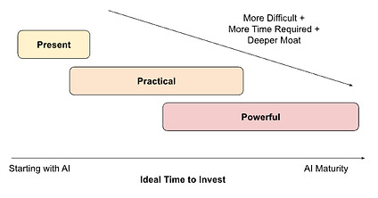
There are three stages to using UX to make AI “intuitive.” They often follow each other and get progressively more technically advanced / more deep as a moat, but there are no hard boundaries:
-
Use UX to make AI more Present: The Product differentiator: your product is better than another’s product because it has AI
-
Use UX to make AI more Practical: The Experience differentiator: your product experience is better than another’s product experience because it is easier to use the AI
-
Use UX to make AI more Powerful: The Utility differentiator: your product is more useful than another product because it helps users gain more value from the AI
Let’s walk through each of the three P’s
.
Presence
The first job of UX is to get AI to the user in the first place in a more accessible manner, making it more present (or ubiquitous). This is what the UI interface for ChatGPT did by going from API to textbox. If your application has AI more present and available than a competitor’s, then the AI has become a real product differentiator, a moat. A vast majority of LLM products today are at this stage.
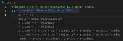
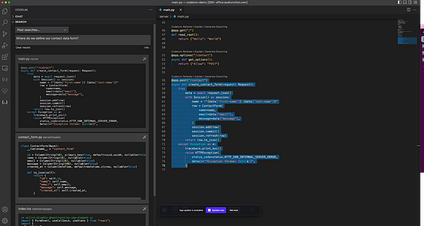
This is the functional UX, what is needed to make the core AI capability. For a coding tool, this might be the UX of showing autocomplete suggestions in grayed out text and using the tab key to accept, or for a search tool, this might be the UX of a drop down to specify what corpus of information to search over.
Practicality
Once the AI is present to the user, the next stage of UX improvements is to make the use of the AI more practical, more easily usable. This is what the abstraction of state management for ChatGPT was – it is not impossible for the user to keep copying in past question/answer pairs to future queries, but that is clunky, and the application can handle that. Let’s look at some common semi-frustrating situations with using LLMs today:
-
You are trying to do the same task again in a new situation but don’t remember exactly how you last phrased the command to get a result you liked.
-
You got a really good result except with some details that are not in the right format (ex. units) so you either have to rerun with additional specifications (hoping it won’t mess up the rest of the output) or manually do the modifications post generation.
-
You have to do a lot of manual “preprocessing” and typing in inputs to capture the relevant state of the world, so it is unclear if using a model actually did save time compared to just coming up with something yourself.
Well, do you remember the three suggestions for shifting work from human to product in assembling a prompt?
-
Command: let users create task presets and then be able to search them
-
Constraints: creating user settings in the app that are automatically pulled in
-
Context: simplifying collection of data (ex. take a picture of your fridge and CV that)
These suggestions exactly address each of the presented semi-frustrating situations in order! These suggestions make it easier to use the AI, make it more practical. This is the experience differentiator because users will have the same goals / tasks / questions, but will be able to get responses in their desired format much more quickly and with less frustration. If people can get results with your tool more easily than another’s, users will notice, and you have a moat.
Today, this is where the majority of UX changes are happening on the “cutting edge” of LLM applications, and where application developers need to pay the most attention to the pitfalls of making illogical experiences or constraining the LLM. There is a lot to be done to make the AI more intuitively fit into a user’s workflow.
Power
This is the final set of UX improvements, the most difficult to pull off, but the greatest source of deep moats. Humans are a lot like machine learning models in a way – when presented with anything new, we explore possibilities for some time until we find something we like and then exploit the heck out of it.
-
New to a city? Explore restaurants until you find your go to spots.
-
New board or video game? Explore different strategies or characters until you find your favorite.
-
New AI tool? Explore different inputs until you find a few templates that give good results.
LLMs are super powerful, and we still don’t fully know what all they are capable of, so if you can design a UX that gets a user to explore more, then you are making the LLM “more powerful” in the eyes of that user. Nothing about the model is changing, but the differentiator is that your product has made the user more effectively wield the intrinsic power of the model than a competitor’s. It made the AI more useful. That’s a serious moat.
The reason why this usually happens last out of the three stages is because it is simultaneously the hardest to implement (usually also requires a lot of backend work) and the hardest for a user to immediately appreciate. If a product has an AI that isn’t super available or it is missing some practicality feature, users will immediately notice, so until the LLM industry matures to a point where all competitors have the same set of presence and practical UX, the power UX will likely continue to take a back seat. That is, unless you consciously invest in it.
We’ll show you a practical example below.
Aside: The UX Moat in Music
There’s been a lot of theorizing in this post so far and LLM products haven’t gone through all of the stages yet, but we can easily look at a more mature product category to break down the UX. Let’s take music apps like Spotify.
If you want any business being a music app, you need the barebones UX of being able to add songs to playlists and then playback the music. You should be able to pause, restart, or skip a song, view your playlists, etc. That’s the presence part. You’ve made it super simple to organize and listen to your music.
But then you realize there’s a lot of UX to make this experience more practical. Spotify has a shuffle play feature so the user doesn’t manually have to reorder songs, an ability to add one playlist to another playlist to make merging playlists less manual, and even automatically-curated mood playlists so that users don’t have to manually assemble them from their existing library of songs. Almost all music apps have these features today, and not having even some of them would put a new app at an immediate disadvantage.
Spotify and others have been around a long time though, so they have had plenty of time to also look at UX that increases the power of the music listening experience. Just like how AI can do so many things beyond an individual’s imagination, there is an incredible amount of music out there that any particular individual has never heard.
So, to increase the power of the app, Spotify needs UX to introduce users to new music that they would like. Spotify is full of these now – public playlists that people could manually search through (ex. “new r&b music”), the ability to see what friends are listening to, AI-curated “Discover Weekly” playlists, and more.
Each stage is more work, but each stage adds moats. AI is still in its iPod-rather-than-Spotify days, where it is mostly about presence, with maybe some practicality to differentiate. But clearly, there is much, much more left to go.
The UX Stages in Practice for an LLM Application
At Codeium, we are building the world’s most advanced gen AI-powered toolkit for software developers (listen to Episode #2 with Varun for more). The same phenomenon with Davinci and ChatGPT happened in our space. Salesforce Codegen is an open source code LLM that has been available for a year now. In theory, anyone can create their own Github Copilot-like tool, and many have tried.
So why are we at Codeium the only ones who bootstrapped off Codegen to reach hundreds of thousands of users? It has been a constant application of these UX stages.
Sure, we have since moved off Codegen because there were model improvements that we were not going to wait on open source for, but we are under no pretense that the open source community cannot catch up. But we also know that the same thing that happened with Codegen will happen with Starcoder and all these recent open-source code models – competition will not easily pop up because the model is not the moat, and we know how much engineering it takes to actually build the UX moat.
To make this more concrete, I’ll walk through how we applied the UX stages to the particular workflow of refactoring code – a very common, yet very consistently disliked task.
Step 1: Presence – Add AI to the Product
You could copy the function to refactor to ChatGPT, write a prompt like
“Please refactor the following function into React Typescript with strongly typed props: <function code>”.
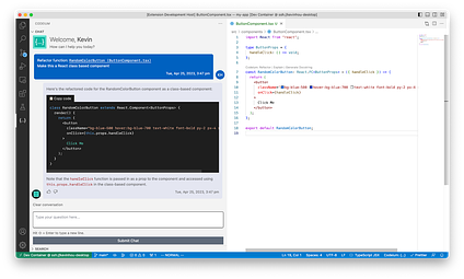
It’ll probably work. The obvious UX experience to make the AI more present would be to simply not leave the IDE, and embed this text-in-text out UX into the IDE instead. It’s safe to say this isn’t a novel step, given the many, many IDE extensions that do just this (example, example, example).
Step 2: Practicality – Improve User Experience
But how do we start moving away from text in, text out? How do we use UX to make this task more practical? Well, for one, we could pull in the code context automatically by, for example, appending whatever code is currently highlighted by the user. Then, in the text-in UI element, you only have to type the “Please refactor the following function into React Typescript with strongly typed props,” saving some unnecessary copy-pastes and text-box formatting.
Well, that’s a start, but maybe this prompt is not enough context to the LLM to understand “refactor” properly. After some prompt engineering, maybe you discover that a better prompt is
“You are a software developer. You will be given a function as context, and are responsible for rewriting it according to a given set of instructions and constraints, and returning the rewritten function to the user. Make sure that the rewritten function is easily understandable by other software developers and add comments describing how the code works: <constraints> <function code>”.
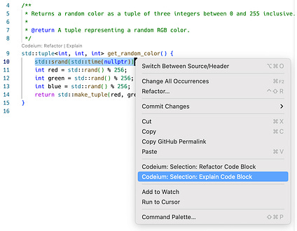
Asking the user to write this prompt out each time they want to refactor would be unreasonable! A more practical UX would be to provide a “refactor code” option when someone highlights some code, which would automatically pull it in as code context:
There’s two problems now:
-
The user could highlight some arbitrary selection of code context, such as partial functions, that aren’t “refactorable” in themselves. A more practical UX that would prevent these errors would be to suggest “refactor code” on code blocks that we have already identified as “refactorable” via syntax parsing (s/o to our open-source codeium-parse library!). Then, we don’t even need the user to highlight the code context, and can provide the “refactor code” option as a CodeLens suggestion:
-
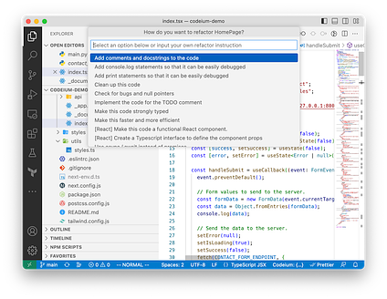
We are now missing the “<constraints>” input to the refactor instruction! How do we provide this in the most intuitive way? Well, one way of thinking about the user flow is [user selects code context to refactor] -> [user provides constraints on how to refactor] -> [refactoring happens] (i.e. the code context and constraints selections happen in sequence rather than in parallel). Maybe after the user selects the CodeLens suggestion, we can bring in the VSCode input bar asking for constraints! We could even get more fancy, saying that the constraints are optional, and inferring what the user wants to do from the function context and/or past refactor commands:
So, this is a full rework of the inputs to “refactor code” to make it more practical. Instead of a user writing out a generic command, copying in code context, and embedding constraints to the text input, there is one hover-and-click to import the command and code context, and a short optional text input box to fill in the constraints.
Now, what about the output? The text still streams out, and the user will still need to copy the output function back into the code window. Or do they? Can we make this part more practical too? Unlike text-in, where we have zero metadata about the inputs, we now know exactly where in the codebase the input function is. As a potential idea, we could use the natural “diff view” in IDEs to not just put the code back where it should be, but also provide more value to the user by highlighting exactly how the code changed in a natural way (rather than having them have to play spot-the-difference between the input and output code blocks)
Step 3: Powerful – Improve Utility
Now what about UX that makes the AI more powerful? Well, we actually already introduced it, but didn’t point it out.
When providing constraints in the VSCode native input bar, we actually show a bunch of things that a user could do. Would a user think of using this flow to automatically fill out a TODO? Add debugging statements? Optimize the code?
Perhaps not, but they are now visually shown these options while they were doing something they knew the AI could do, namely, refactoring a function into React Typescript with strongly typed props. This is the start of using UX to make users naturally discover what is possible with the AI. Right now it is a static list, but you can imagine creating an engine that determines which of these options are truly applicable for the current code context, and showing that list instead (or making small tooltips suggesting the user to try it!)
So let’s put it all together. No changes to the LLM or even the underlying text that is passed in. Just better UX:
The possibilities are endless. UX is the real moat.
Conclusion
At first glance, it might feel like UI/UX is the farthest thing from hardcore LLM development, but we are strong believers that it will be the synergy of incredible modeling with stellar product/UX that will stick with users.
Now, if you read the pre-amble at the very top, you may have noticed that this UX talk really addressed the second burning question of “how to differentiate my LLM product,” but not really the third of “how to make money off my LLM product.” Believe me, there’s a pretty clear answer for that as well, but you’ll have to wait for the next post…
Codeium Plug
And a little bit more on us – we build Codeium, the modern coding superpower. We started by building a free and comparable Github Copilot alternative, but we knew that autocomplete was just the tip of the iceberg when it comes to AI devtool capabilities (and not the ideal UX in all tasks). We have since launched natural language based, repo-wide semantic search using local embeddings and common workflows such as refactoring, writing documentation, and explaining code using ChatGPT-like models. We want to keep iterating on the product and UX using input from the most developers possible – we would love for you to try out the magic for yourself at codeium.com!
And if you work at a company and want to use AI tools there, let your employer know about Codeium for Enterprises. Not only do you get all of this incredible UX, but you also get unbeatable security, fine tuned models to your company’s codebases, better user analytics, and more! Essentially the best theoretical performance of a pair programmer for your particular use cases, all without sacrificing on any security or legal stances.
Yes, yes, ChatGPT used GPT3.5 and not Davinci, which was released roughly in conjunction with ChatGPT so there were some model improvements, especially around RLHF. But as you read, it will get clearer why the UX improvements were the bigger contributions towards increased usage and adoption.
Constraints can likely be subdivided and labeled even further. Constraints like “you are a …” are role oriented, “for a …” are audience oriented, “using only …” are format oriented, etc. At the end of the day though, all of these pertain to attributes or preferences of the user(s) involved. So, to not make this description unnecessarily complex, I wrapped them all into one category.
Anyone with a marketing background might notice that there is now a set of C’s (command, constraint, context) and P’s (present, practical, powerful), very similar to Marketing 101 (although those are a very different set of C’s and P’s). This was intentional! In many ways, UX is the purest form of marketing – instead of using external messaging to hype up a product, better UX lets the product sell itself!


