Useful engineering metrics and why velocity is not one of them
Here’s my horoscope for today:
Things should improve for you as the day progresses, Taurus. You shouldn’t depend on something that may not pan out the way you want.
As you can see, it’s useless, just like your team’s velocity metrics and burndown charts.
Velocity metrics are as loathsome as the horoscope because neither provides any insight on why something went wrong or how to fix it. Moreover, if only you squint your eyes hard enough, both burndown charts and the horoscope will show you whatever you want to see.
Stop and think about it. Besides telling you that “velocity is low,” what else does a burndown chart reveal about your team’s bottlenecks, problems, and inefficiencies? Nothing.
Low velocity, just like retrograde Mercury, can explain anything you want. Because velocity gives people absolutely no insight into the team’s problems, managers can come up with whatever reason to justify any unproductive decisions they already had in mind, like adding resources to an inefficient system or telling folks to “work harder” and develop a greater “sense of urgency” — words as vague as today’s horoscope.
To summarise, velocity is a terrible metric because it offers no predictive power and doesn’t help you make decisions.
In this post, I’ll expound on the metrics and visualizations you should use to help you improve your processes and make your team more productive and predictable.
I’ll start by modeling an engineering team as a queueing system. Then, I’ll explain the four core metrics which impact the queueing system’s performance and how they relate to each other.
Then, I’ll turn those metrics into charts to demonstrate how you could monitor your system’s performance over time and spot problematic patterns at a glance.
The third section of this post covers a few other granular metrics and visualizations that offer predictive power and help managers spot inefficiencies.
At the end of this post, there’s also a short warning to help folks avoid misusing these metrics and visualizations and a concise summary for you to share with your team.
The system and its metrics
The best way to understand which metrics best represent an engineering team’s performance is to model it as a queueing system. In this system, tasks come in on one end, and software comes out on the other. The team itself is the processing mechanism in the middle.
In an engineering system, tasks come in on one end and valuable software comes out on the other
To monitor the performance of this system, we must attach metrics to its parts. That way, we’ll understand how each part performs and how they influence one another.
Let’s start by attaching metrics to the right and left sides.
On the left side, where tasks come in, we have the arrival rate, which represents arrivals over time. On the right side, where tasks come out, we have the departure rate — also called throughput, — which represents departure over time.
The arrival rate determines how quickly tasks arrive on the left side, and the throughput determines how quickly tasks depart on the right side
Whenever the arrival rate exceeds the system’s departure rate, the number of items in the system — its WIP (work in progress) — increases. Therefore, queues form. When queues form, each item task takes increasingly longer to be done.
The larger a system’s queue, the longer teams will take to get to the queue’s end
The greater the difference between the arrival and departure rates, the more dramatic the rise in WIP will be. Consequently, the rate at which cycle times increase will be greater too.
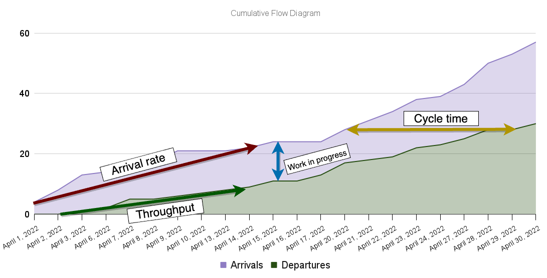
Another way to visualize this phenomenon is through a cumulative flow diagram. This diagram shows the cumulative number of tasks entering and leaving the system over time.
The cumulative flow diagram is a helpful chart because it reveals an enormous amount of information about the team’s performance at a glance.
In that chart, the bottom slope represents the average amount of tasks delivered over time (throughput), while the top slope represents the average number of tasks entering the system over time (the arrival rate).
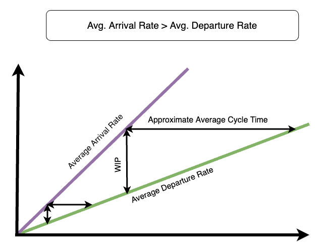
As the average arrival rate increases, the difference between the top and bottom slopes increases more drastically over time. Consequently, the amount of work-in-progress in the system, represented by the vertical distance between bands, grows faster. In turn, average cycle times, represented by the horizontal distance between bands, also increase more quickly.
The chart below shows how these metrics change over time when the average arrival rate exceeds the average completion rate.
When arrival rates are greater than departure rates, WIP increases over time, increasing the average cycle-times
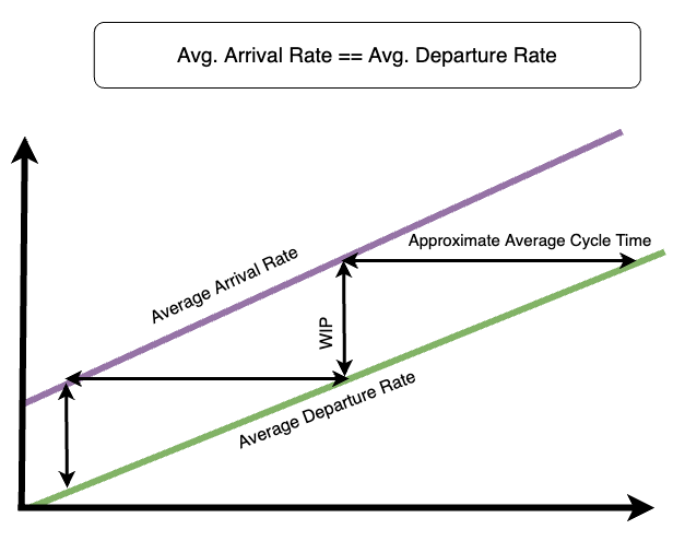
A manager who wishes to make their team’s cycle times more uniform can try matching the rate at which tasks enter the system to the rate at which they leave.
When the average arrival rate equals the average departure rate, WIP remains constant, and so do cycle times
That way, WIP remains constant, and so do cycle times.
By being aware of the relationship between these four metrics, managers know how their team will behave as the variables change. That way, they know which variables to influence to obtain regular cycle times, making their teams predictable and productive.
Another way to describe this behavior is by using Little’s Law, which establishes a clear relationship between these variables.
Avg. Cycle Time=Avg. Work In ProgressAvg. Throughput
{Avg.\ Cycle\ Time} = \cfrac{Avg.\ Work\ In\ Progress}{Avg.\ Throughput}
Avg. Cycle Time=Avg. ThroughputAvg. Work In Progress
This simple formula summarises the behavior you’ve just seen in the cumulative flow diagram.
Breaking down the system into multiple sub-systems
For an engineer to deliver a task, they don’t simply type away a bunch of code and send it straight to production. Instead, they write some code, have someone review it, deploy the code to a staging environment, validate it, and only then send it to production.
Once again, we can model that process as a queueing system. The difference is that we’re now dealing with a queueing system composed of multiple queues feeding one another.
An engineering system modeled as a system composed of multiple queues feeding one another
The advantage of modeling our engineering system as a multi-queue system is that we can still use the same metrics to analyze its behavior. Furthermore, we can still use cumulative flow diagrams to monitor its performance.
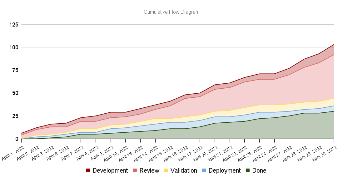
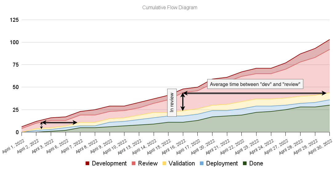
Let’s go ahead and plot a cumulative flow diagram for a multi-queue system. This time we’ll break down the “in progress” band into multiple other bands representing the various queues, which are the different parts of our process.
A cumulative flow diagram for a multi-queue engineering system
Despite having broken down the cumulative flow diagram’s bands, the same principles apply. This time, however, we have much more granular information about how the different parts of the system behave.
If we want to know the number of items that need reviews, we can look at the vertical distance between the “development” and “review” bands, for example. Similarly, we can look at the horizontal distance between those bands to determine the approximate average time items take from “development” to “review.”
The cumulative flow diagram’s properties remain the same in spite of us having broken it down into multiple bands
In addition to the visual representation of metrics remaining the same, the dynamics between them persist.
Assume, for example, that the rate at which tasks enter the review stage is greater than the rate at which they are deployed to a staging environment. In that case, the diagram’s red band will bulge, revealing an increase in work-in-progress and, consequently, in average cycle time.
When tasks become ready for review more quickly than they are reviewed, WIP increases, and, consequently, cycle-times elongate
This dynamic between metrics once again reveals how important it is to match arrival and departure rates. This practice applies both to the system as a whole and its different parts.
This rate-matching is the precise reason why Kanban worked so well for Japanese manufacturers during their “economic miracle.”
For example, a car manufacturer that uses Kanban would only send parts to the “painting” stage once the folks in the painting stage send back a message saying, “we have capacity to paint more parts.”
By sending these signals from the end of the queueing system to its beginning, the manufacturers could rate-match the different parts of their process, increasing their predictability and reducing WIP, which is particularly damaging when you have hundreds of pieces sitting on the factory floor.
That’s the theory behind Goldratt’s Theory of Constraints. A management paradigm focused on identifying and iteratively fixing these bottlenecks so that you’re constantly adjusting segments’ departure or arrival rates to match one another.
In the software industry, sometimes, we have similar stationary bottlenecks. These may occur when a company relies on manual testing instead of automated testing. In that case, we can identify the bottleneck and fix it to increase our testing segment departure rate.
Other times, our bottlenecks are temporary because we’re not reproducing the same work repeatedly. Instead, we’re creating the recipe for new workpieces, which implies variability.
For that reason, besides knowing how to code, engineers need to understand how to test and operate their software. That way, we can dynamically allocate resources to fill bottlenecks at different process stages.
Some teams may not be aware of those dynamics, but, as humans, we are good at naturally finding ways to improve our processes. That’s why we came up with a culture of automated testing and principles for developing a “DevOps” culture.
In any case, when managers are aware of the principles behind these metrics, they can more easily see where the bottlenecks are and come up with creative solutions to improve their processes rather than simply adopting automated tests or instilling a “DevOps culture,” which may not apply to all cases.
Other problematic patterns on cumulative flow diagrams
As you’ve seen in the previous section, bulging bands represent a lack of rate-matching between different parts of your process. That lack of rate matching causes work-in-progress to increase and, consequently, cycle times to elongate.
Besides bulging bands, other patterns yield helpful information about problematic parts of your process.
In this section, I’ll provide a few examples of problematic patterns, explain what each one may indicate, and suggest possible interventions.
Flat lines
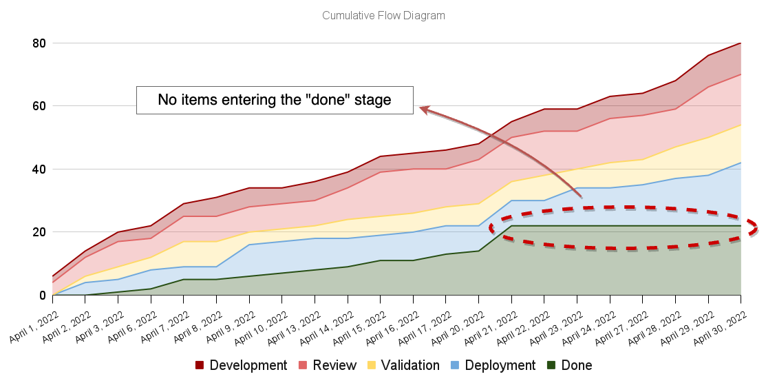
Flat lines represent periods of inactivity in a particular part of your process.
Imagine, for example, that your deployment scripts are broken. In that case, there will be zero departures from the “deployment” stage to the “done” stage, causing a flat line to appear in your cumulative flow diagram.
Flat lines indicate long periods of inactivity in a particular part of the process
Such flat lines help managers identify broken parts of their processes more quickly and go after what’s wrong.
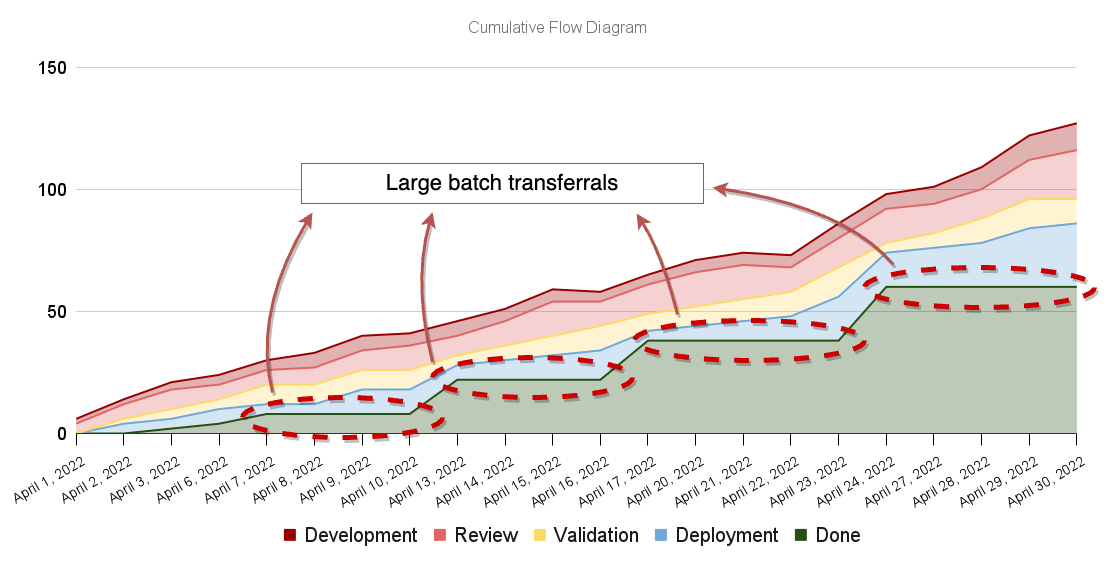
Besides helping managers spot broken processes, flat lines may indicate a part of your process that is too painful or time-consuming, causing it to happen less often. When that’s the case, engineers transfer large batches of tasks at once to save themselves the effort of performing a painful task multiple times.
Imagine, for example, that your deployment process is manual and time-consuming. In that case, there’s a high transaction cost of moving items from the “deployment” stage to the “done” stage.
Such large batch transferrals will show up as “stair steps” in your cumulative flow diagram.
Stair steps may indicate that a particular part of the process is slow or painful. Consequently, it happens less often and there are larger batch transferrals
These large batch transferrals are why Martin Fowler and numerous other authors advocate for continuous delivery. When deployments happen frequently, besides reducing the change delta and the room for errors, it makes it easier to rate-match different parts of your engineering system.
Bands that disappear
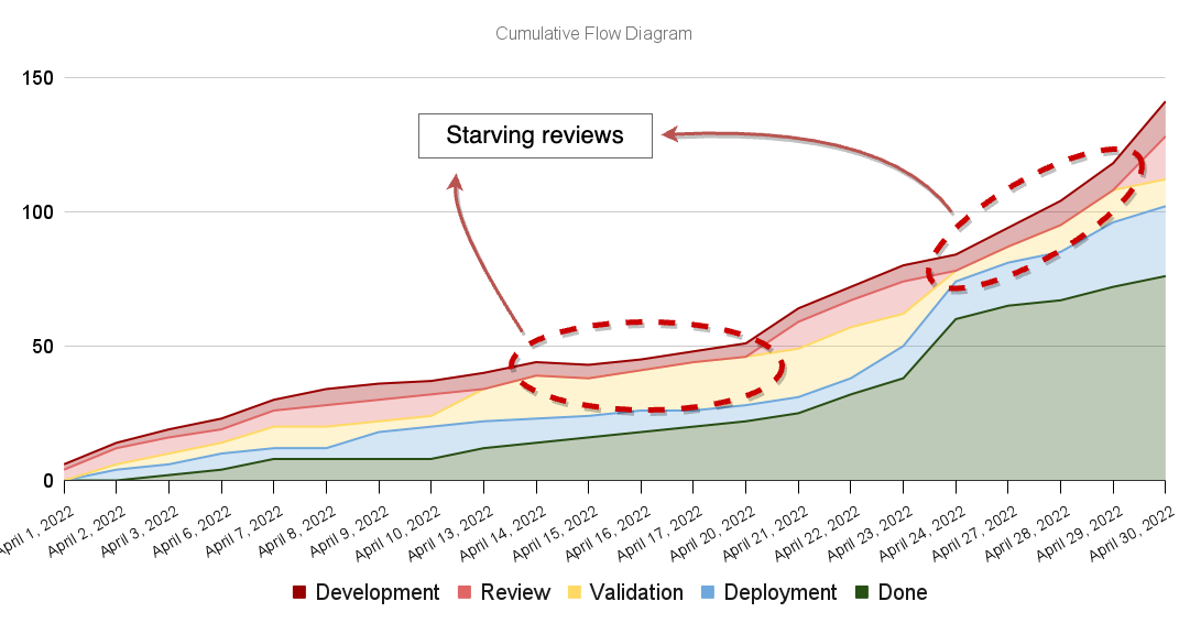
Whenever a band disappears, it signals that a particular part of the process is starving. In other words, disappearing bands indicate that an upstream segment has a faster processing rate than the downstream segment.
Imagine, for example, that your team has various pieces of automation to aid reviews. In that case, reviews happen more quickly than development, causing the review process to starve.
Disappearing bands indicates a particular part of the process is starving
In this case, starvation itself is not problematic. Still, the fact that you can’t get items into review indicates it may be advantageous to make the development stage more quickly by increasing reuse or refactoring complex parts of your software. By doing that, you’d be trying to match the departure rates of the “development” and review stages.
This pattern may also indicate that the upstream segment (the development stage) is highly variable, causing your team to be more unpredictable. Therefore, the “review” band’s size keeps surging and disappearing.
Starvation becomes more of a problem when there’s a fixed amount of resources waiting to receive work, as in manufacturing. When resources are cross-trained to work in different parts of the process, we can dynamically redirect effort towards bottlenecks. That’s why it’s important to avoid silos.
It’s also essential to notice that a manager’s goal is not necessarily to avoid starvation at all costs. Managers who prioritize efficiency (everyone being busy all the time) will increase the formation of queues. Therefore, they’ll end up increasing WIP and cycle times, as I’ve explained in another blog post.
Other helpful visualizations for spotting problems
Sometimes, just because a Cumulative Flow Diagram looks impeccable, it doesn’t mean your team’s performance is as optimal.
Imagine, for example, that your team consistently ships a significant amount of critical bugs. In that case, whenever someone discovers one of those bugs, the bugfix becomes the top priority and gets done quite quickly.
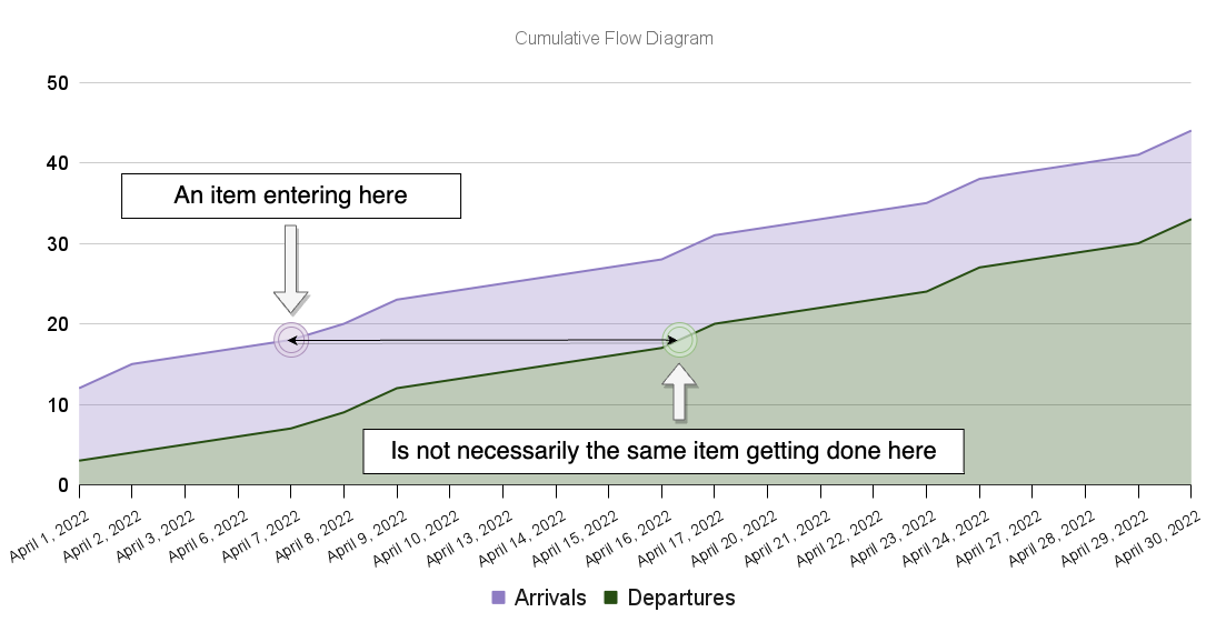
When that happens, it may be the case that your cumulative flow diagram will show arrival rates matching departure rates, but nothing besides bug fixes is getting done. Therefore, your team won’t ship any features, and any other tasks will be left to rot.
The diagram below, for example, could illustrate that scenario.
A cumulative flow diagram doesn’t specify which items get done, it specifies the quantities of items entering and leaving the system
In this situation, we say you’re accumulating “flow debt.” That means you’re artificially aging one issue to expedite another.
Another way to think of “flow debt” is to imagine you’re borrowing cycle time from one task to another.
Flow debt kills predictability because shifting priorities will cause other issues to age artificially. In this scenario, it will be difficult to predict when you’ll finish something because you don’t know whether something will take focus away from items in progress. That’s why it’s essential to finish what you start.
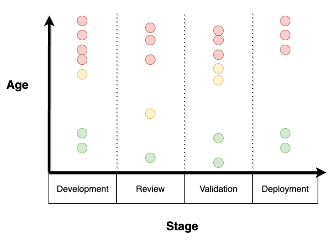
To visualize flow debt, you can use a scatterplot with the item’s ages on the Y axis and the process stages on the X axis. That way, you can visualize discrepancies in the age of each item throughout the different stages of your process.
A scatterplot which illustrates the age of the different work items throughout your progress
Alternatively, you can use a cycle-time histogram. When you have flow debt, such a graph will display a bimodal distribution in cycle times, meaning you’ll probably see a peak on the left side, where cycle times are short, and another peak on the right side, where cycle times are large. The large cycle times on the right are the items incurring flow debt, while the short cycle times on the left represent the expedited items.
A cycle time histogram showing a bimodal distribution indicating some items may be expedited while others artifically age
Finally, another way to identify flow debt is to look at your “flow efficiency”. A team’s flow efficiency measures the percentage of time items spend in a blocking state.
For example, if a team’s average flow efficiency is 50%, issues are blocked, on average, 50% of the time, causing them to age artificially. The lower a team’s flow efficiency, the more inflated tail cycle times will be.
Putting it all together.
An engineering team can be modeled as a queueing system. In such a system, tasks come in on one end, and software comes out on the other.
There are four metrics you can use to measure the performance of such a queueing system:
- Arrival rate — the rate at which tasks arrive in the system
- Work in progress — the number of items in progress at any given time
- Departure rate or throughput — the rate at which tasks leave the system
- Cycle time — the time it takes for tasks to leave the system
The amount of work-in-progress will increase whenever the system’s arrival rate exceeds the system’s departure rate. This increase in WIP represents the growth of a task queue. When queues form, cycle times elongate because it takes increasingly longer to get to the end of the queue.
One excellent way to visualize a system’s performance over time is to use a cumulative flow diagram, which plots the number of tasks in progress and completed over time.
In a cumulative flow diagram, the top slope represents the arrival rate, and the bottom slope represents the departure rate (or throughput). The vertical distance between bands represents the amount of work in progress, and the horizontal distance between them represents the approximate average cycle time.
To analyze the system’s performance in more detail, you can break down your queueing system into multiple connected queueing sub-systems. Each of these sub-systems feeds one another. You can perform such a breakdown also in your cumulative flow diagrams by breaking down the “in progress” band into multiple other bands representing the different stages of your process.
When a sub-system’s throughput exceeds the next, there will be a mismatch between arrivals and departures in the downstream system. Therefore, queues will form, and cycle times will elongate in the downstream system. That’s why it’s essential to rate-match your processes.
To rate match processes more easily, you could cross-train engineers to work on different parts of your process. That way, you can dynamically direct efforts towards bottlenecks, which tend to be mobile in stochastic processes like software development.
Such mismatch in arrival and departure rates between sub-systems will manifest itself in a cumulative flow diagram through the bulging of a particular band. That bulging band represents the process which can’t keep up with the upstream sub-system’s arrival rate.
Besides bulging bands, there are two other problems that a cumulative flow diagram may help you spot:
- Large batch transfers or broken processes — when lines flatten
- Disappearing bands — when a sub-system starves
Just because a cumulative flow diagram seems okay, that doesn’t mean your team is performing well.
The cumulative flow diagram shows quantities of items in different parts of the process but not exactly what those items are. Therefore, it may be the case that your arrival rate matches your departure rates simply because some items are being expedited while others are left to rot and never get done. That phenomenon is known as “flow debt”.
You can use a cycle-time scatterplot to detect _flow debt_and look for outliers. Alternatively, you could use a cycle time histogram and look for a bimodal distribution.
Notes on good metrics and a few words of caution
A good metric has three characteristics:
- It’s not a target — Instead of determining an end state, it helps determine whether you’re going in the right direction.
- It’s actionable — It helps managers make decisions and intervene in a system to generate improvements.
- It has a clear relationship to other metrics with characteristics 1 and 2 — You know how other metrics will change as you pull different levers.
I consider the metrics for which I advocate in this post to be good metrics because they have all three characteristics. Velocity, on the other hand, has none of them.
Despite considering these metrics “good,” I must urge managers not to:
- Turn metrics into targets — As Goodhart’s law states, when you turn metrics into targets, they cease being a good metric. That’s because people will game the system to make metrics get better at all costs instead of actually fulfilling the organization’s purpose.
- Weaponize metrics — As Deming says, “whenever there’s fear, you get the wrong figures”.
- Use metrics as a substitute to talk to your team and perform qualitative analysis. — Metrics must serve as an “alarm.” They ring a bell when something goes wrong, but it’s your job to determine how to intervene.
Managers must also be aware that managing exclusively by metrics (management by results) is like “driving a car looking through the rearview mirror”, as W. E. Deming would say.
The past will not necessarily resemble the future. Yet, spotting patterns in past behavior can help you adapt to the future and avoid making the same mistakes.
Further reading
If you wish to use any of the visualizations or metrics I mention in this post, they’re all available on Actionable Agile, as Daniel Vacanti mentions in his brilliant book “Actionable Agile Metrics for Predictability.”
I have no affiliation with Actionable Agile, and this is not paid promotion.
Wanna talk?
If you’d like to have a chat, you can book a slot with me here.


