Your guide to self-serve onboarding: How to get your product to sell itself – OpenView
In a self-serve environment, your product has to sell itself.
The first-day experience is the most critical part of the user journey. And it’s where most products fall flat.
It’s on the first day that you have a user’s full attention and you have an extremely narrow window to impress them.
Why should you care?
- Drop-off rates after the first day can be surprisingly high. At the average SaaS company 40-60%+ of new users never return to the product on a second day.
- If a user does see value on their first day, they’re far more likely to become a paid customer and share your product with others, compared to if they don’t.
- Improvements to new user activation tends to improve all downstream KPIs: free-to-paid conversion, retention, net expansion, CAC payback, NPS, etc. If you can nail it, you’ll be on the path to a very strong business model.
Over the past year, I’ve signed up for 50+ self-serve SaaS products. The same mistakes come up time and again.
Here are the top seven onboarding mistakes you could be making. Read on to learn how to improve and get inspired by some of the best SaaS onboarding experiences.
The top 7 self-serve onboarding mistakes
1–Your product is too confusing without sales or success helping out
As product-led growth (PLG) becomes trendy, we’re seeing more companies experiment with introducing their first self-serve freemium or free trial offering. But PLG isn’t only a pricing change; it’s a mindset shift. It means designing for the end user and helping those users see value as quickly as possible.
A new user is missing so much context that you might take for granted; even the basics like who your product is for and what it does. You never get this feedback from folks who abandon your product unless you’re intentional about seeking it out.
What to do next: Ask new employees to sign up for your product and have them screen share as they do. You’ll be blown away by what you find.
2–You have too much of a blank slate
If everything’s empty in your product, it’s hard to visualize the promised land of what’s possible.
The best SaaS companies know exactly what they want new users to accomplish on their first day and get them excited to do it. These companies will expose additional capabilities later, as they become relevant to users.
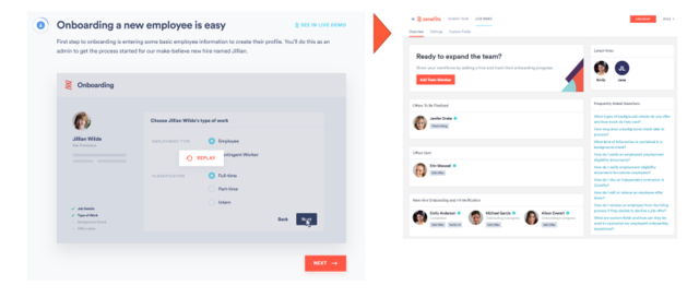
Zenefits, the people operations software, shows how easy it is to onboard a new employee through the platform. They then take this in-product guidance a step further by allowing a user to see how it looks in a live, interactive demo environment (right hand side). Seeing the potential end state helps motivate users to complete the set-up required to get there.
Miro, the visual collaboration software, doesn’t even have a blank slate in their product. A new user’s Miro board is already populated with their preferred template (a mind map, in the example below). Miro gets bonus points because they’ve created landing pages that explain what a mind map is, when to use it, and how to use it – all before a user ever signs up for the product.

What to do next: Curate help materials specific to key elements of your product and populate them in the relevant context. Then explore adding dummy data or pre-built templates so users can visualize the promised land before they’ve fully completed set up.
3–You don’t explain “what’s in it for me”
In a self-serve environment, your product needs to sell itself. You don’t always have a rep available to explain why you built a feature or how that feature helps the user.
Short, readable, and value-centric copy can go a long way in building trust with your users and encouraging them to finish the set-up process.
Mailchimp, the marketing and email platform, has this down pat. During the onboarding process Mailchimp asks users to provide a physical address (pretty invasive, huh?). But then they explain why they’re asking. It’s to comply with anti-spam laws, not to send you even more spam.

What to do next: Audit your new user onboarding and find every major area where you’re asking for something from the user. Then write a 1-2 sentence explanation of why, from the user’s perspective. Loop in your Product Marketer if you have one.
4–You rely too much on in-product tours
I don’t have a grudge against in-product tours. In fact, they can be a fast, low cost, and no-code way to improve your user onboarding experience.
But in-product tours are a band-aid and not a panacea. Your product needs to be intuitive on its own.
What to do next: Carve out product and engineering resources to optimize your native onboarding experience *in addition to* any in-product tours.
5–Your in-product guidance goes away too fast
You’ve probably seen this before: you got fed up with a long product tour and clicked out of it in haste. Then you regretted the decision because you were left completely on your own and didn’t know what to do. (Just me? 🤦♂️)
This confusion gets amplified if a user tries to return to the product the next day, or the next week, and has forgotten where they left off.
Make sure there are still resources to guide users on what to do after the product tour has ended. Checklists and progress bars can be useful tools here.
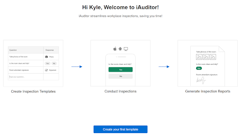
iAuditor by SafetyCulture, the inspection software, eliminates any doubt about what to do next. There are three steps featured prominently in the product: create an inspection template, conduct inspections, then generate reports.
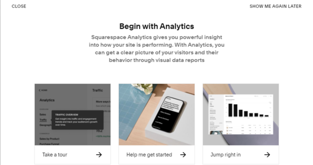
Squarespace, the website builder, continues to offer in-product guidance as users reach deeper product functionality like analytics. Squarespace even lets users pick their own path based on how they prefer to learn: take a tour, help me get started, or jump right in.
What to do next: Add a checklist or progress bar to the console during the user onboarding. Alternatively, pin the product tour so users can go back to it later.
6–You make it *too* easy to sign up
Wait, isn’t the goal of PLG to make it super easy for a user to try your product?
Hear me out on this one.
Many companies have poured resources into conversion optimization as a way to generate as many sign-ups as possible. For example, maybe they added an option to sign-up with an email from the homepage or perhaps they added an option to log-in through Google rather than create a new account.
In many cases these companies celebrate their acceleration in sign-up growth, only to realize later that the extra sign-ups never translated into more customers or revenue. (Pro-tip: many of these extra sign-ups might have actually been bots.)
There are two paths to proceed if you run into this problem.
First is to provide more nurturing through content, context, and community outside of your product in order to turn low-intent visitors into high-intent users.
The second is to redesign your onboarding so that you have a path for low-intent users who aren’t yet ready to activate, let alone purchase your product. Videos and best practice guides go a long way.
What to do next: Ditch sign-ups as a core marketing KPI and replace it with activated sign-ups, which creates a stronger alignment between marketing and product. Then revisit your onboarding flow, with the mindset of a low-intent user, in order to spot opportunities to add more educational resources at pivotal moments.
7–You send mixed and confusing messages
We’ve all been there. You signed up for a product only to get bombarded by a chaotic array of touch points spanning in-product chat, sales rep outreach, company announcements, marketing emails, and so on. You tried to unsubscribe but somehow the messages kept coming anyway.
From a vendor standpoint, each of these touch points has a clear purpose otherwise it wouldn’t have been introduced. But collectively they make it hard for users to focus on what matters.
What to do next: Document every touchpoint that a new user receives in their first two weeks and then map those touch points on a timeline. Use those lessons to streamline the user journey and kill touch points that aren’t additive. Bonus points if you can shift towards contextual, trigger-based touch points that are personalized to a given user.
Bonus – You aren’t personalized
I intentionally left this off my list of mistakes because it doesn’t necessarily apply to every product. That said, personalization can be an extremely powerful way of taking your self-serve onboarding to the next level.
Users come to your product with different contexts, jobs they’re trying to do, and levels of familiarity with related software tools. So why should they all go through the same onboarding path?
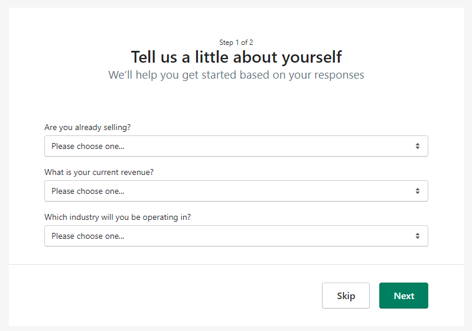
Shopify, the eCommerce software company, asks users several upfront questions in order to segment them into a specific onboarding flow. One of these questions is “are you already selling?”, which identifies whether the user wants to migrate from an existing eCommerce platform or is starting from scratch.
Another question is “which industry will you be operating in?”, which can greatly impact the type of online presence that’s right for them. Shopify has a set of templates, themes, and examples tailored to whether the business is in home and décor, art, food and drink, or something else entirely.
What to do next: If it’s relevant for your product, list out the most common use cases across your customers. Then turn the top ones into templates for new users. Pro-tip: these templates can also help users find your product in the first place.
What to do next to improve your onboarding
You won’t perfect your self-service onboarding overnight. But you should set up the foundation for collecting real user feedback, measuring milestones along the user journey, and experimenting with different iterations.
A few ways to get started:
- Collect real user feedback: The goal is to develop deep user empathy and understand users’ experience with your product. You can go about that through a range of methods including: (a) external user research platforms (ex: UserTesting); (b) in-product session recording; (c) interviewing and surveying users who get stuck; and (d) recruiting prospective users to give your product a try.
- Measure milestones along the user journey: Treat your in-product journey like you treat your sales-led journey. There should be milestones that delineate a greater degree of engagement and likelihood to buy. You can start with a hypothesis-based approach and then refine it over time as you collect data. Common stages include:
- (a) sign-up
- (b) qualified
- (c) activated
- (d) PQL
- (e) paid customer
- Experiment with different iterations: Regardless of how much preparation you put in, your best ideas won’t always work in practice. Your goal should be to use experiments to gain critical insights that help you improve the next iteration. Expect many of your experiments to fail; if that’s not happening, you’re probably not aiming high enough!
