Designing a Usable Dashboard – /rg/
A Product Manager’s Guide to Quick and Effective Design.

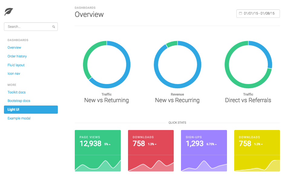
A dashboard, in many ways, is like the screen of a digital device — there are numerous activities that happen underneath the surface, but as users we are unaware of such activities and simply believe what we see.


Who knows or even cares how many system calls does it take to show the battery status on a screen? But the moment battery sign turns red, we quickly understand that if ignored for too long, the device will soon be unusable. Over time we start relying on system design.
When it comes to a B2B SaaS product, the dashboard is its lifeline as it is the primary interface that customers interact with. While a dashboard encapsulates the complexity of the underlying system, its success lies in how meaningfully it communicates KPIs to users, how reliable it is as a source of information and how it makes its customer’s work hours productive .
In this post, I’d like to share how as a scrappy product manager with limited access to dedicated designers you can apply Jakob Nielsen’s 10 Usability Heuristics to assess your SaaS product’s dashboard design. For the unacquainted, Jakob Nielsen is often called ‘the guru of Web page usability’ and his design principles are as relevant as they were when published over 20 years ago.
So what’s a heuristic? Simply put, a heuristic is a rule of thumb, or as Daniel Kahneman says, “a simple procedure that helps find adequate, though often imperfect, answers to difficult questions”.
Let’s dive in to see what these 10 heuristics are and how various dashboards adopt them.
1. Visibility of system status
The system should always keep users informed about what is going on, through appropriate feedback within reasonable time.
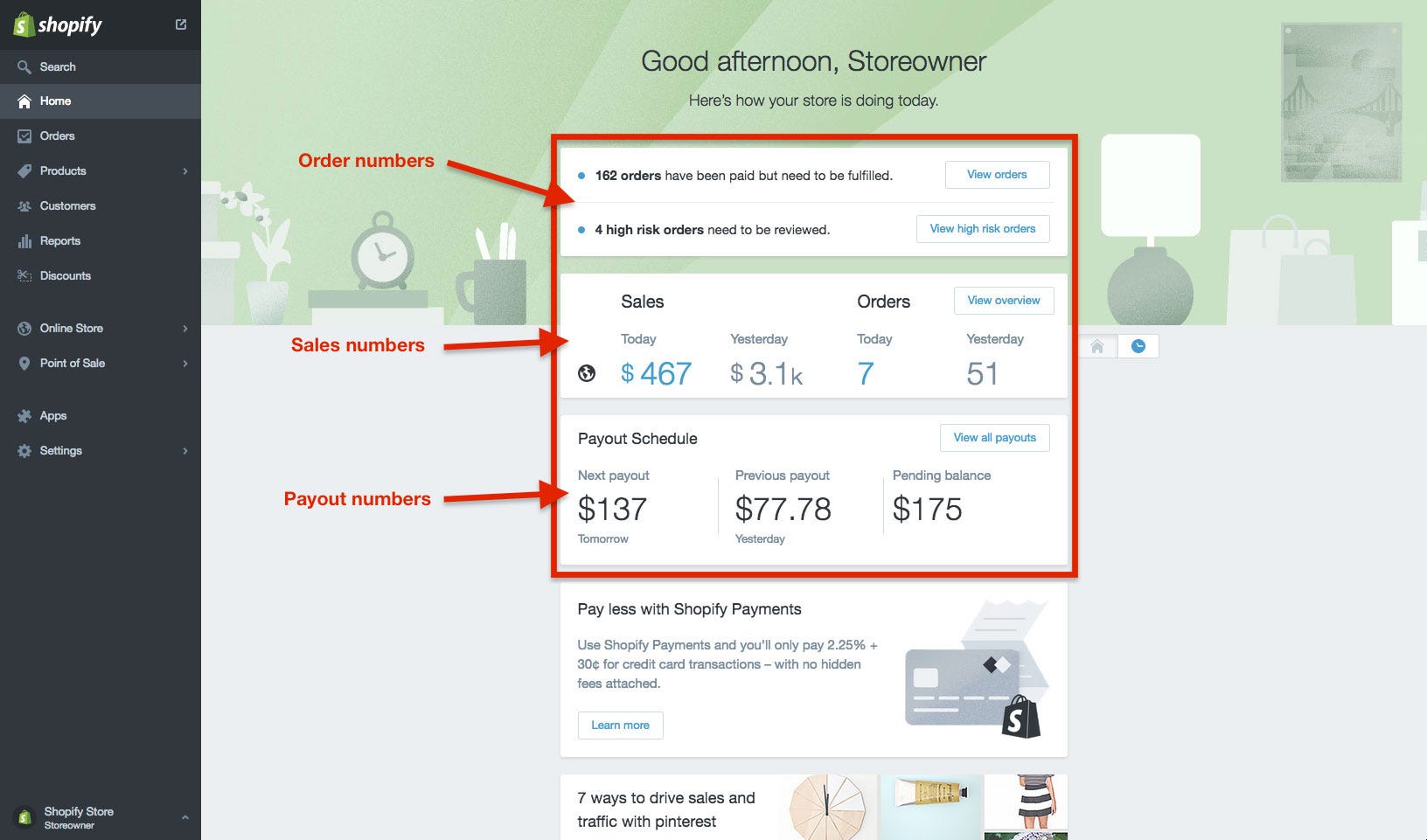
In the context of dashboards, information that matters most to the users should be displayed upfront. Depending on the kind of customer segment your product serves, information presented maybe — numerical, helping users visualise key metrics that they frequently track through charts, or textual, through summary cards.
Since storeowners mainly use Shopify to sell physical products online — the dashboard informs storeowners how their business is performing by displaying sales, orders and payout numbers as soon as they log in.

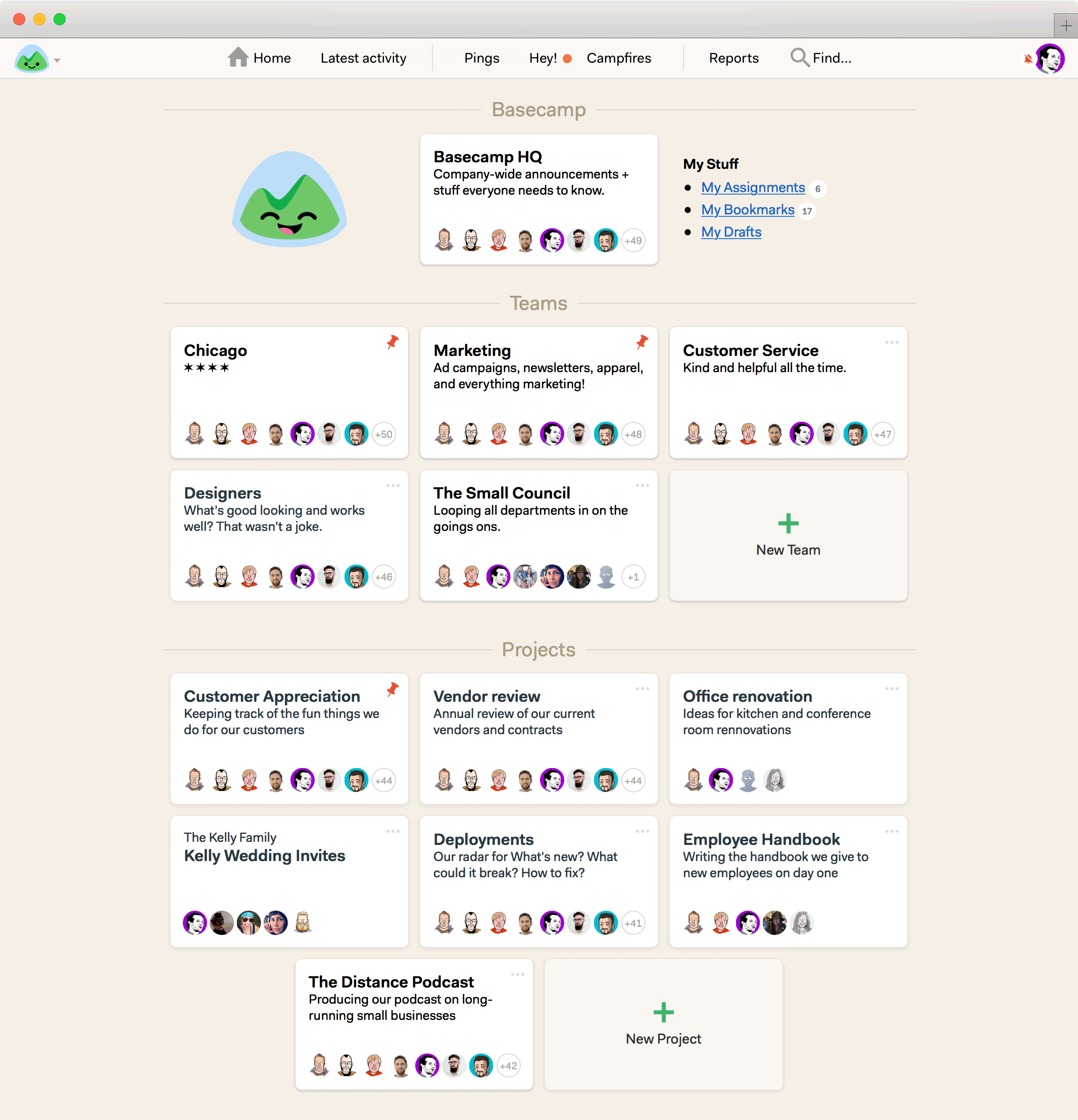
Basecamp’s homepage gives users an overview of different teams and projects through summary cards that include a title, short description and list of team members. These cards in turn serve as entry points to different sections of the website.

2. Match between system and the real world
The system should speak the users’ language, with words, phrases and concepts familiar to the user, rather than system-oriented terms. Follow real-world conventions, making information appear in a natural and logical order.
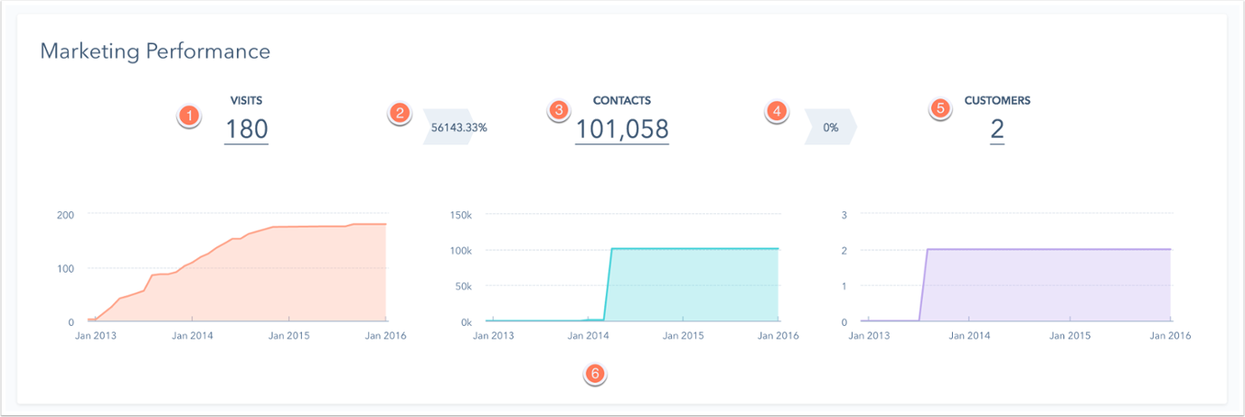
Hubspot speaks with its core audience of marketers through words such as visits, contacts, customers, landing pages, conversion, views, submissions that makes the dashboard easy to relate to.

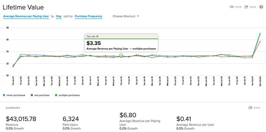
Localytics, another marketing automation product, uses phrases like lifetime value, average revenue per user, purchase frequency, growth, paid users that marketers use everyday.

3. User control and freedom
Users often choose system functions by mistake and will need a clearly marked “emergency exit” to leave the unwanted state without having to go through an extended dialogue. Support undo and redo.
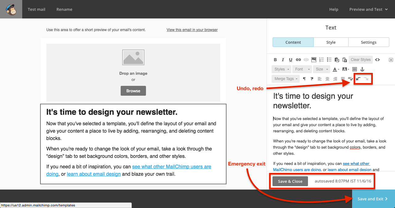
Mailchimp users can leave the template creation workflow by clicking on the clearly marked ‘Save and Exit’ button. Additionally, users can ‘Save & Close’ separate components of the template such as boxed test, image card; view last saved timestamp as well as undo, redo changes.

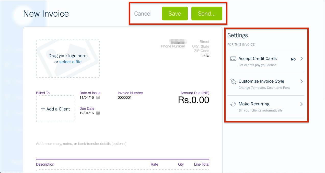
Freshbooks users can return to the dashboard either by cancelling or saving and exiting the current task of generating a new invoice. The buttons’ size, style, label and placement make them easy to follow.

4. Consistency and standards
Users should not have to wonder whether different words, situations, or actions mean the same thing. Follow platform conventions.
The more time users spend on a platform the stronger their mental model becomes. This heuristic has become more challenging to apply since the number of platforms have grown over last few years.
There are 2 sides to this heuristic —
(1.) A product’s dashboard needs to be consistent implicitly, i.e., irrespective of the platform that the customers use to interact with the product, the interface, words, and actions must look familiar.
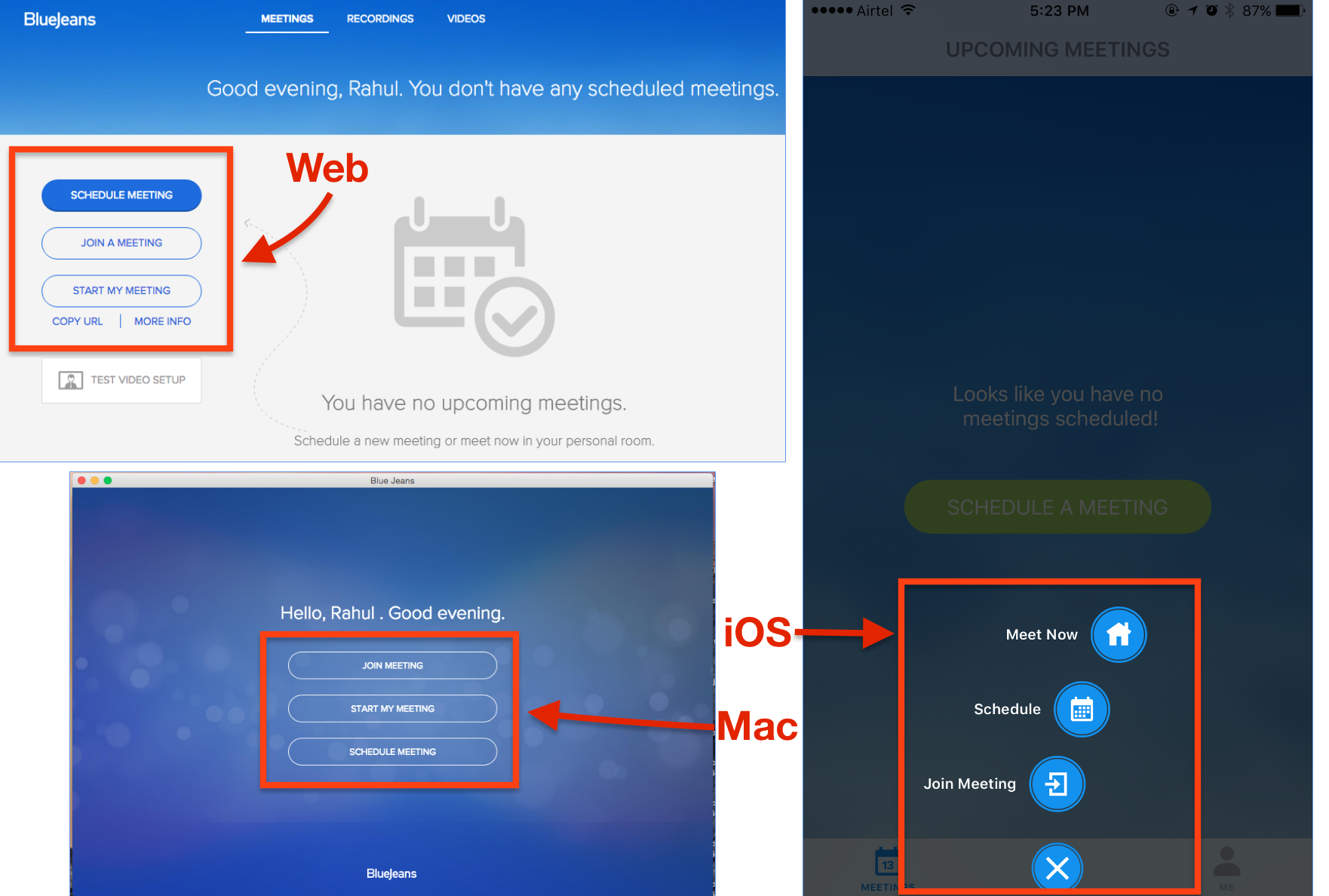
BlueJeans, an enterprise video communication platform, shows users three standard call-to-action buttons (‘Schedule Meeting’, ‘Join a Meeting’, ‘Start My Meeting’) consistently on different platforms — be it web, desktop, or mobile. As a user there’s a sense of familiarity that gets triggered when you see the interface — the number of call-to-action buttons and their names are always the same.

(2.) Wherever applicable, the dashboard design should stick to the underlying platform’s design guidelines.
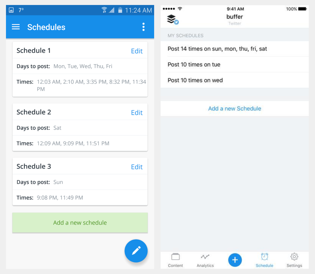
On both Android and iOS, Buffer offers the same functionality, but different UI as both the apps follow the underlying platform’s design guidelines. On Android, you will see components like hamburger and overflow menu, cards, floating action button, etc. while on iOS, you will see tab bars, navigation bars, pickers, etc.

5. Error prevention
Even better than good error messages is a careful design which prevents a problem from occurring in the first place. Either eliminate error-prone conditions or check for them and present users with a confirmation option before they commit to the action.
Of course, basics such as form validations, input type and range checks, error messages and help texts work well, but how about pre-empting certain scenarios when users are likely to make mistakes? Being proactive in design approach saves users from frustrating experiences and reflects the designer’s empathy for her users.
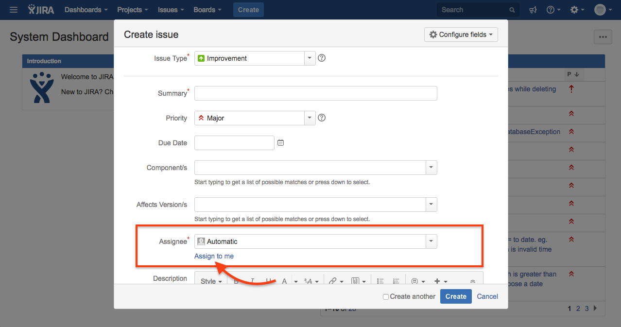
JIRA makes it mandatory to select an ‘Assignee’ for an issue to be created successfully. As often happens, while adding issues in bulk, one doesn’t know beforehand as to who exactly will be fixing the issue. JIRA helps users by offering good defaults of two kinds — a. automatically assigning an issue, usually to the administrator or board owner or current user, b. offering a link called ‘Assign to me’ that assigns tasks to the reporter of the issue.

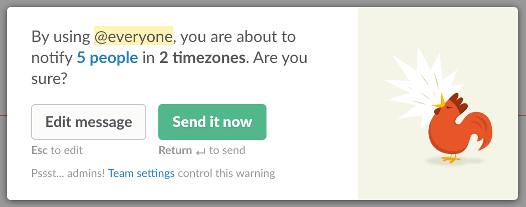
Slack displays a warning message whenever a user tries to make an announcement to 5 or more team members. The warning prevents an announcement to happen mistakenly by seeking user’s confirmation.

6. Recognition rather than recall
Minimise the user’s memory load by making objects, actions, and options visible. The user should not have to remember information from one part of the dialogue to another. Instructions for use of the system should be visible or easily retrievable whenever appropriate.

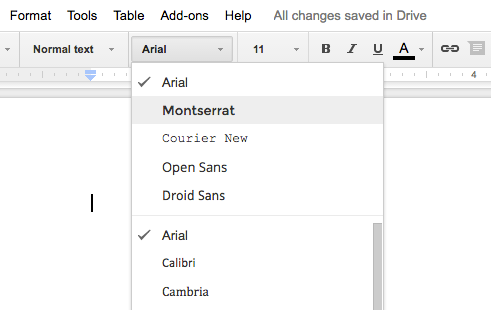
The classic illustration of this heuristic is the font drop-down commonly seen in text editors. Cognitively, it’s much easier to recognise how a font looks like when its name is styled rather than recalling it just from the font name.
Such visual cues go a long way in reducing the mental effort required to retrieve information for completing tasks.
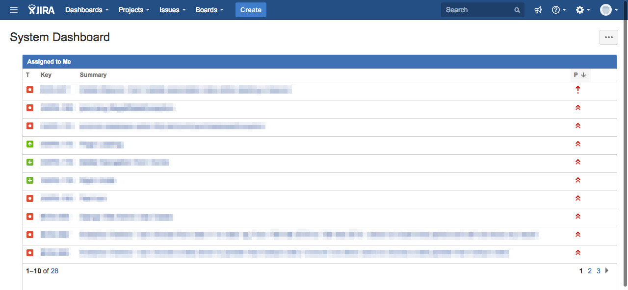
When it comes to dashboards, JIRA promotes recognition over recall by showing a feed of issues assigned to a user on the System Dashboard. This helps users quickly navigate to relevant issues rather than spend time and effort applying filters to find issues.

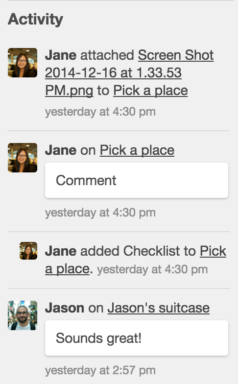
Instead of making users recall changes made to cards and boards, Trello displays a log of changes in the Activity feed that help users recognise changes easily.

7. Flexibility and efficiency of use
Accelerators — unseen by the novice user — may often speed up the interaction for the expert user such that the system can cater to both inexperienced and experienced users. Allow users to tailor frequent actions.
Accelerators are advanced features such as keyboard shortcuts that help expert or power users of a product get more done in less time. Note that expert users do not get access to an additional functionality, but just another interaction experience that makes them more productive while using the same functionality.
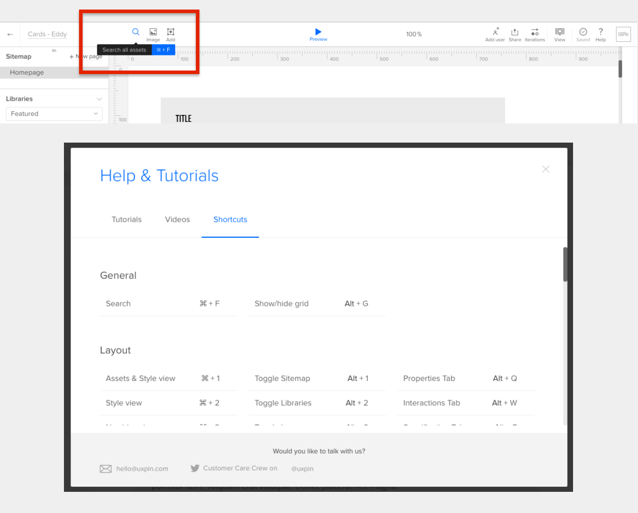
UXPin helps expert users become more efficient through keyboard shortcuts that are visible when a user hovers the cursor on a button.

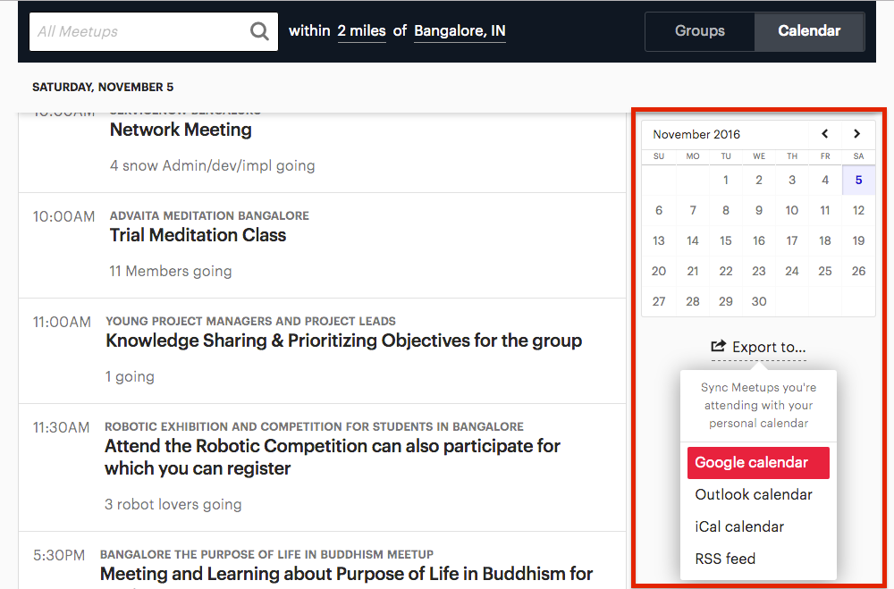
Expert users who use Meetup regularly and rely heavily on personal calendars can sync meet-ups with various services such Google Calendar, iCal, while novice users can view upcoming meet-ups from the dashboard’s calendar widget.

8. Aesthetic and minimalist design
Dialogues should not contain information which is irrelevant or rarely needed. Every extra unit of information in a dialogue competes with the relevant units of information and diminishes their relative visibility.
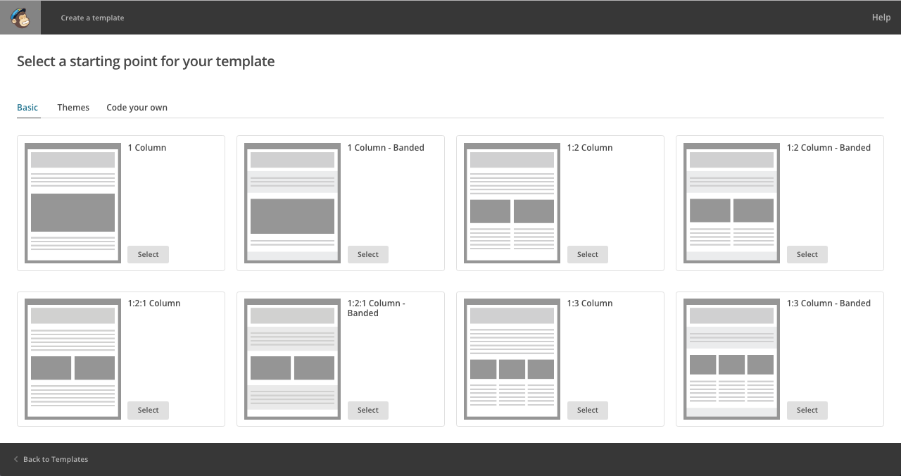
Mailchimp’s email template section contains just enough information for a user to select a template — users can distinguish between various templates by looking at names and wireframes. The design is minimal with grayscale colour tone, ample white space, and a visual hierarchy that is easy to perceive.

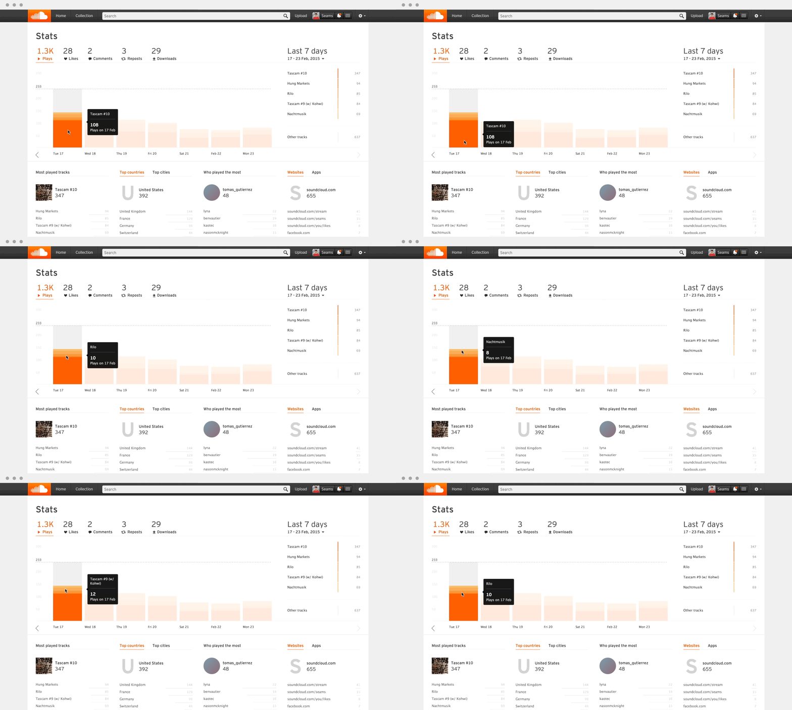
SoundCloud’s Stats page offers artists a wealth of information that can be clearly discerned as it is well-structured through interactive chart, lists, key colour and whitespace.

9. Help users recognise, diagnose, and recover from errors
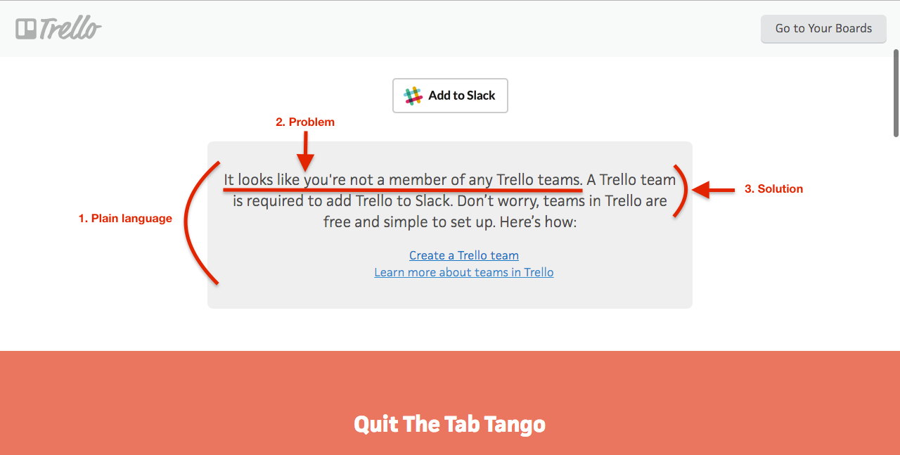
Error messages should be expressed in plain language (no codes), precisely indicate the problem, and constructively suggest a solution.
While trying to integrate Trello with Slack, if a user doesn’t belong to a team, an error message is shown that is written in plain language, describes what the problem is and offers a solution.

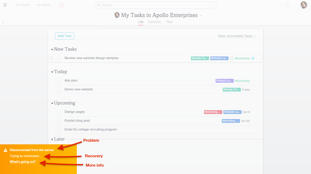
If disconnected from the server, instead of showing an error code, Asana overlays the screen, which makes it inactive and displays a bright popup message that informs users about the error that occurred, how Asana is recovering from that error and a link to find more details about possible causes.

10. Help and documentation
Even though it is better if the system can be used without documentation, it may be necessary to provide help and documentation. Any such information should be easy to search, focused on the user’s task, list concrete steps to be carried out, and not be too large.
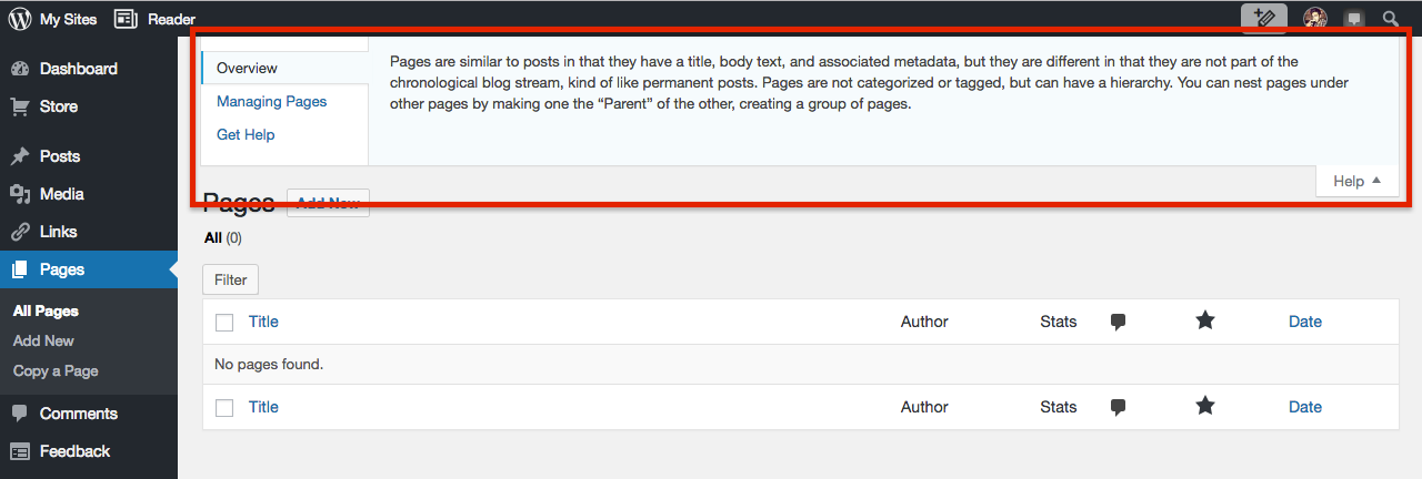
WordPress Help widget is available across all pages — it’s easy to find, related to the section the user is currently on, brief and can be collapsed or expanded as required.

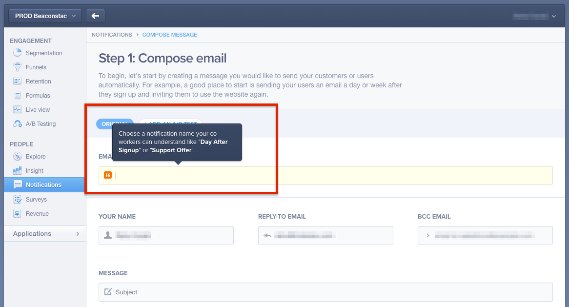
Mixpanel shows short, useful and relevant help messages when users start filling up text fields.

What are your favourite dashboard references and how well do you think they adopt any of the heuristics mentioned above?
If you enjoyed reading this story, do recommend the story to others by hitting the star icon below.

