A Netflix Web Performance Case Study – Dev Channel – Medium

Improving Time-To-Interactive for Netflix.com on Desktop
tl;dr: There are no silver bullets to web performance. Simple static pages benefit from being server-rendered with minimal JavaScript. Libraries can provide great value for complex pages when used with care.
Netflix is one of the most popular video streaming services. Since launching globally in 2016, the company has found that many new users are not only signing up on mobile devices but are also using less-than-ideal connections to do so.
By refining the JavaScript used for Netflix.com’s sign-up process and using prefetching techniques, the developer team was able to provide a better user experience for both mobile and desktop users and offer several improvements.
- Loading and Time-to-Interactive decreased by 50% (for the logged-out desktop homepage at Netflix.com)
- JavaScript bundle size reduced by 200kB by switching from React and other client-side libraries to vanilla JavaScript. React was still used sever-side.
- Prefetching HTML, CSS and JavaScript (React) reduced Time-to-Interactive by 30% for future navigations
Reducing Time-to-Interactive by shipping less JavaScript
The area optimized for performance by the Netflix developers was the logged-out homepage, where users come to sign-up or sign-in to the site.
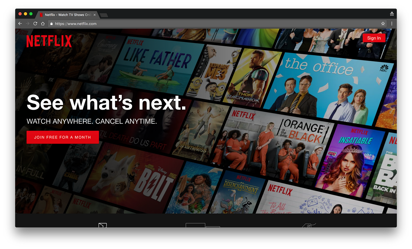
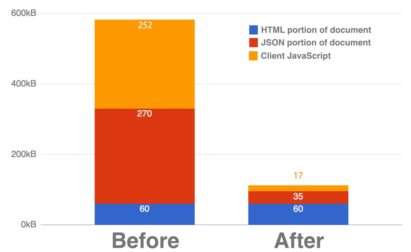
This page initially contained 300kB of JavaScript, some of which was React and other client-side code (such as utility libraries like Lodash), and some of which was context data required to hydrate React’s state.
All of Netflix’s webpages are served by server-side rendered React, serving the generated HTML and then serving the client-side application, so it was important to keep the structure of the newly-optimized homepage similar to maintain a consistent developer experience.

Using Chrome’s DevTools and Lighthouse to simulate the logged-out homepage page being loaded on a 3G connection showed that the logged-out homepage took 7 seconds to load, far too long for just a simple landing page, so the potential for improvement was investigated. With some performance auditing, Netflix discovered their client-side JS had a high cost.

By turning off JavaScript in the browser and observing which elements of the site still functioned, the developer team could determine if React was truly necessary for the logged-out homepage to function.
Since most of the elements on the page were basic HTML, remaining elements such as JavaScript click handling and class adding could be replaced with plain JavaScript, and the page’s language switcher, originally built using React, was rebuilt in vanilla JavaScript using less than 300 lines of code.
The complete list of components ported to vanilla JavaScript were:
- Basic interactions (tabs halfway down the homepage)
- Language switcher
- Cookie banner (for non-US visitors)
- Client-side logging for analytics
- Performance measurement and logging
- Ad attribution pixel bootstrap code (which are sandboxed in an iFrame for
security)

Even though React’s initial footprint was just 45kB, removing React, several libraries and the corresponding app code from the client-side reduced the total amount of JavaScript by over 200kB, causing an over-50% reduction in Netflix’s Time-to-Interactivity for the logged-out homepage.
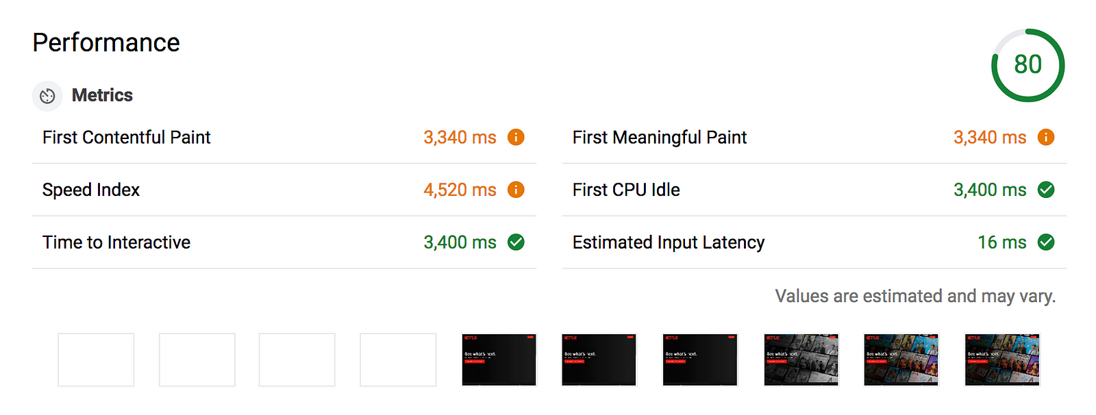
In a lab environment, we can validate users can now interact with the Netflix homepage quickly using Lighthouse (trace). Desktop TTI is < 3.5s.
What about metrics from the field? Using the Chrome User Experience report we can see First Input Delay — the time from when a user first interacts with your site to the time when the browser is actually able to respond to that interaction — is fast for 97% of Netflix users on desktop. This is great.

Prefetching React for subsequent pages
To further improve performance when navigating their logged-out homepage, Netflix utilized the time spent by users on the landing page to prefetch resources for the next page users were likely to land on.
This was achieved by using two techniques — the built-in <link rel=prefetch> browser API and XHR prefetching.
The built-in browser API consists of a simple link tag within the head tag of the page. It suggests to the browser that the resource (e.g. HTML, JS, CSS, images) can be prefetched, though it doesn’t guarantee that the browser actually will prefetch the resource, and it lacks full support from other browsers.
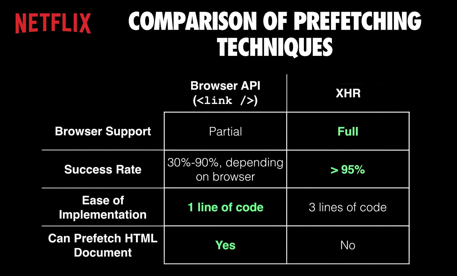
XHR prefetching, on the other hand, has been a browser standard for many years and produced a 95% success rate when the Netflix team prompted the browser to cache a resource. While XHR prefetching cannot be used to prefetch HTML documents, it was used by Netflix to prefetch the JavaScript and CSS bundle for subsequent pages.
Note: Netflix’s HTTP response header configuration is preventing HTML caching with XHR (they do no-cache on the second page’s HTML). Link Prefetch is otherwise working as expected because it will work on HTML even if no-cache is present up to a certain point.
// create a new XHR request
const xhrRequest = new XMLHttpRequest();
// open the request for the resource to "prefetch"
xhrRequest.open('GET', '../bundle.js', true);
// fire!
xhrRequest.send();
By using both the built-in browser API and XHR to prefetch HTML, CSS, and JS, the Time-to-Interactive was reduced by 30%. This implementation also required no JavaScript to be rewritten and didn’t negatively impact the performance of the logged-out homepage, and hence offered a valuable tool for improving page performance at a very low-risk.
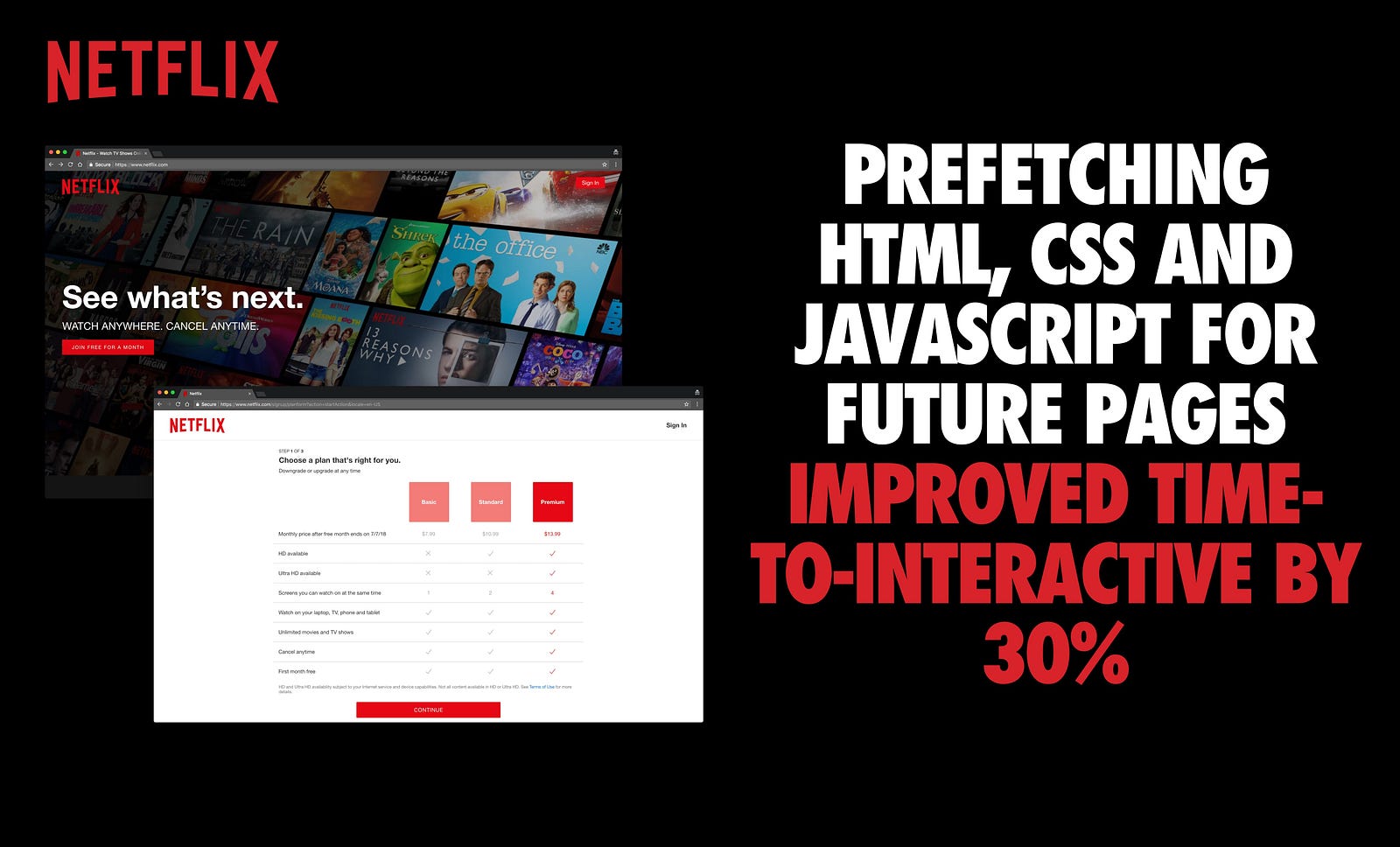
After prefetching was implemented, the Netflix developers observed improvements by analyzing reductions in the Time-to-Interactive metric on the page, as well as using Chrome’s developer tools to directly measure cache hits of resources.
Netflix logged-out homepage — optimization summary
By prefetching resources and optimizing the client-side code on Netflix’s logged-out homepage, Netflix was able to greatly improve their Time-to-Interactive metrics during the sign-up process. By prefetching future pages using the built-in browser API and XHR prefetching, Netflix was able to reduce Time-to-Interactive by 30%. This was for the second-page loading, which contained the bootstrapping code for single-page app sign-up flow.
The code optimizations carried out by the Netflix team showed that while React is a useful library, it may not provide an adequate solution to every problem. By removing React from the client-side code on the first landing page for signup, the Time-to-Interactive was improved by over 50%. Reducing Time-to-Interactive on the client-side also caused users to click the sign-up button at a greater rate, showing that code optimization can lead to a greater user experience overall.
While Netflix didn’t use React for the homepage, they prefetched it for subsequent pages. This allowed them to leverage client-side React throughout the rest of the single page application sign-up process.
For more details on these optimisations, see this A+ talk by Tony Edwards:
Conclusion
Netflix discovered opportunities to improve their Time-to-Interactive by keeping a close eye on the cost of JavaScript. To discover if your site has opportunities to do better here, consult your performance tools.
The tradeoff Netflix decided to make is to server-render the landing page using React, but also pre-fetching React / the code for the rest of the signup flow while on it. This optimizes first load performance, but also optimizes the time to load for the rest of the signup flow, which has a much larger JS bundle size to download since it’s a single-page app.
Consider if leveraging vanilla JavaScript is an option for flows in your site. If you absolutely need to use libraries, try to only ship down down code your users will need. Techniques like prefetching can help improve page load times for future page navigations.
Additional notes
- Netflix considered using Preact, however, for a simple page flow with low interactivity, using vanilla JavaScript was a simpler choice for their stack.
- Netflix experimented with Service Workers for static resource caching. At the time, Safari didn’t support the API (it now does) but they’re exploring them again now. The Netflix sign-up flow needs more legacy browser support than the member experience. Many users will sign-up on an older browser, but watch Netflix on their native mobile app or a TV device.
- The Netflix landing page is quite dynamic. It’s their most heavily A/B tested page in the sign-up flow, with machine learning models used to customize messaging and imagery depending on location, device type and many other factors. With almost 200 countries supported, there are different localization, legal and value messaging challenges for each derivative. For more on A/B testing, see Testing Into A Better User Experience by Ryan Burgess.
With thanks to Netflix UI Engineers, Tony Edwards, Ryan Burgess, Brian Holt, Jem Young, Kristofer Baxter, Nicole Sullivan and Houssein Djirdeh for their reviews and contributions.
