A Phone Setup That Will Make You More Mindful – Better Humans
…Not Less
Note: This guide is for iPhone users, but all optimizations are transferable to other brands and operating systems.
If your phone was more like your toothbrush, your life would be a lot better.
Your toothbrush is the greatest tool of all time. Why? You only use it when you’re supposed to, for as long as you need to and never forget what it’s for.
A great tool serves only one purpose: to put control in your hands at all times, whether you’re wielding it or not.
That makes your phone a lousy tool at best. It constantly clamors for your attention and, once it has what it wants, never lets go. According to the latest Nielsen report, we spend 2.5 hours on our phones, every single day. I can’t see why anyone would need to use their phone 17.5 hours a week, unless they work part-time at a call center. Can you?
Your phone is your toothbrush’s arch enemy, trying to suck as much energy out of you as it can. Today, we’re going to change that. In a few easy steps, we’ll turn your phone into a mindfulness enhancer, making it the useful tool it was always meant to be.
But before we start, a quick primer on what makes good tools.
Optimize For Mindfulness
Our phone is a device to achieve certain outcomes and our behavior with this tool should reflect that. That’s why, instead of centering my phone setup around certain features, I designed it based on how I aspire to behave.
The behavior all great tools are optimized for is mindfulness. The resources they’re trying to preserve are our time and attention. Many of our tools don’t. They encourage us to use them long after they’ve fulfilled their purpose, spending a lot more time on our minds than they should.
Great tools share three characteristics, which prevent this dilemma:
- They only trigger you when it actually benefits you to use them.
- They require as little time as possible of you once you pick them up.
- They prompt you to let go of them as soon as you’re done.
Your toothbrush has a flashy color to make you notice it on the two daily occasions when you need it. Just slap on toothpaste and you’re good to go. It’s easy to put back after 3 minutes, because you can’t do much else with it.

Your toothbrush is the embodiment of mindfulness. Your phone, however, is trying hard to get noticed, to seduce you and to make you stay.
What if, instead, your phone always kept you in a state in which you’re aware of why you use it and what for? To find out, here’s how you can bring the three characteristics of great tools to your phone.
1. Minimize Triggers
The goal of this first step is that your phone only makes you aware it exists when it would be a good idea for you to pick it up. Depending on your work, that will fall somewhere between ‘never’ and ‘for certain calls only.’ There are two kinds of triggers to eliminate here.
Aural & Haptic Triggers
This includes all ringing and vibration. The easiest way to do this is to change just one setting: Go to ‘Sounds,’ uncheck ‘Vibrate on Silent’ and you’re done.
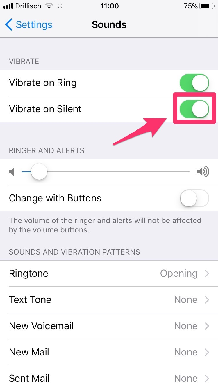
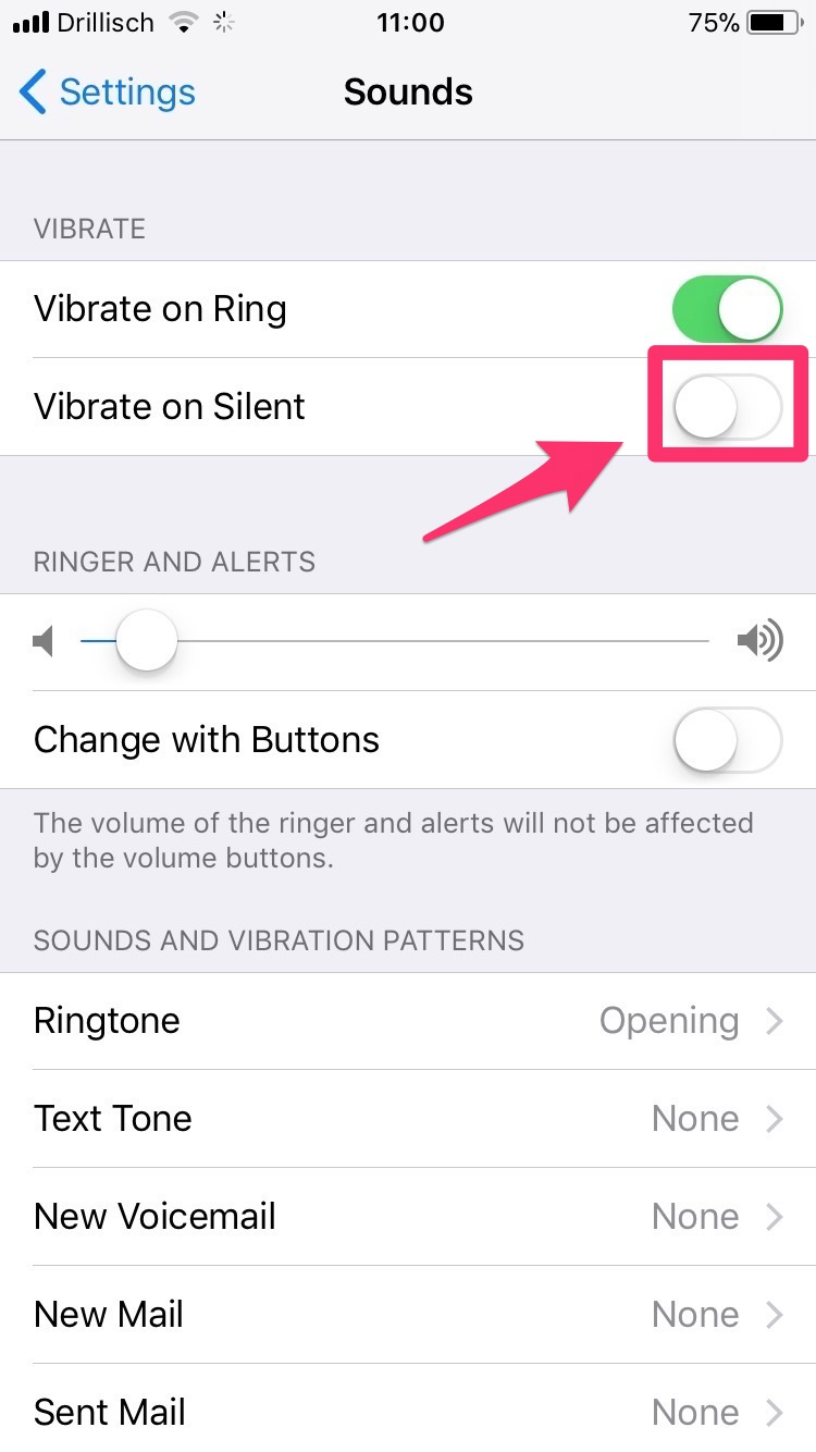
I keep my phone in Silent mode close to 100% of the time. Push down the little knob on the side of your iPhone and check if you see orange.
Note: Your alarms will still sound and calls from favorite contacts will still ring. Use this to exempt the right people.
Visual Triggers
When we say “Can I see that?” we usually mean “Can I touch it?” There’s a saying that babies always ‘look’ with their hands, but it’s not just toddlers. To silence your phone’s visual “Come check me, just in case!” screams, hide it from view.
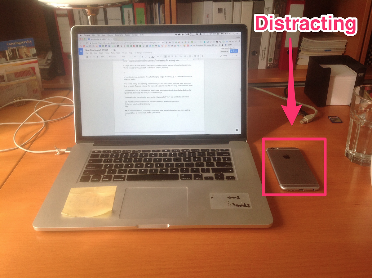
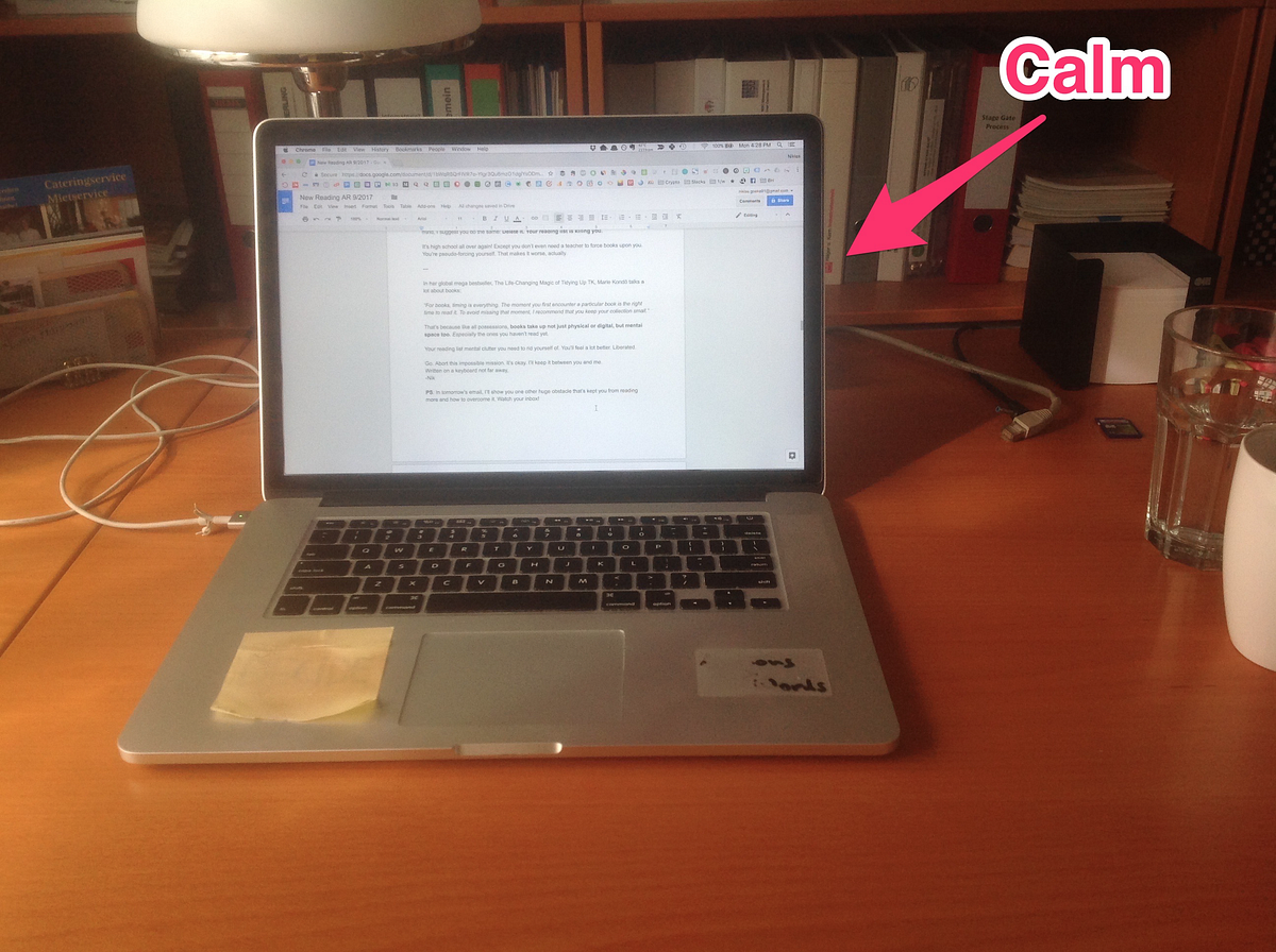
Put it in a drawer, leave it in your bag or locker, charge it in another room or, my go-to choice, simply place it behind your laptop or computer screen. If you doubt this helps, play a fun game: track how often you grab your phone in the next hour, then hide it and track again. You’ll be amazed.
With your phone’s infantile tendencies out of the way, it’s time to make using it more efficient.
2. Streamline Usage
The goal of this section is to design a phone that helps you find whatever you need efficiently, while requiring as little of your time as possible. Let’s start from the moment you decide you do need to get your phone, because you have a proper reason to. The first question that arises is: what do you see when you pick it up?
The Mindful Lock Screen
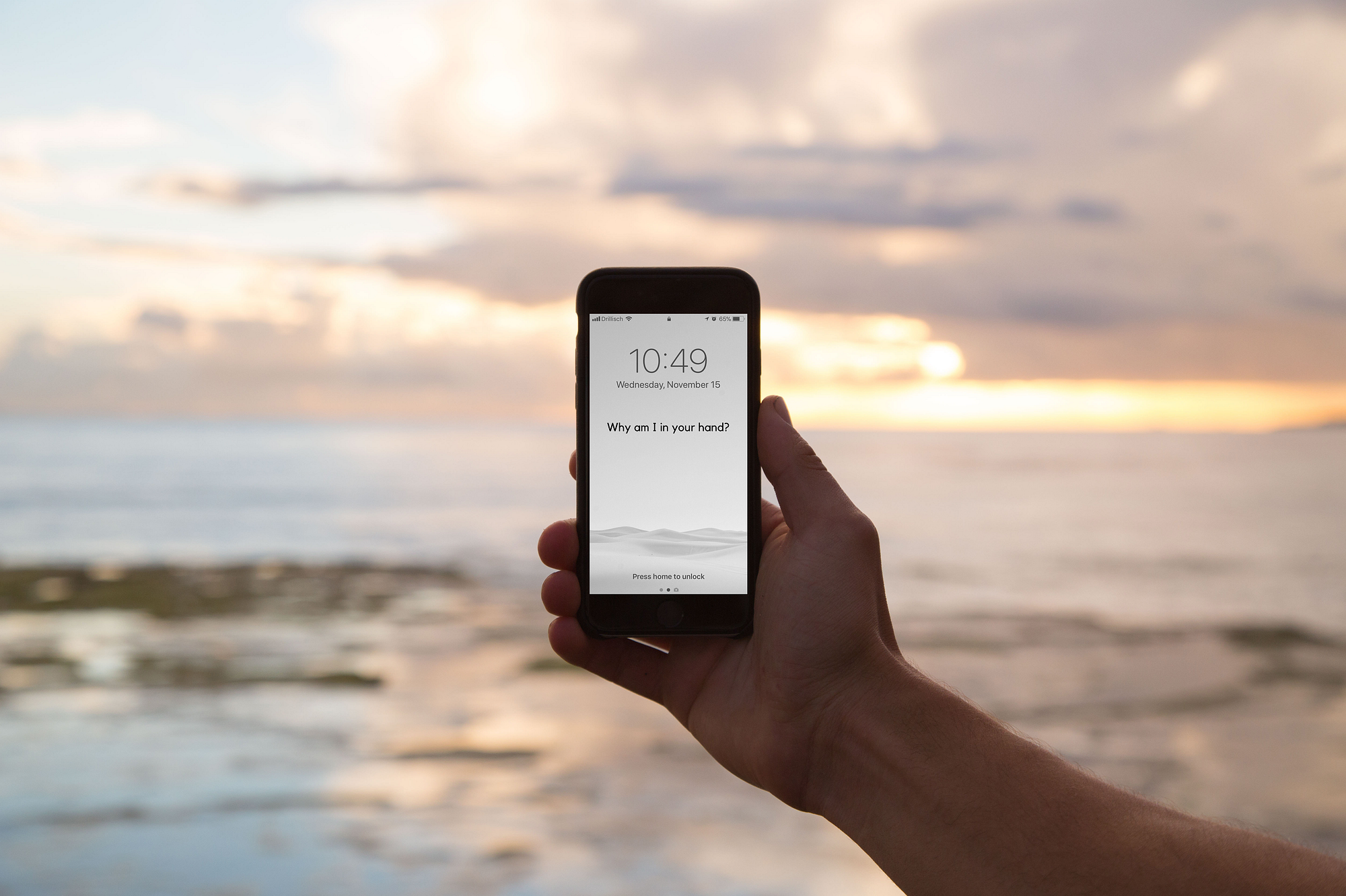
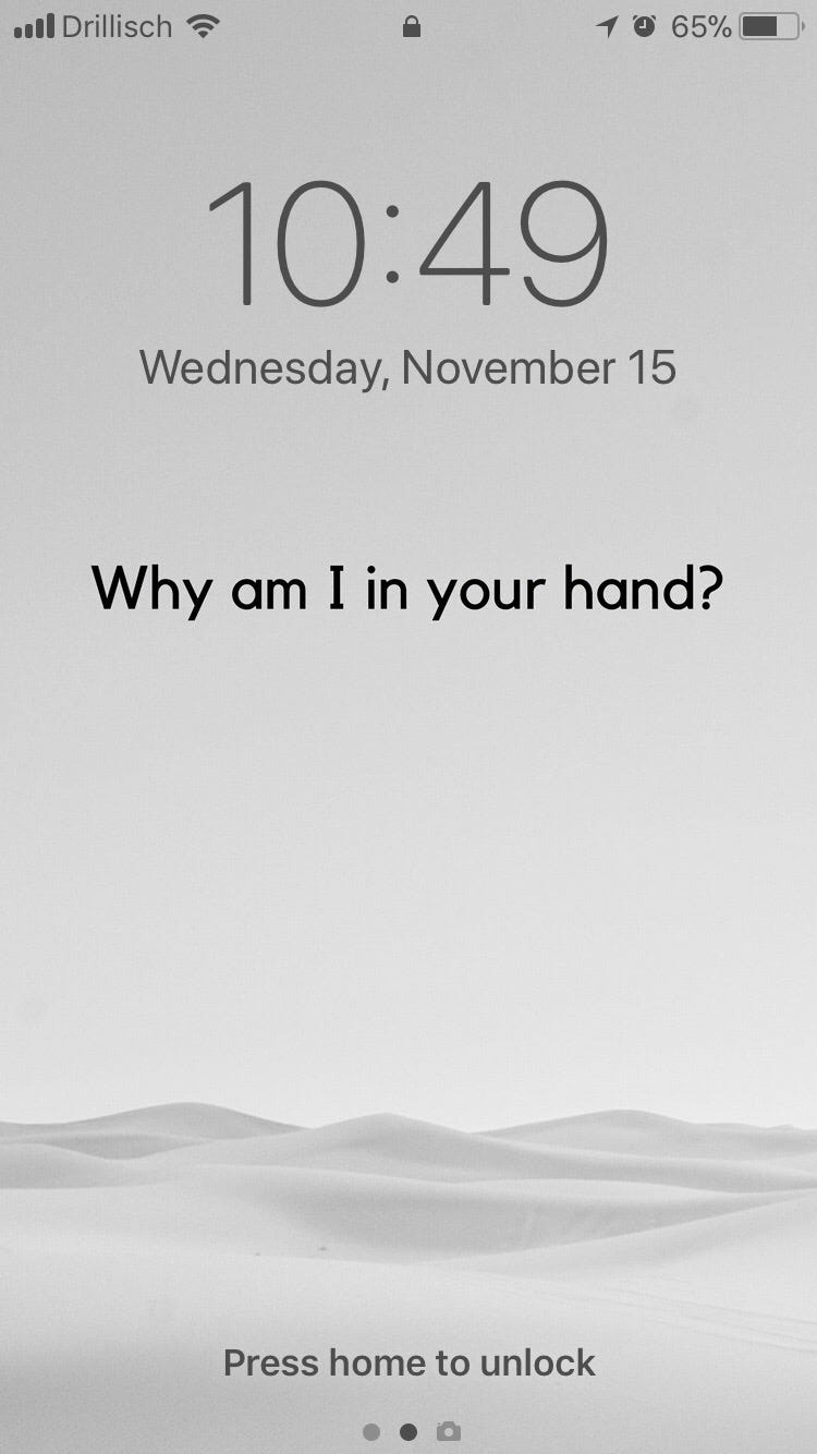
I owe a big thank you to Jason Stirman for his ideas around calm wallpapers, which I used to design mine. Here’s my lock screen:
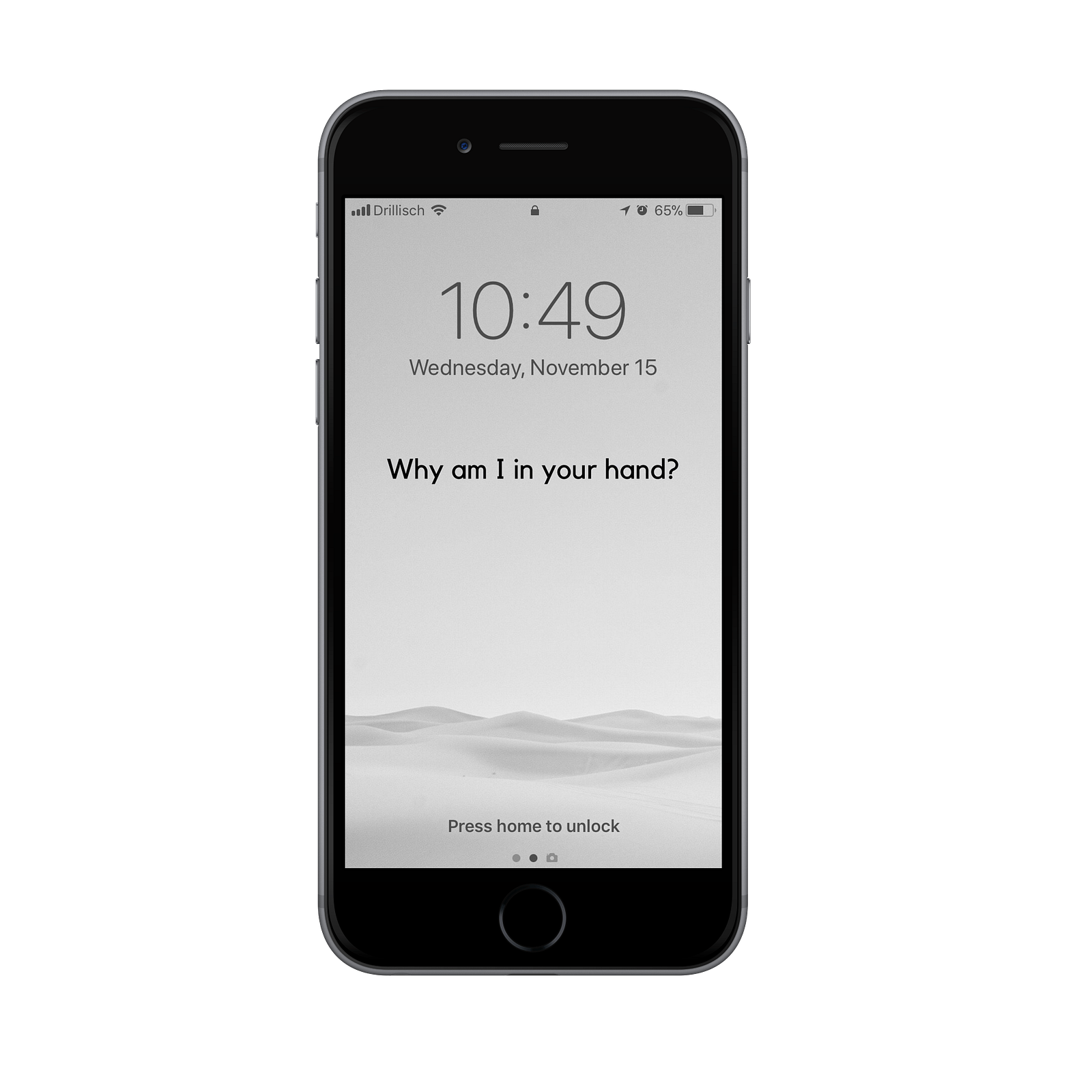
Everything you see on there, you see for a reason:
- It’s black and white, because everything on my phone is. We’ll get to that.
- It’s a picture with zero movement and lots of blank space, because that induces calmness, rather than sensory overload.
- It shows a desert, reminding me a smartphone is like a world in a grain of sand and it’s usually only a single grain I’m looking for.
- It asks me a thought-provoking question, which forces me to be honest with myself.
While you can find calm wallpapers online, a custom build increases your emotional commitment to using the system. I took an image from Unsplash, checked the right sizes at iOS Res and made a custom design in Canva. The question sits just below the upper third mark.
You’ll see why I chose “Why am I in your hand?” but here are some variants:
- What are you looking for?
- Why are you here?
- Why are you holding me?
When I look at this screen, I don’t just mindlessly unlock. I think. What can I do here? As it turns out, it’s quite a lot.
Do You Even Unlock?
Unlocking my phone reminds me of the scene in Harry Potter where he first discovers the Pensieve in Dumbledore’s office. Before he even realizes what veil he’s lifting, he falls head over heels into a new world.

Apple continues to make it easier for us to fall, so do this first:
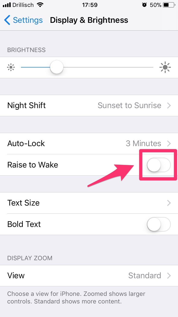
- Disable ‘Raise to Wake.’ It’s under ‘Display & Brightness.’ I say when the screen lights up. Not my wrist reflex.
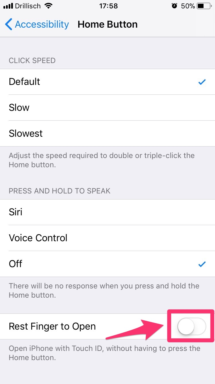
- Disable ‘Rest Finger to Open.’ You can find this under ‘General’ -> ‘Accessibility’ -> ‘Home Button.’ Now your iPhone won’t spontaneously unlock when you grab it. You’ll need to press the home button to do so.
Once you spend more time looking at your screen before unlocking it, you’ll see all the options you have without ‘going in.’
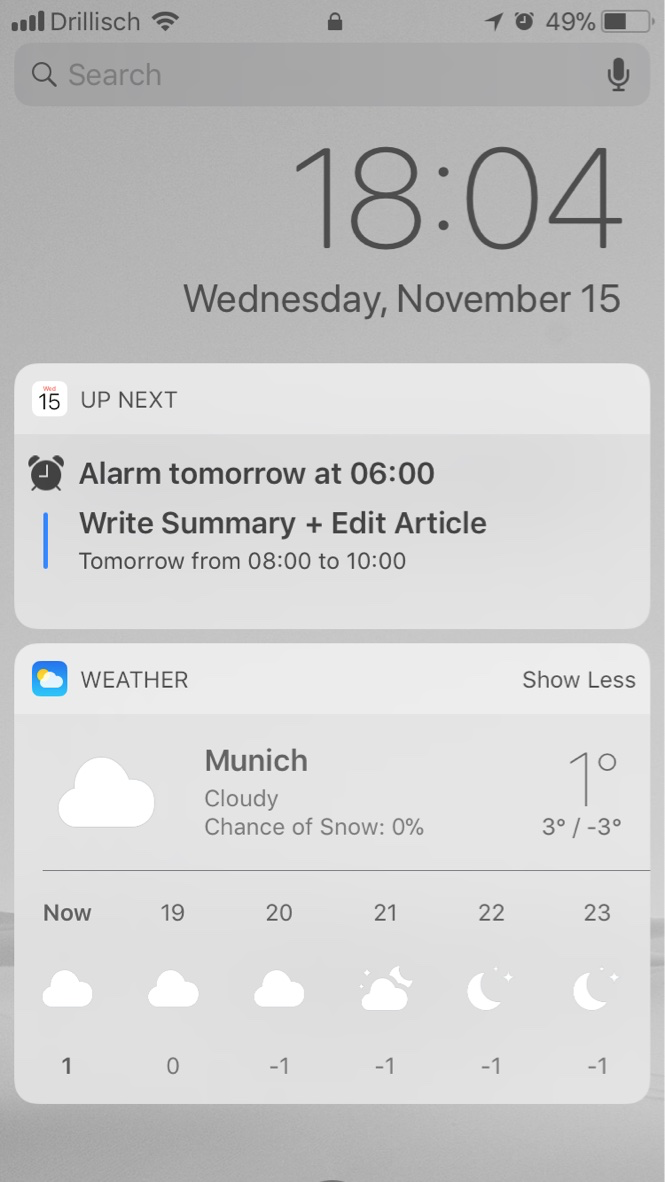
- If you swipe left to right, you get the widgets section. I only keep ‘Up Next’ and ‘Weather’ in here, but Jason made some useful suggestions as to what else might be worth including. If you need to, you can tap on them and go straight to the respective app.
- If you swipe right to left, you can access all camera features.
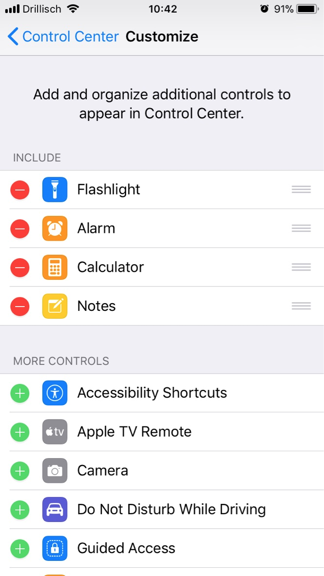
- If you swipe up from the bottom, you land in control center. Since iOS 11, you can change a lot more settings by 3D touching on the symbols. You can also add more apps below the bottom row in ‘Settings’ -> ‘Control Center.’
- If you swipe up from the middle, you can check your notification history. This is a great way to check messages without triggering read receipts. I’ve included all messaging and phone apps here, as well as Calendar and Reminders. Just enable ‘Show in History.’
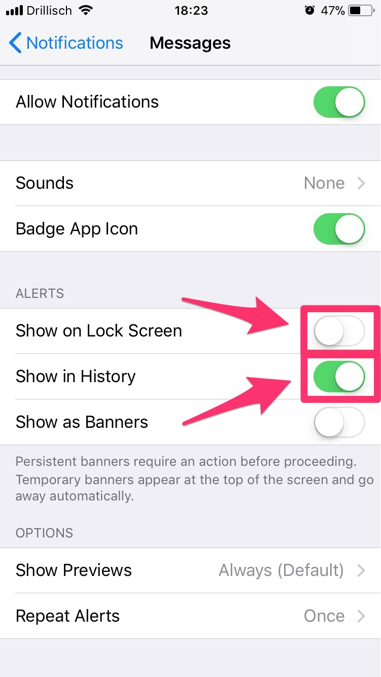
One more important aspect: For whichever apps you check ‘Show on Lock Screen,’ notifications will show up in the middle of your locked phone’s screen. I only have these enabled for calls and calendar events. Checking messages should be done on your initiative, not the person sending. Letting them show up only in notification history is perfect for that.
If you configure these sections appropriately, you won’t have to unlock your phone 7 out of 10 times you grab it.
Now that we’ve got that covered, let’s talk about those other 3 times.
A Home Screen That Feels Like Home
No matter how small, the space behind any home’s front door says ‘Welcome.’ But when we enter our phone, most of us end up right in a minefield.
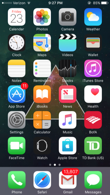
There are two types of mines you can and should sweep right away:
- Dust Catchers. A great decluttering rule is to throw out anything you haven’t worn in 6–12 months. Declutter your app closet. You can always download them again.
- Slot Machines. Tony Stubblebine popularized this phrase for apps you open and immediately get lost in. News, stocks, all social media, games, shopping, and dating apps, for example.
Delete everything that falls into either category. That’s already a lot better, but I really want a home screen that actually feels like home. When I enter, I want a butler to greet me and ask “What can I do for you today, sir?”
A bit like finding an oasis in the desert.
Tier 0: The Oasis
When I unlock, this is where the journey starts:

I chose to go empty because it’s the purest form of forcing myself to think before I act. From a home screen like this, there are three things you can do:
- Siri. I don’t use it and I feel many people don’t, because they think they look stupid talking to Siri in public. But in theory, you could Siri your way anywhere from here or even the lock screen.
- Search. I love Jason’s idea to use Spotlight for everything, because it adds an extra layer of “What are you looking for?” Experimenting with it.
- Scroll. My current setup of four pages, ordered in tiers based on how often I need the respective apps.
Below you can see all pages in order.
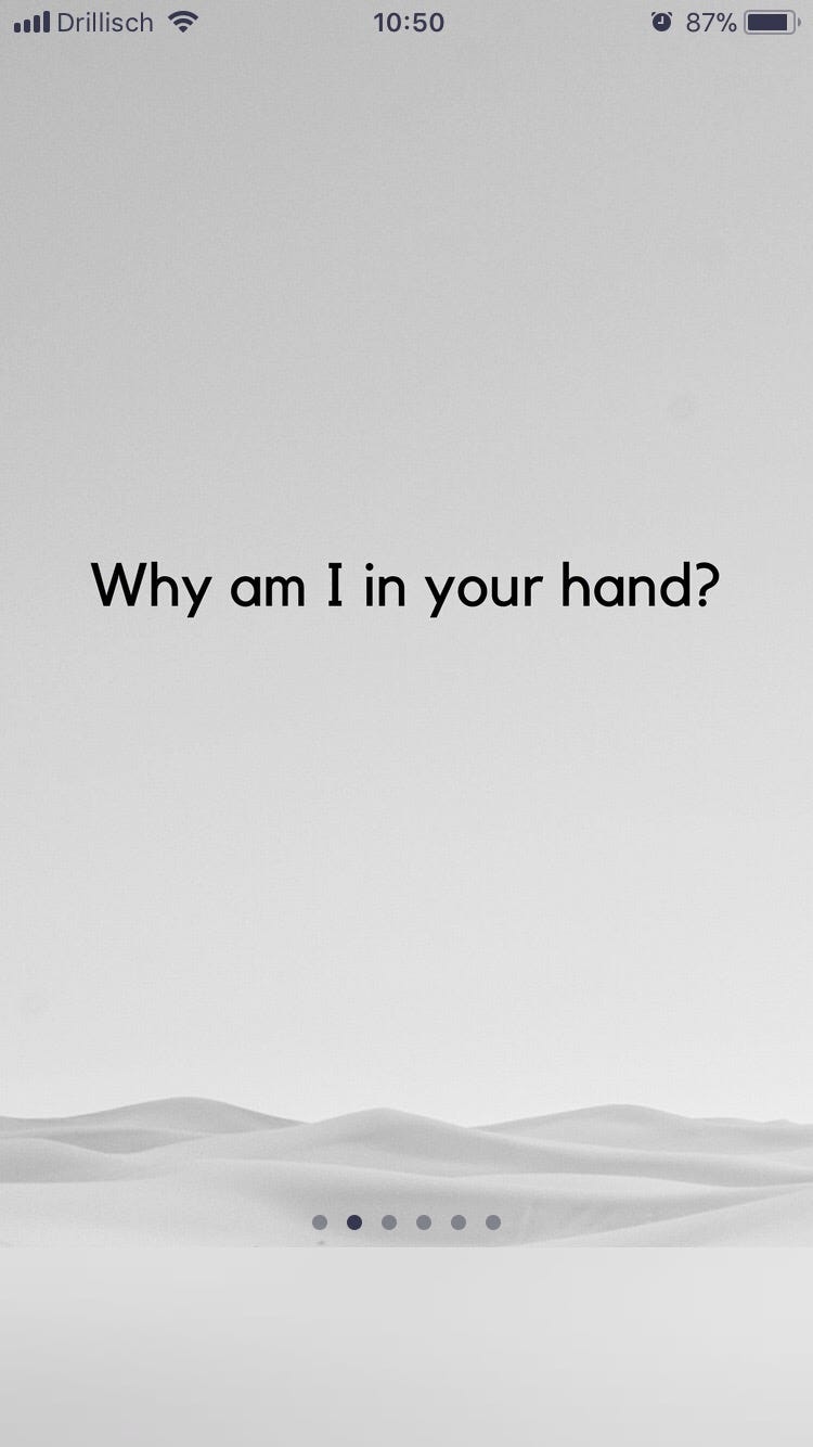
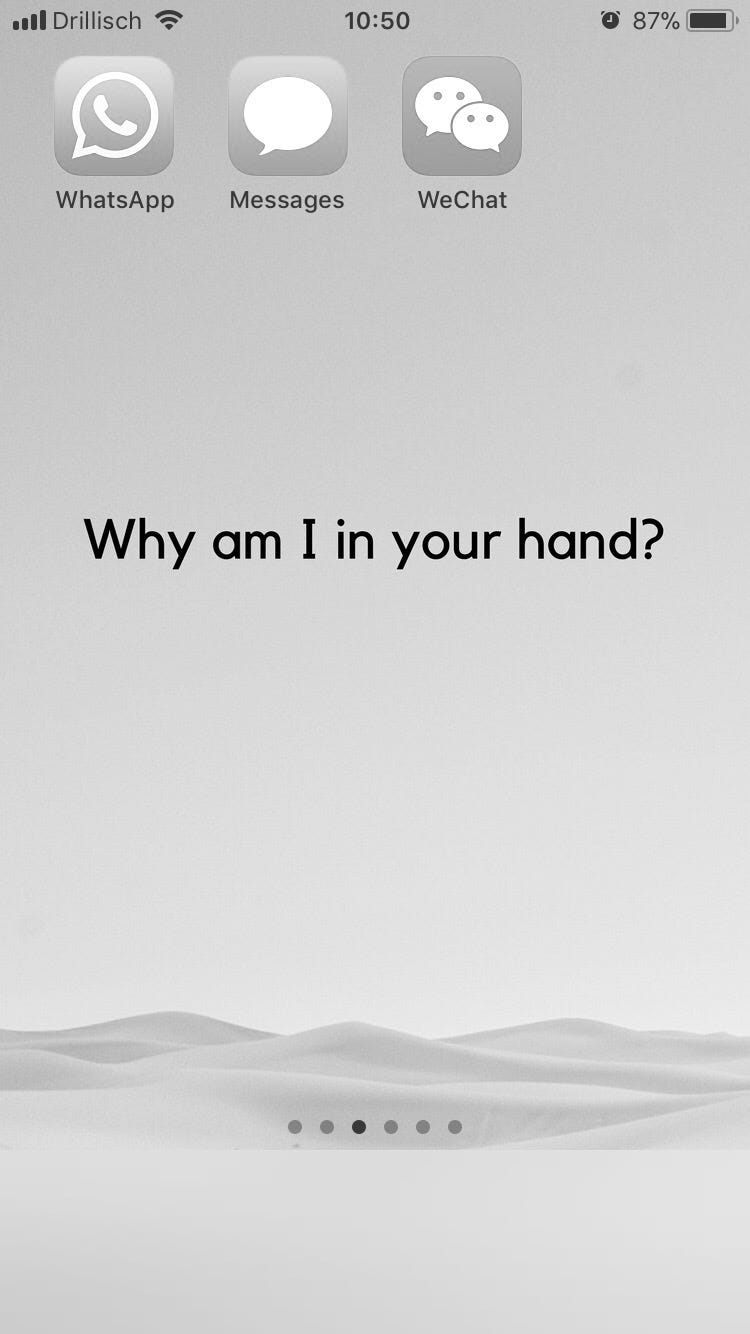
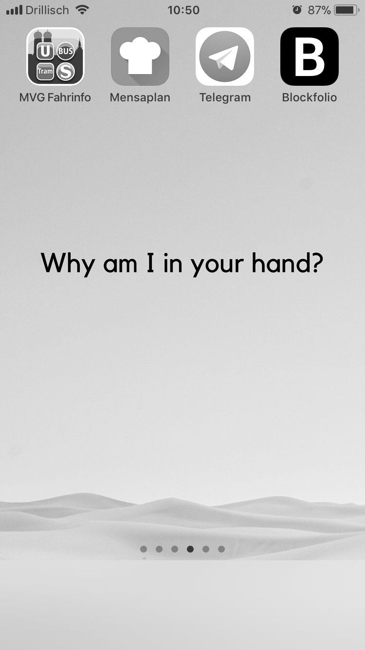
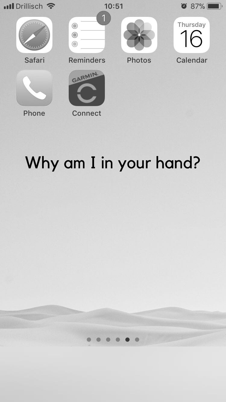
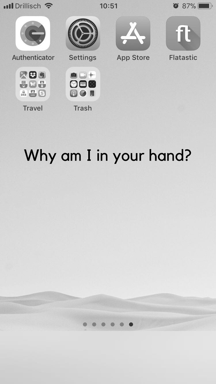
Come on, I’ll show you around.
Tier 1: Apps I Use Multiple Times A Day
One swipe from my home screen and I’m in communication land. I have no badges, banners or other notifications enabled for these, but I often remember stuff I want to tell people. Since I regularly check the history, I never miss anything, but can always respond on my own time.
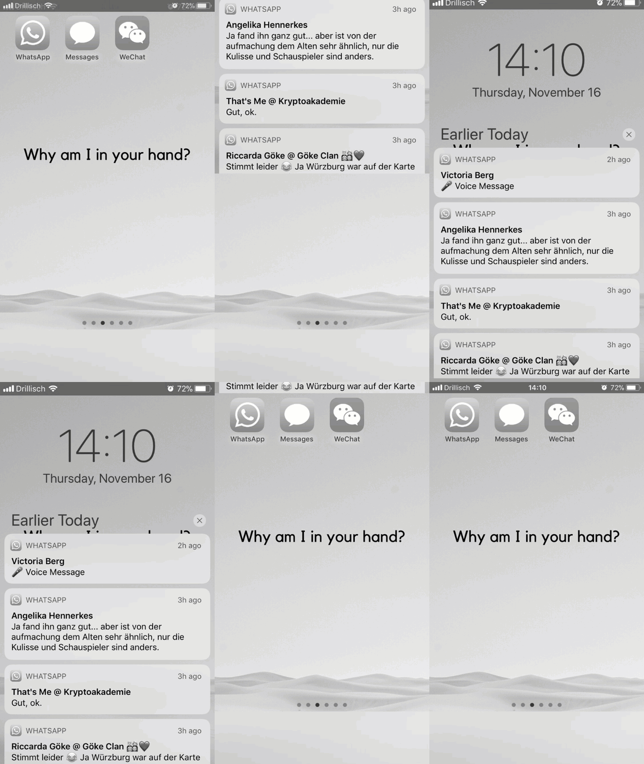
Tier 2: Apps I Use Up To Once A Day
A public transport route planner, the school’s lunch menu, and my crypto chats and portfolio are things I don’t or shouldn’t need more than once a day.
Tier 3: Apps I Use At Least Once A Week
Safari, Reminders, Photos, these are all things I usually access on my Mac, but I use them on the go too. Also here: my activity tracker, to sync once a week.
Tier 4: Apps I Use Only When I Must
Authenticator codes, changing the settings, accounting and app updates, should only happen when they need to. Also includes travel-only apps and a trash folder with all the preinstalled stuff you can’t delete but never use.
A few notes on this system:
- No more than 2 rows on one screen, in order to keep the question visible.
- I sorted the apps based on how often I use them within the categories too, meaning in Tier 1, I use WhatsApp the most, then Messages, and so on.
- Apps you don’t see anywhere, because I always access them from control center, are Alarms, Calculator, Notes and Music.
The idea is that whatever you need most often is closest to the oasis, but that you’ve ideally decided which tier you need before you even start scrolling.
Grayscale
By now you’ve surely noticed that all pages are black and white. Two reasons:
- The ‘boring’ look reminds me that my phone is not an amusement park.
- Grayscale is a more consistent version of Night Shift, which colors your screen an orange, sunset-like color from dusk till dawn. This helps reduce blue light as to not suppress production of your sleep hormone, melatonin.
Hat tip to Nat Eliason, who I learned this from. Night Shift is under ‘Display & Brightness,’ and Grayscale can be enabled under ‘General’ -> ‘Accessibility’ -> ‘Display Accommodations’ -> ‘Color Filters.’
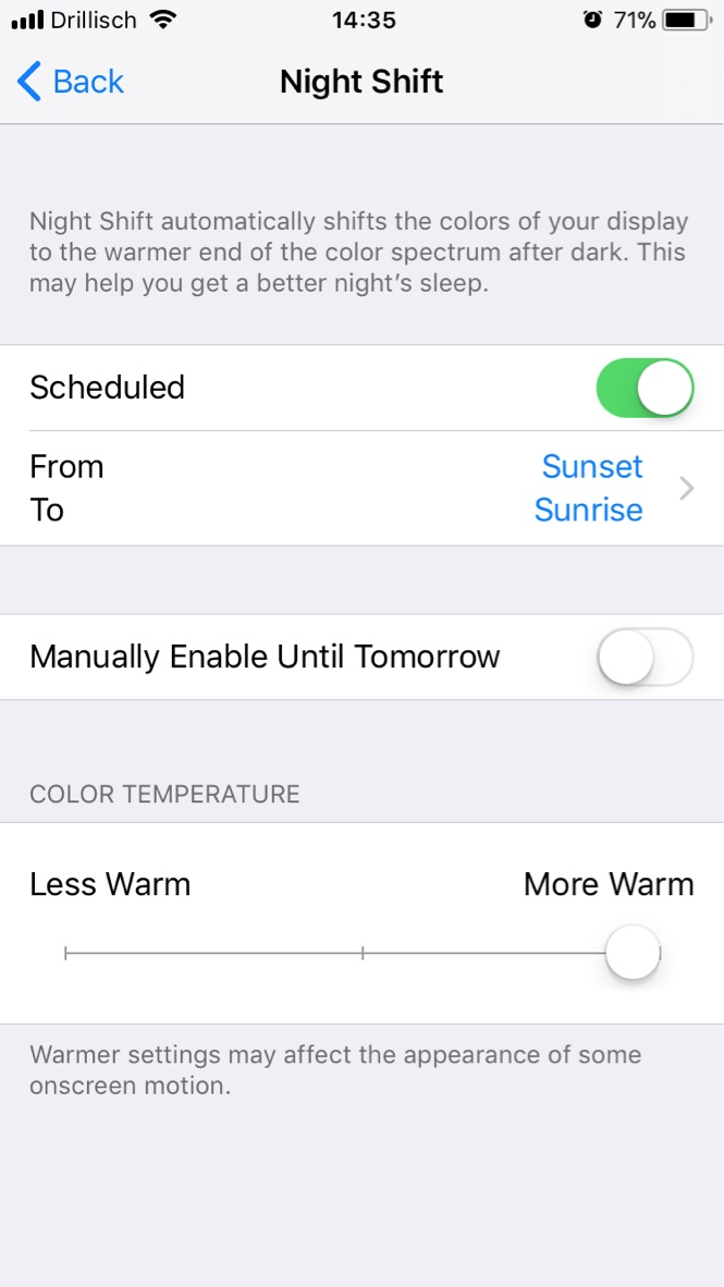
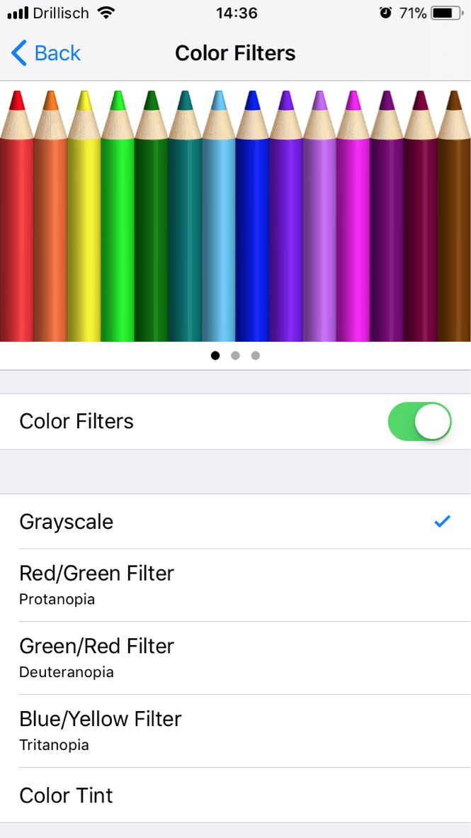
Unless you take and view lots of photos/videos with your phone for work — let’s face it, who does — the color just makes the distractions more distracting. If you’re not ready for this yet, I suggest you at least enable Night Shift to reduce your phone’s energizing effect at night.
Disable Notifications Along The Way
Each stop on the way to your target app presents an opportunity to reaffirm what you want, but also one to get distracted. Hence, it’s crucial to get your notification settings right. Out of my 32 apps, only 8 send notifications in one form or another.
- Badges are useful for apps you check once a day or less, for example only if they contain news, in my case Telegram, Reminders, Phone and the App Store for updates.
- Banners only make sense for calls or calendar alerts, since they interrupt you while you’re in an app or moving around.
- Alerts I don’t use at all, just worse than banners.
You already know my take on messages: not on the lock screen, only in your notification history. That’s it! Your phone is now streamlined for maximum mindfulness. There’s only one thing left to do.
3. Install Exit Prompts
This is the utopian dream: a phone that tells you to put it down right when it’s done being useful. I can’t think of a good way to implement this as of now, so my best shot is choosing the perfect question for your wallpaper.
Originally I had it set to “What are you looking for?” However, that only addresses your journey into the phone, not out. After answering your call,
you might be ‘looking for’ fun and distractions.
“Why am I in your hand?” is better because the question is just as valid once you’re done using an app.
“Why am I still in your hand?” if you will. To make good use of this, you can:
- Press the home button after finishing your business inside an app.
- Press it again to return to the oasis and hopefully decide to lock your phone.
I’m fascinated by the fact no one has come up with a good solution for this, though not surprised. You can’t sell medicine to healthy people and you can’t sell apps to people who don’t use them.
Prometheus’s Smartphone
Mankind’s biggest struggle has always been to master our tools before the tools master us. Prometheus and the fire, monkeys and sticks, Neo and the Matrix. History is full of battles in this infinite war.

Zeus entrusted Prometheus with the creation of humans by giving him fire and clay. The fire was Prometheus’s smartphone. Like a toy, it constantly fooled him into playing, lulling him into a false sense of security. And so, in a careless, overconfident act, he passed fire on to man, bringing punishment upon himself and unto us all.
There is a ray of hope, though: Prometheus didn’t invent fire and neither did we. He stole it and gave it to us. However, we did invent both the toothbrush and the smartphone. Unlike the Greek titan, we are wrestling with our own creations.
As you brush your teeth tonight, please remember that it’s your job, no, your destiny, to participate in this fight.
We must not lose it.
