An Introduction to Interaction Flows – UX Planet
Could IX Flows be a key to smoother design/dev handoffs?

As UX Designers, we put care and critical thought in our projects. Every interaction is planted with a specific purpose for the user. This is why it makes it that much more painful for us when the final developed interface does not align with our original vision.
It’s easy to blame the developer, but I’d argue that the onus is on us to improve documentation in the designer/developer handoff. It’s not that the developer is incompetent or that she lacks common sense. When the design comps lack a clear explanation of what happens when X occurs, the developer has to … well, try to make it up as they go. It would kill momentum to stop development, send an email to the designer to ask about a certain interaction, wait, respond to clarify her question, wait, then finally get an answer.

We, as interaction designers, have to explain the behavior of the interface … but how? I searched for various ways to bridge this communication gap. I tried creating user flows, annotated wireframes, and logic trees … but they all fell short of conveying the ideas in my head.
I then started developing Interaction (IX) Flows.
Where the idea for IX Flows came from
Dan Saffer’s “Microinteractions”
Dan Saffer’s “Microinteractions” book has to be one of the best books I’ve read on interaction design yet. Though short, it is dense with great information. He breaks down microinteractions into 4 elements: the trigger, feedback, rules, and loops/modes. To [over]simplify:

Triggers: the user-initiated or system-initiated action that starts the microinteraction (Example: a submit button, a light switch)
Rules: the capabilities and constraints in the microinteraction; what can and cannot be done in a microinteraction (Example: a date picker for an airline allows you to select departure and returns dates but neither date can be in the past)
Feedback: the visual cues that tell the user what is happening (Example: a red warning icon appears when the user’s password is incorrect, the flash on the screen when a user takes a screenshot, the dwindling character count as you type out your tweet)
Loops: the repeatability and lifecycle of a microinteraction (Example: a software update modal will pop up whenever your device detects that a new update is available)
Modes: the different versions or states of an element (Example: a read-only mode versus an edit-mode)
Nielsen and Norman Group: Wireflows
I also just happened to run across this article on Nielsen and Norman on Wireflows, which argued for the fusion of user/task flows and wireframes. While they show processes and relationships in a simple way, user flows don’t show how the visual elements provide entry points into each page or how they facilitate the user’s goals. Wireframes are great for laying out those visual elements, but by themselves, they are not very descriptive of the relationship or flow between pages.
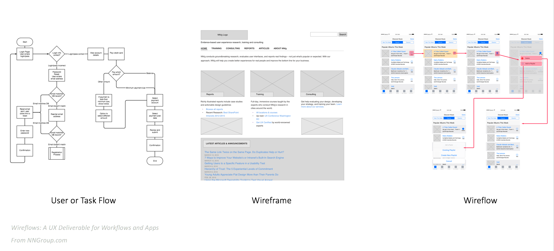
The wireflow idea was a great solution that shows both the flow and the layouts but there was still a gap between how I envisioned the page to behave versus how the developer would interpret it. The details were still not there.
I looked back on the framework from Dan Saffer’s book and thought: why not combine these two awesome approaches? Why not define the triggers/rules/feedback/loops/modes in the wireflow?
The IX Flow
An IX Flow is a wireflow that utilizes Saffer’s framework to define each interactive element’s trigger, feedback, rules, and loops/modes.
In this example, I compiled wireframes of the Instagram app. I figured that most readers would be familiar with it and can follow along this example with the app. First, I will show the entire Interaction Flow and then break down the different elements that make up the document:

Why put together an IX Flow?
The thoroughness of the IX Flow can be intimidating, but communicating these interactions has many benefits:
- Centralizes the flow, visual design, and interactions in one document
- Can be exported as a PDF, JPEG, etc. so this document can be viewed on any desktop
- Reduces guesswork and ambiguity on the developer’s part
- Reduces mistakes during development
The different parts of an IX Flow
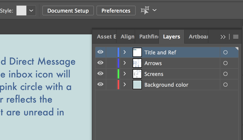
This document consists of 3 layers on the Adobe Illustrator file. The locked layers include the background color(s) and the title and reference panel. We also have separate layers for the linked screen images and the boxes and arrows.
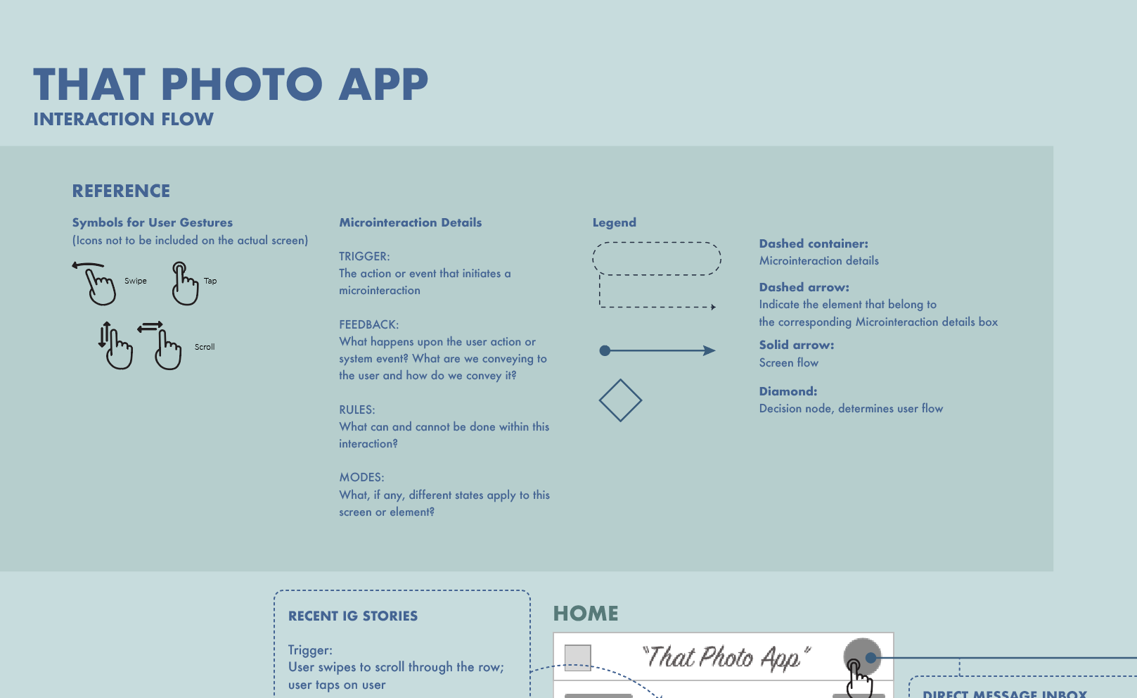
The Reference Panel
This provides the types of gestures involved on this app and the symbols to represent those gestures, definitions for terms used when describing the interactions, and a legend that defines the flow lines, microinteraction-related symbols, and decision nodes.
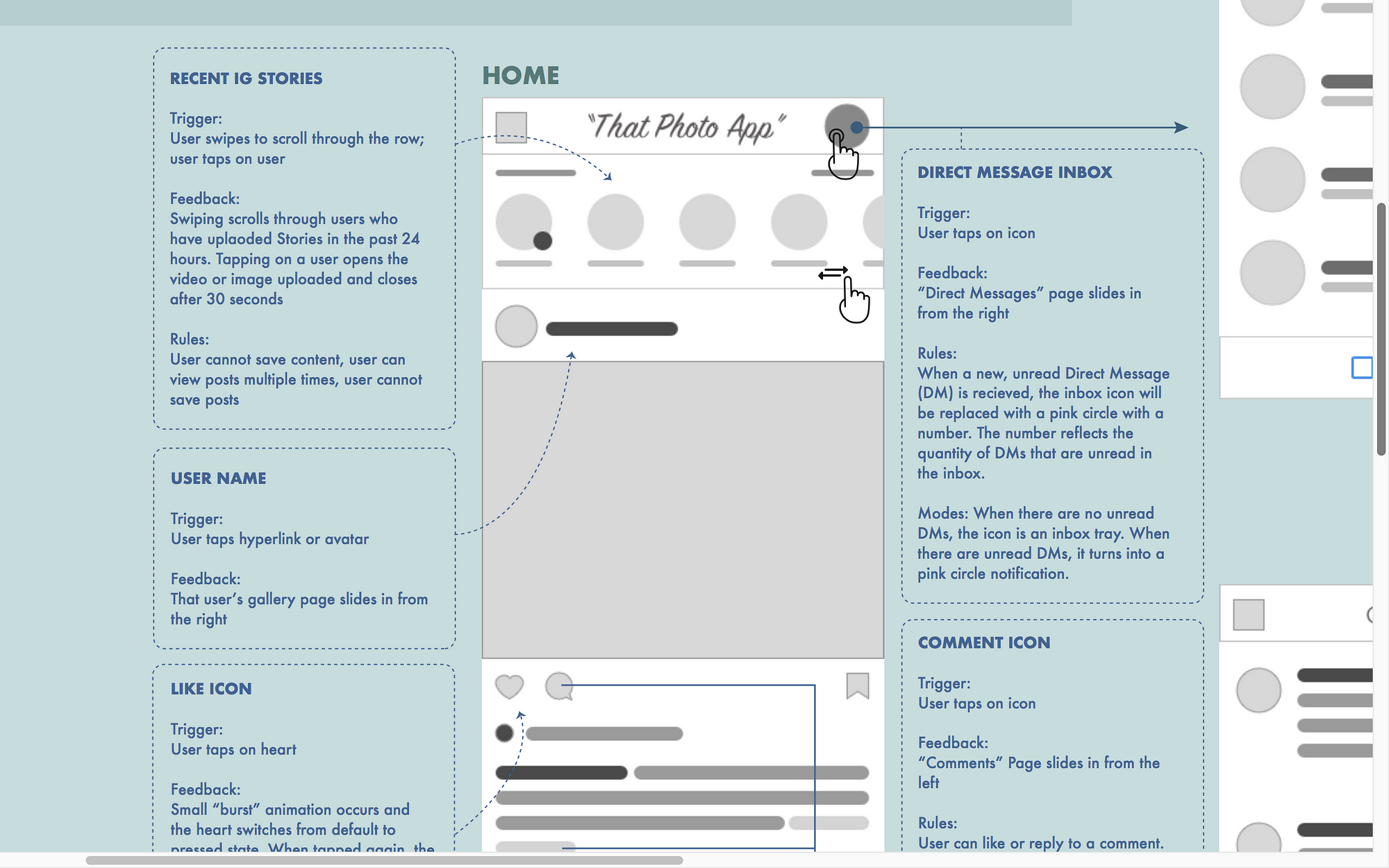
Wireframes
These were created in Sketch and then dragged onto this Adobe Illustrator file as a linked image. It’s not imperative that you use Sketch or even Illustrator, use what you are comfortable with. I have also done IX Flows for fully designed mockups, too. The key here is to show the visual layout of the actual screens so you can depict and define the interactions of those specific elements. The great thing about linking them on the AI file is that if you revise the screens and override the file in the folder they are linked from, those screens will update on the AI file automatically!
Arrows, Lines, and Containers
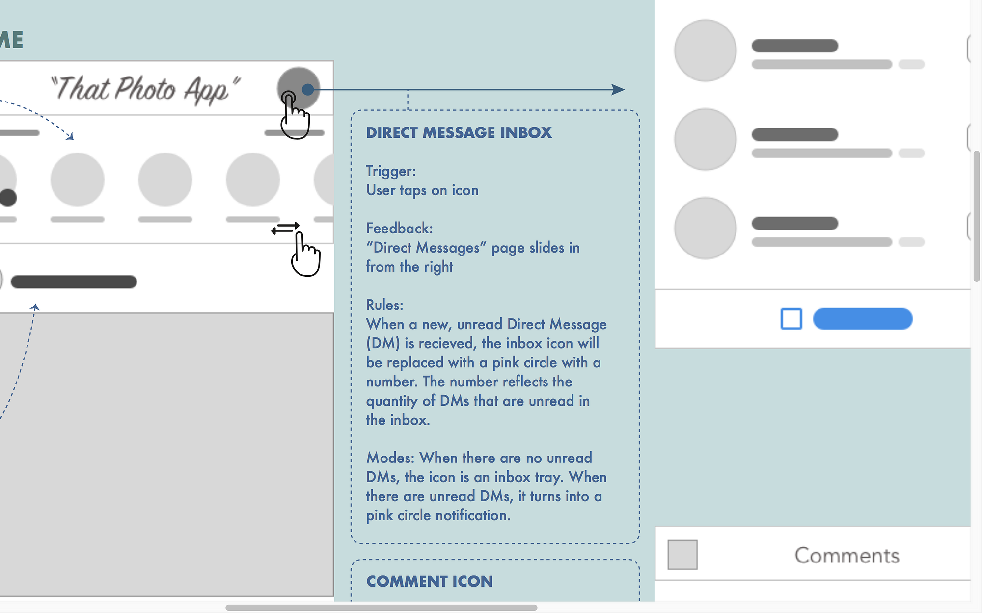
These represent sequences and relationships. You define them in the Reference panel and above is an example of those tools in action.
Specifically, this is a container with the microinteraction details:
- It includes the name of the interactive element, i.e. the inbox icon
- The trigger is defined and reinforced with the gesture icon.
- Feedback explains what visually or physically, e.g. vibrations, happens if the trigger is initiated.
- Rules explain what can and cannot be done within this single interaction (this section is typically the longest and most detailed).
- Finally, the last bit here includes details on the different modes of the inbox icon. Modes and/or Loops are not always applicable to every microinteraction but if there is one, give explicit details.
How long does this take?
Without the basic concept and the assets, my first run through this took a week for a single app. However, as I work on more, I have been able to whittle down my time to completion to just 5 hours. Copy and pasting the details for similar interactions, mass-editing the lines, and doing initial sketching of how to lay out the flow helped cut down the time it takes to compile the IX Flow. The main challenge in your first attempt will be to switch to the logical, meticulous side of your brain when it comes to writing out the feedback, rules, and modes. The effort, however, is well worth it and will make you a stronger interaction designer moving forward.
An added bonus
The additional benefit of compiling an IX Flow for the UX Designer is that this also helps us audit the UX of the interface. Despite multiple rounds of approvals on the mobile app wireframes and design comps, compiling this IX Flow was like running a fine-tooth comb through it. While writing the rules for an element, I sometimes discovered that an interaction or flow really did not make any sense at all. Or it was actually quite confusing or not necessary. I was able to run back to my UX team to discuss and resolve the issue before it ever went to development.
Finding those flaws and breaks early on can save the UX, visual design, and development teams a lot of time.
Try it yourself
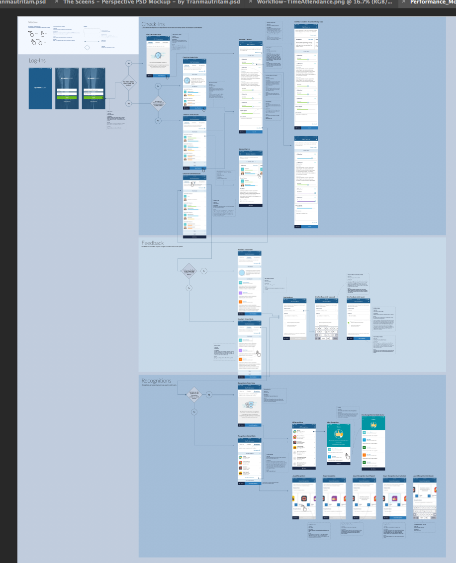
Want to give it a go? Download my .ai template here to start!
This is something I still want to improve so I would love to get feedback and see what you’ve created. And if you are a developer, I welcome any suggestions about how to make this document even more useful. You can comment, DM me, or contact me through email.
Hope this helps!
Major thanks to Sheefeni Hauwanga, for his feedback from a developer’s perspective and making sure this document was useful. Thank you to Ying Yao, Ki Arnould, and Beth Mattern of Ladies That UX for reading this over and helping me edit it!
