A new kind of map: it’s about time – Points of interest
By: Peter Liu
How would you describe your morning commute?
If you’re like most people, it starts with a ballpark estimate of how long it usually takes. Or maybe several estimates, depending on when you leave for work, how bad traffic is, or whether you’re walking, driving, or taking the bus.
There’s something strange here: we’re answering a question about a trip through physical space, with numbers in units of time. Often, the trip itself — which roads to take, landmarks along the way, miles and kilometers traveled — comes up later, if at all.
An opportunity
Almost 25 years into digital mapping, we’re at an interesting crossroads. Maps are useful for understanding (very literally) the lay of the land, and guide our direct interactions with that land. But computers have also gotten really good at these tasks: GPS pinpoints our current location, geocoders can look up the street address, and navigation apps plan cross-country trips in a split second. Together, they assure us that we’ll never really be completely lost, and every destination is somehow reachable.
At the same time, our decision-making around places — where to go for lunch, if a certain day trip is feasible, and yes, whether a commute is practical — have shifted toward how long it takes to get there. But we still rely on traditional maps to do that: eyeballing straight-line distances, and running that through some alchemy of guesswork and firsthand experience to how long that trip would take.
What would a more directly useful visualization — indeed, a map of time — look like?
Prior art

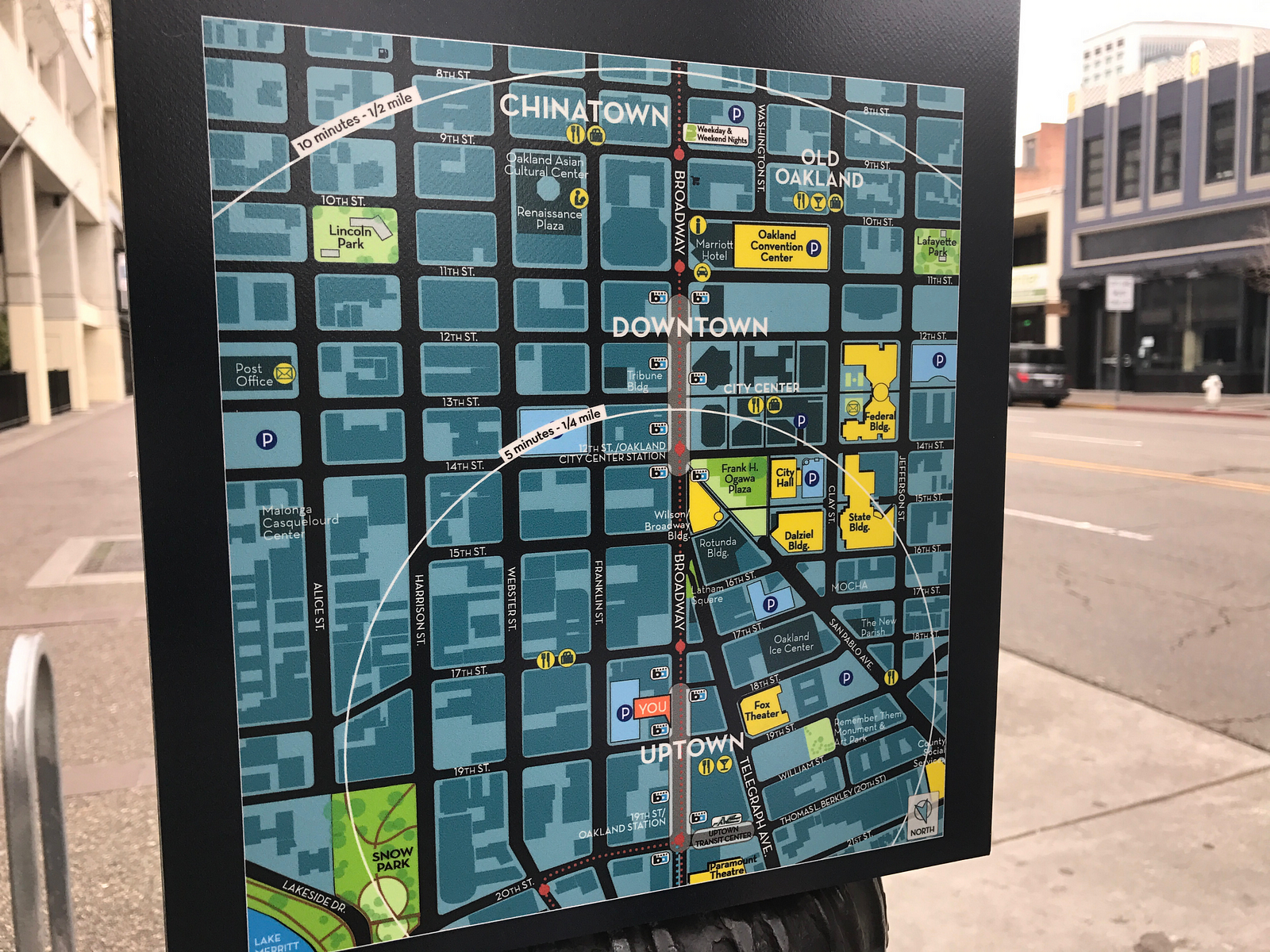
In city centers with a lot of walking traffic, you may see maps overlaid with progressively larger circles, to estimate travel time based on simple physical distance. But this assumes that people move like crows fly: that there’s a straight-line road for anywhere we want to go, through concrete walls and over lakes, without traffic ever to slow us down. In an urban setting, none of these are practical assumptions to make.

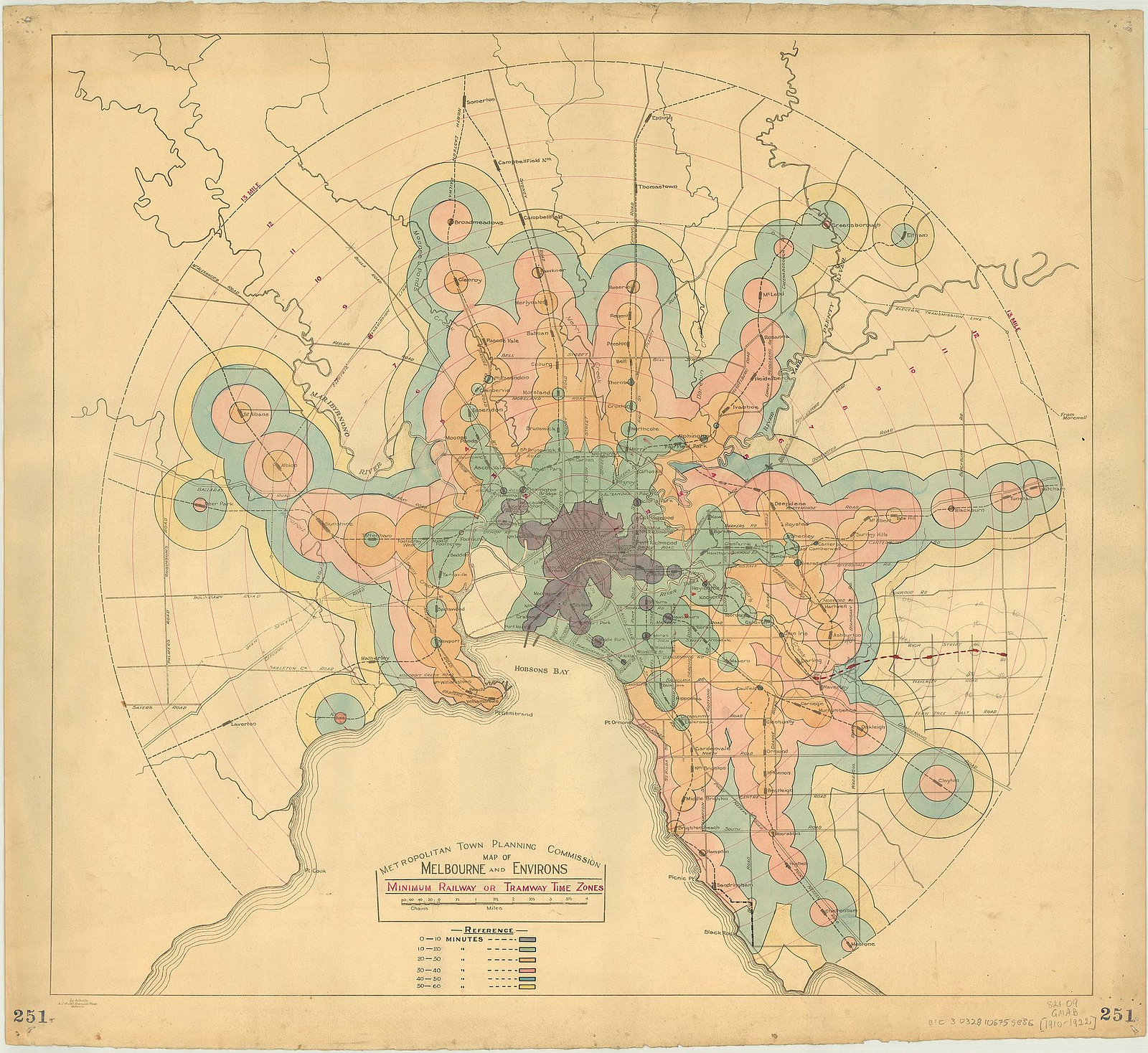
Isochrones get us a bit closer. With a starting point and a mode of travel, they examine the actual geometry of surrounding roads, to delineate an area based on how long it takes to get there. Areas within the same isochrone (Greek for “same time”) take a similar time to reach. Tendrils extend along fast-moving corridors, and squeeze to wrap around mountains, rivers, and other natural barriers.
A step further
But at the core, these maps still serve double duty in visualizing both space and time. Recently, we’ve been thinking of a visualization that cuts directly to the way in which people make decisions about where to go: what would a map look like if we swept the physical world away completely, in favor of the time needed to move around it?
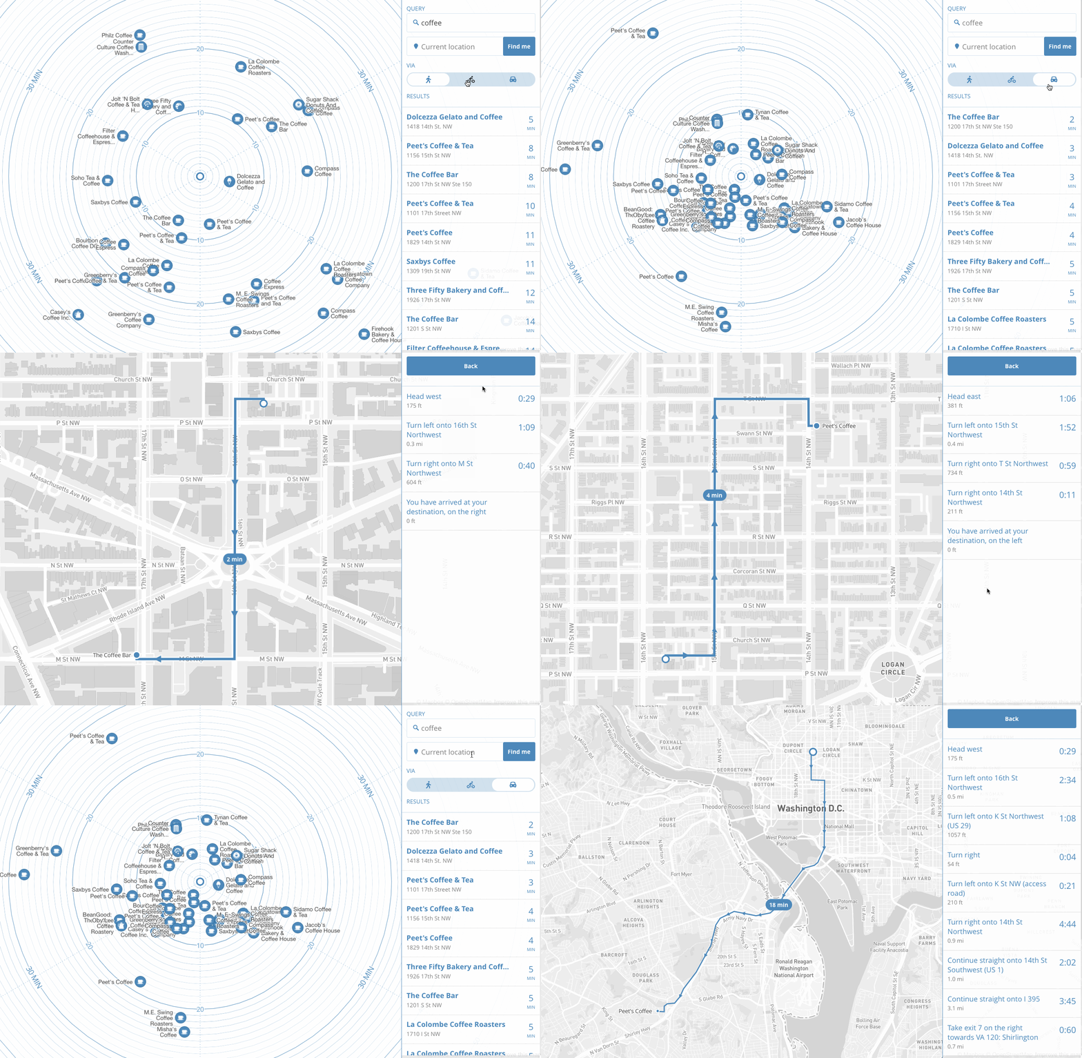
We’ve been prototyping a simple discovery tool on this idea. We take search results from the Foursquare API and array them around the user at the center:

In this time map, we preserve the direction of each point, relative to the user. But the visual distance from that center point is determined by the time it takes to get there, whether driving, biking, or on foot.
By removing literal geography, we now have a map that more closely reflects the way we think about our environment: a cluster of restaurants “five minutes that way” versus “ten minutes the other.” We can watch our surroundings literally expand and contract with different means of travel. And only after choosing a destination do we think about roads, turns, and the specifics of how to get there.
Notes on tech
Undergirding all of this, of course, is a bag of low-level tools that do the heavy lifting: Mapbox Geocoding API for positioning, locations from Foursquare, Mapbox Matrix API for travel time calculations, and Mapbox GL for visualization.
From a design perspective, each piece is the smallest complete articulation of a solution to a problem. This modular format affords developers maximum expressiveness and flexibility to incorporate exactly the toolkit they need. It becomes ever more critical as we continually push, tailor, and redefine the user experiences we build.
