The Only Metric That Matters — Now With Fancy Slides!
One question I get asked a lot by founders and product managers I meet is “Are my metrics good enough?” This might refer to good enough to raise money, or good enough to keep working on a feature or product, or good enough to believe the product will grow into something much bigger someday. People love to have benchmarks to compare their metrics to. But benchmarks are dangerous since they may tell very different stories for different products. There really isn’t an easy answer to compare all products against each other. There’s no clear threshold where it becomes clear something is working or not. The reality is it depends a lot on the actual product.
A couple of years ago, I posted on this topic: “The Only Metric That Matters.” Recently, I was invited to present this at the Mind The Product conference (#mtpcon) and I used the opportunity to refine my thinking. After giving the talk, I received a number of requests to post the slides. I’m happy to share them below.
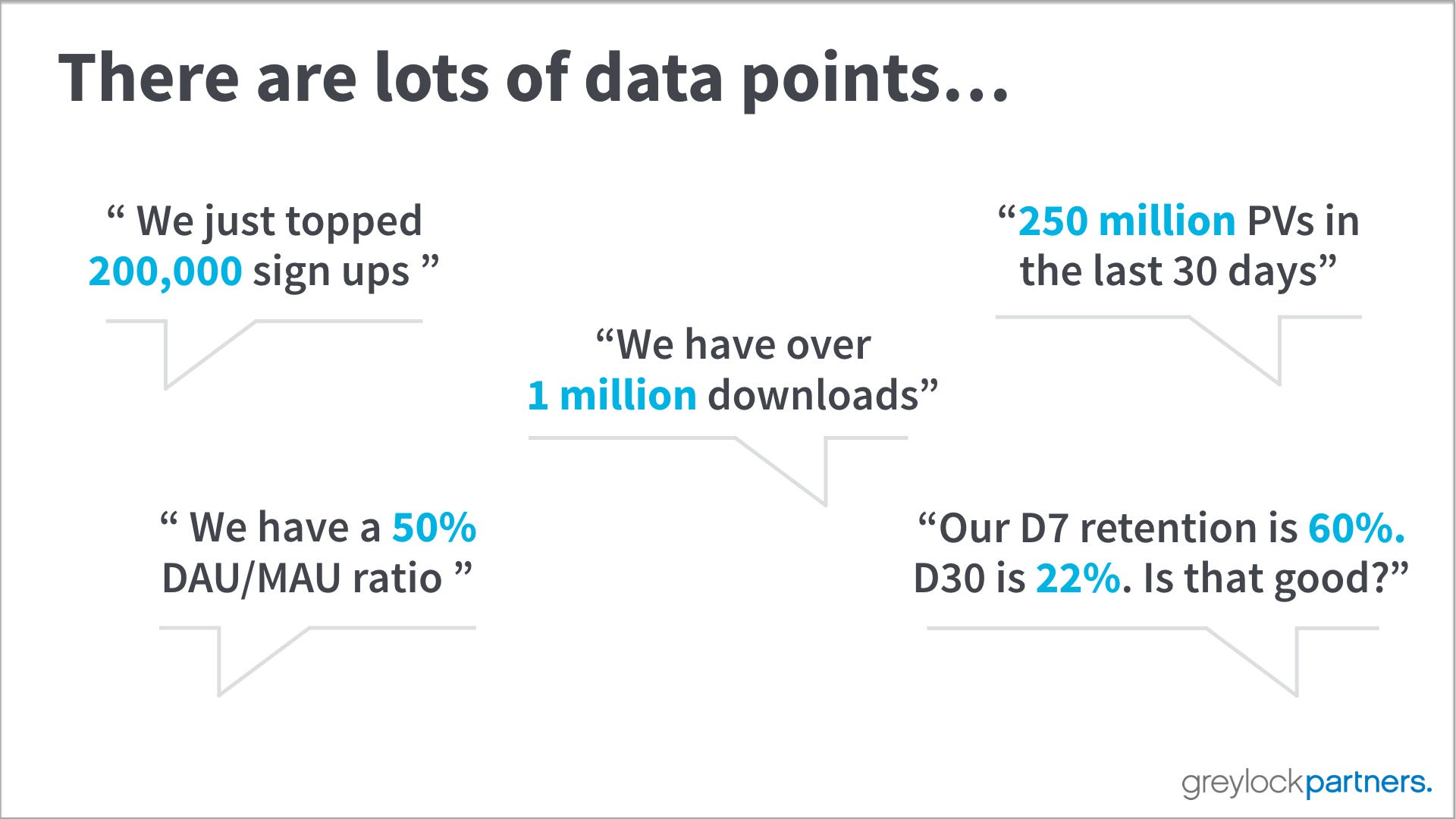
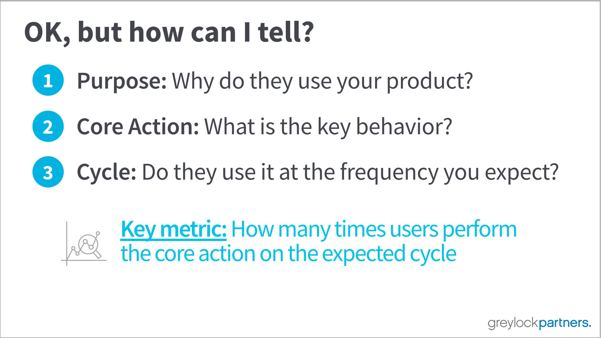
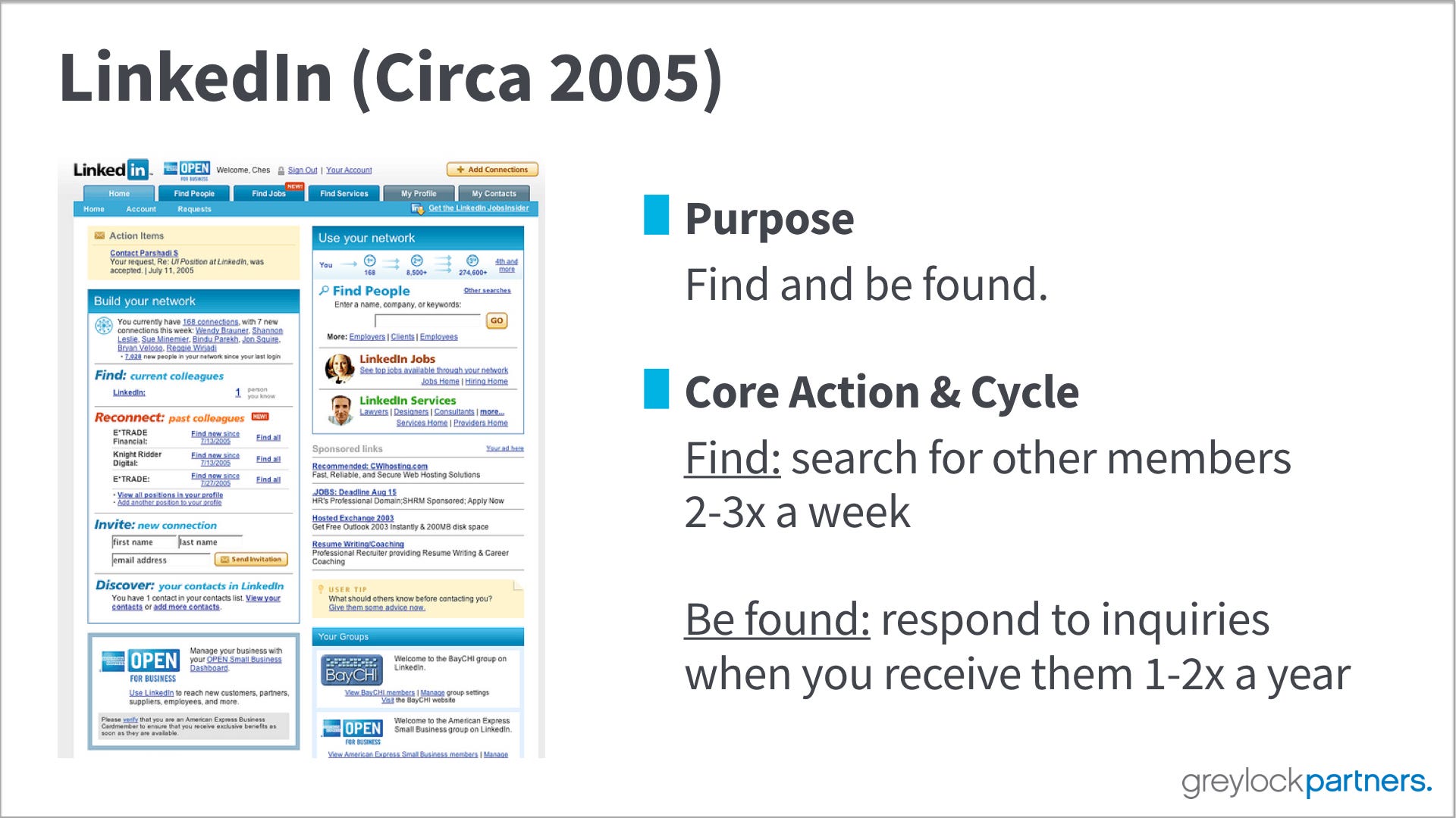
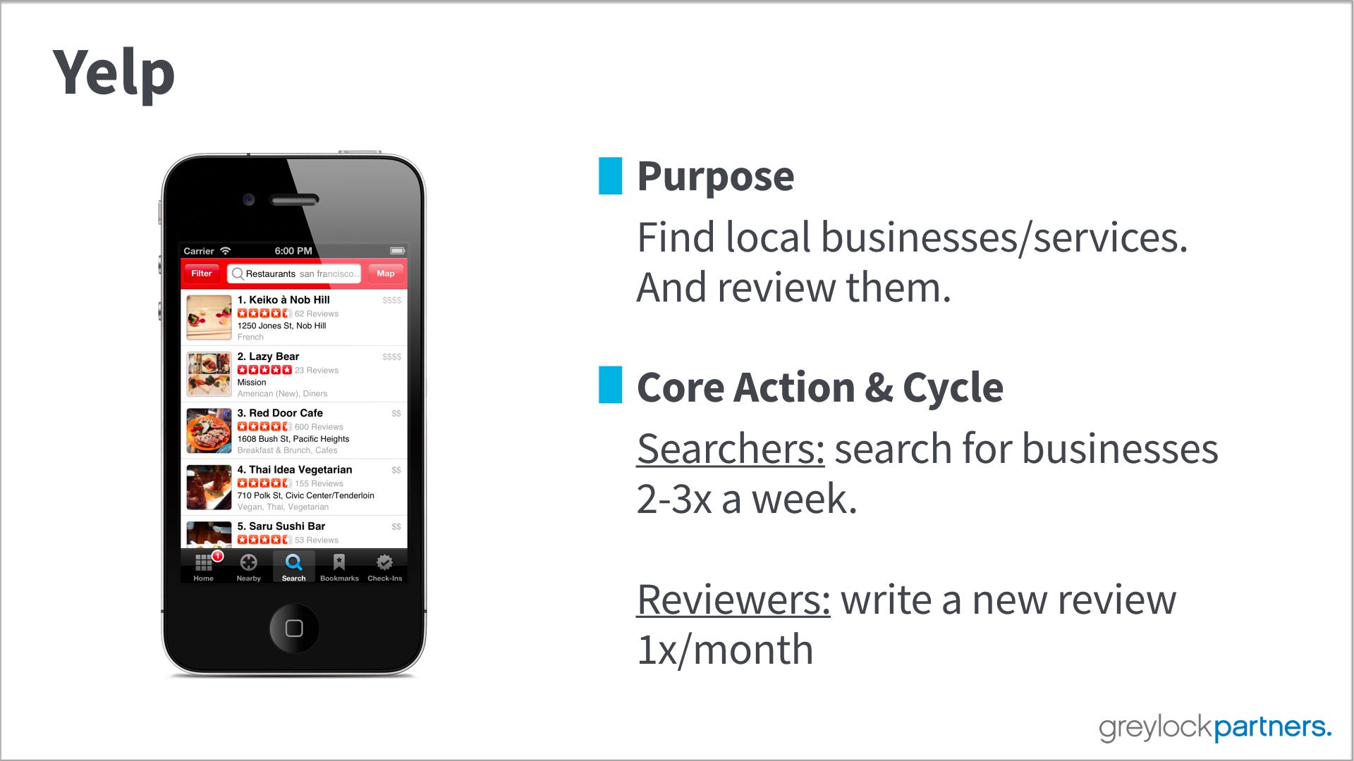
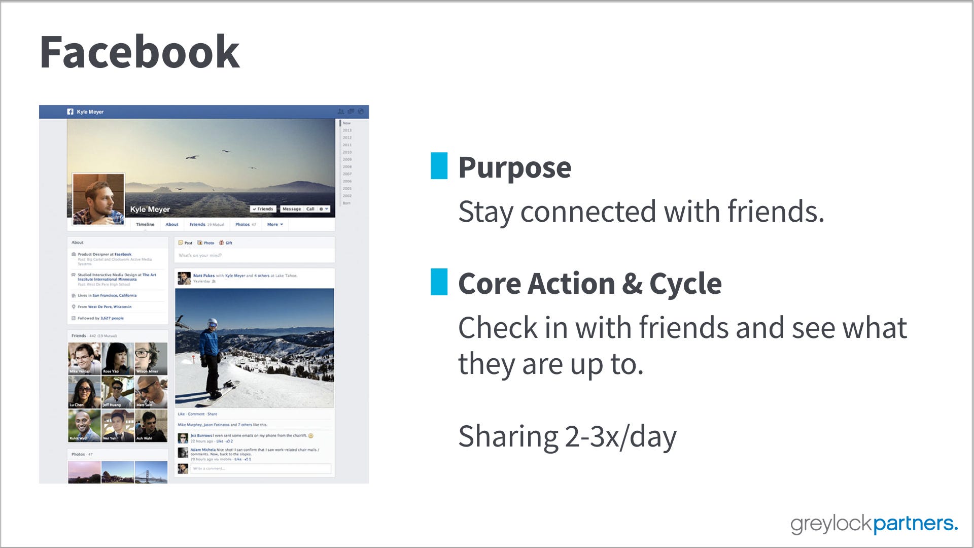
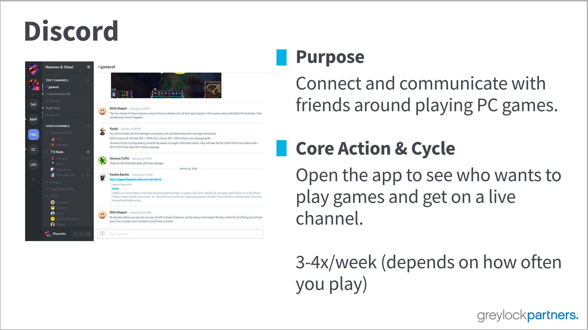
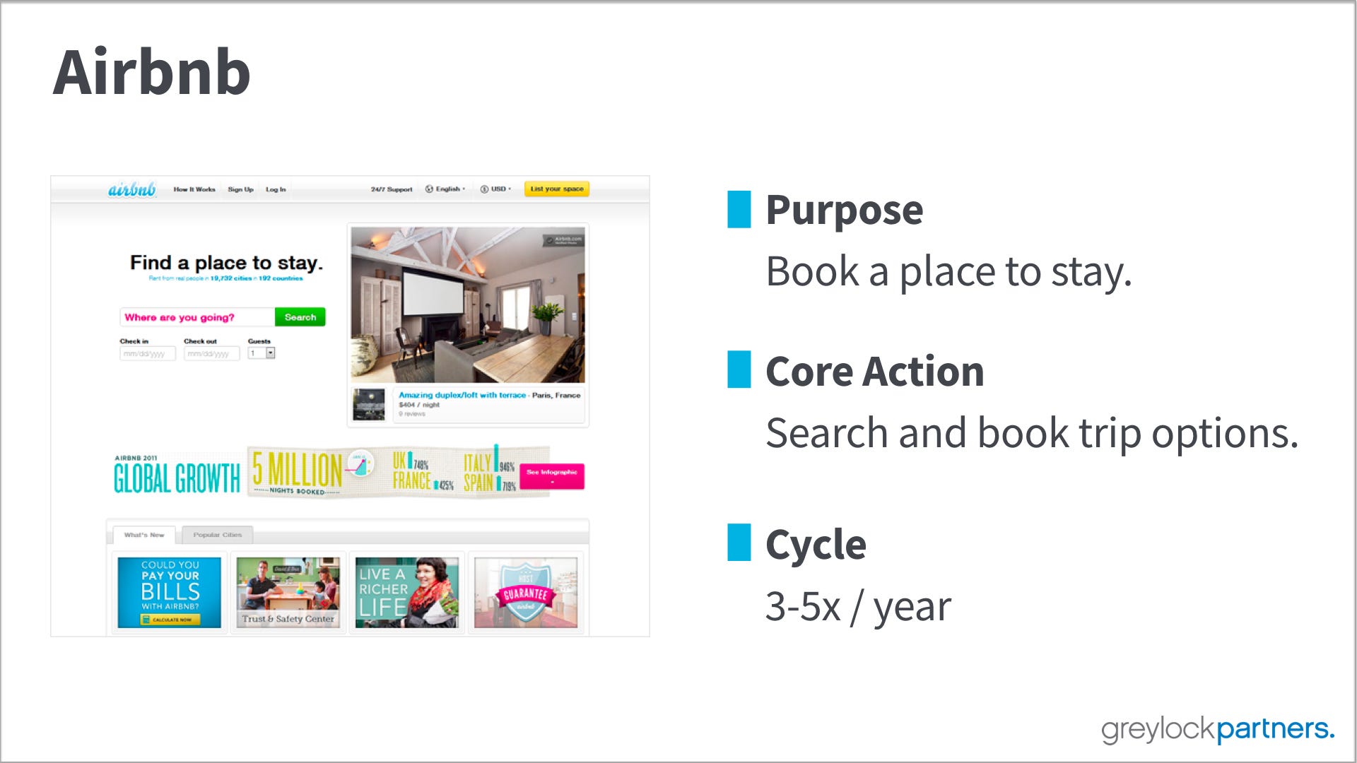
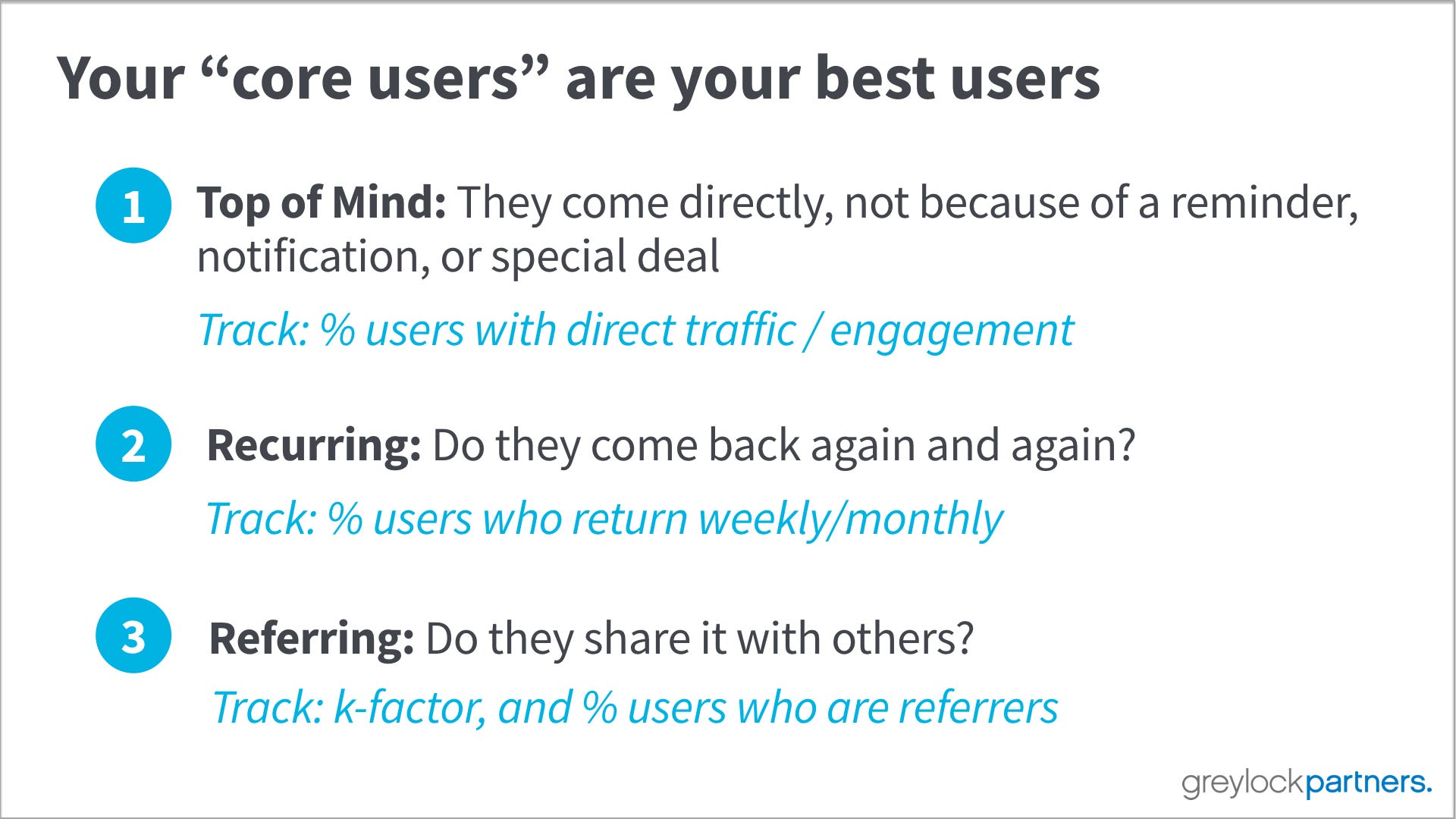
In the deck below, I came back to the core question about metrics and knowing whether or not something is growing and working. It’s easy to get lost in vanity metrics and data points that other companies are using to sell their business. But, the only thing founders need to think about is: Are people using your product? Are they using it how you expect (i.e performing the core action)? And, are they performing the core action at the frequency you expect?
Please let me know if you have any feedback, and remember, focus on the only metric that matters.







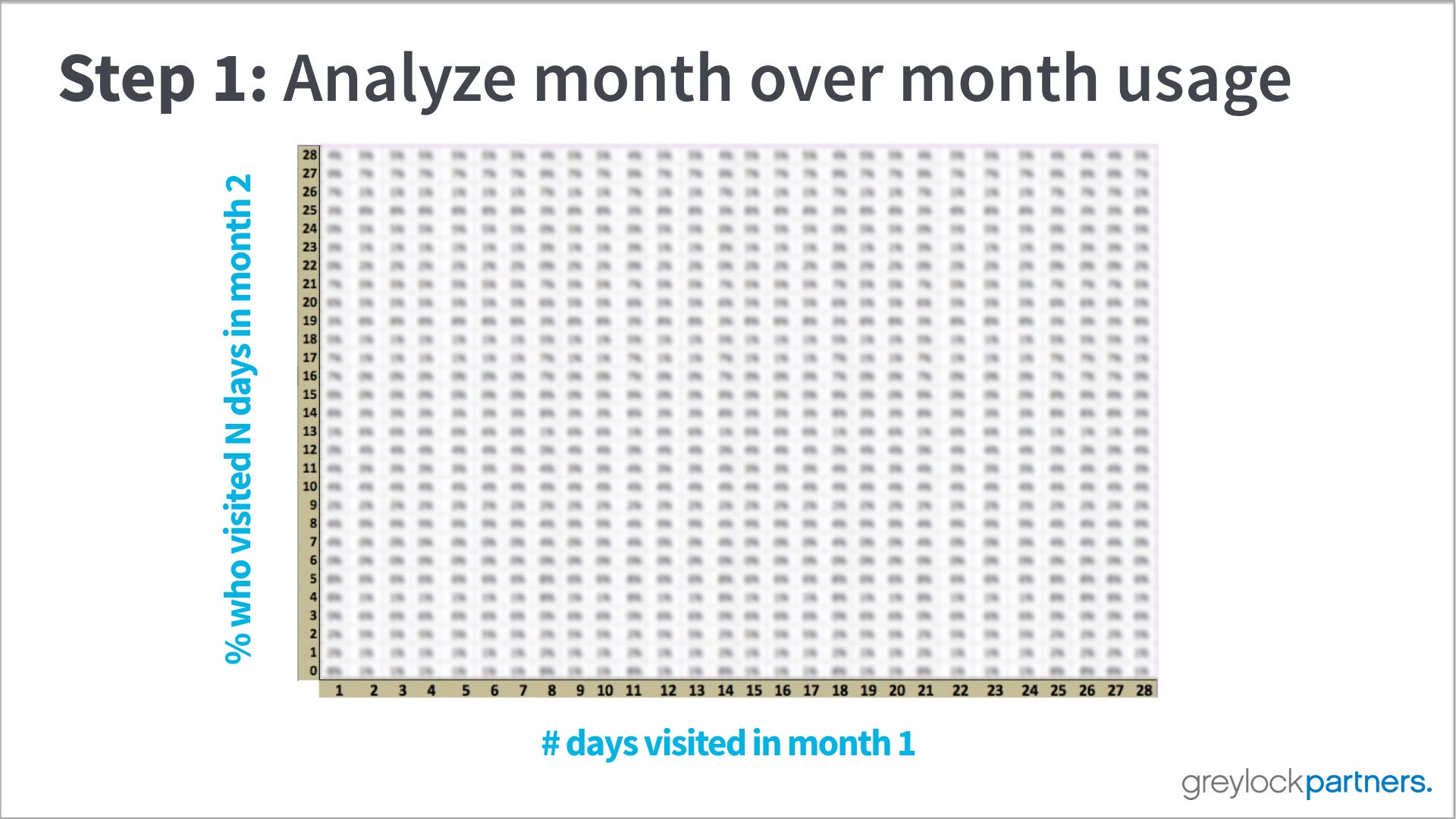
Step 1: You want to understand which users are more likely to come back than others. Start this by calculating in a grid how likely someone is to return to your product N or more days in the second month based on how many days they visit in the first month. You are looking to see if you can tell in one month which users are most likely to be sticky.
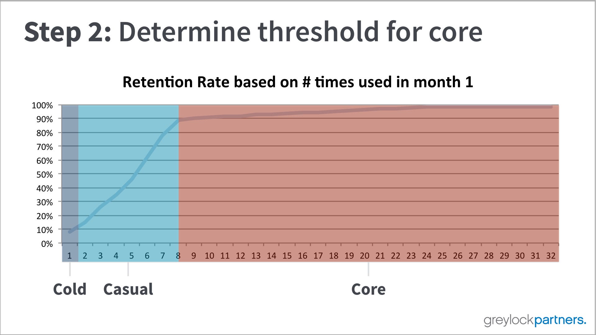
Step 2: Once you have calculated the grid in step 1, you can now chart the data. You will likely see a breaking point after which you are pretty likely (90% or more) that someone who uses the product enough will likely come back the next month. We separated the userbase into three buckets, cold (doesn’t come back), casual (might come back), core (highly likely to keep coming back). Core users are the best.
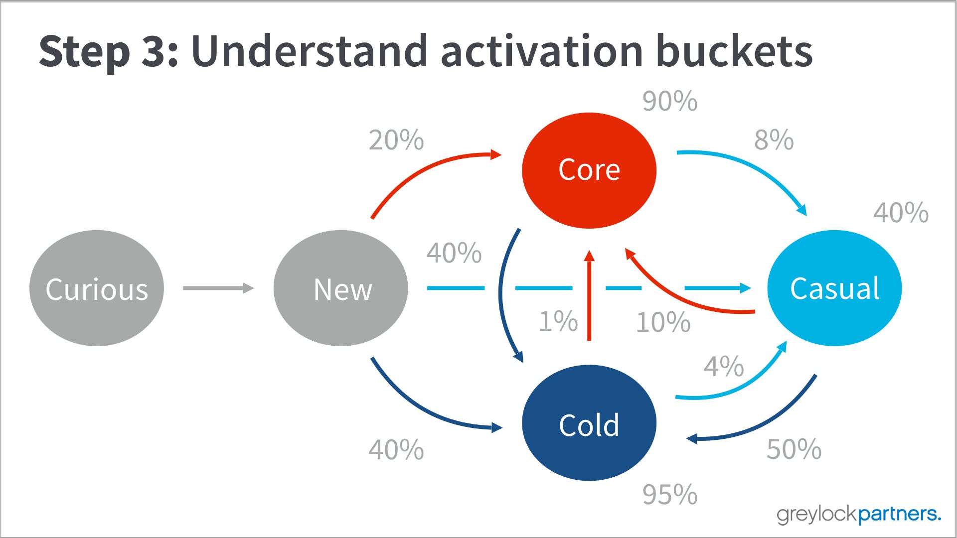
Step 3: Once you can tell which users are core vs casual, then you can map out how likely someone is to be in one bucket in one month, and transition to another bucket in the next month. You map this as a state diagram. You want to have most of your new users converting to core in the first month.
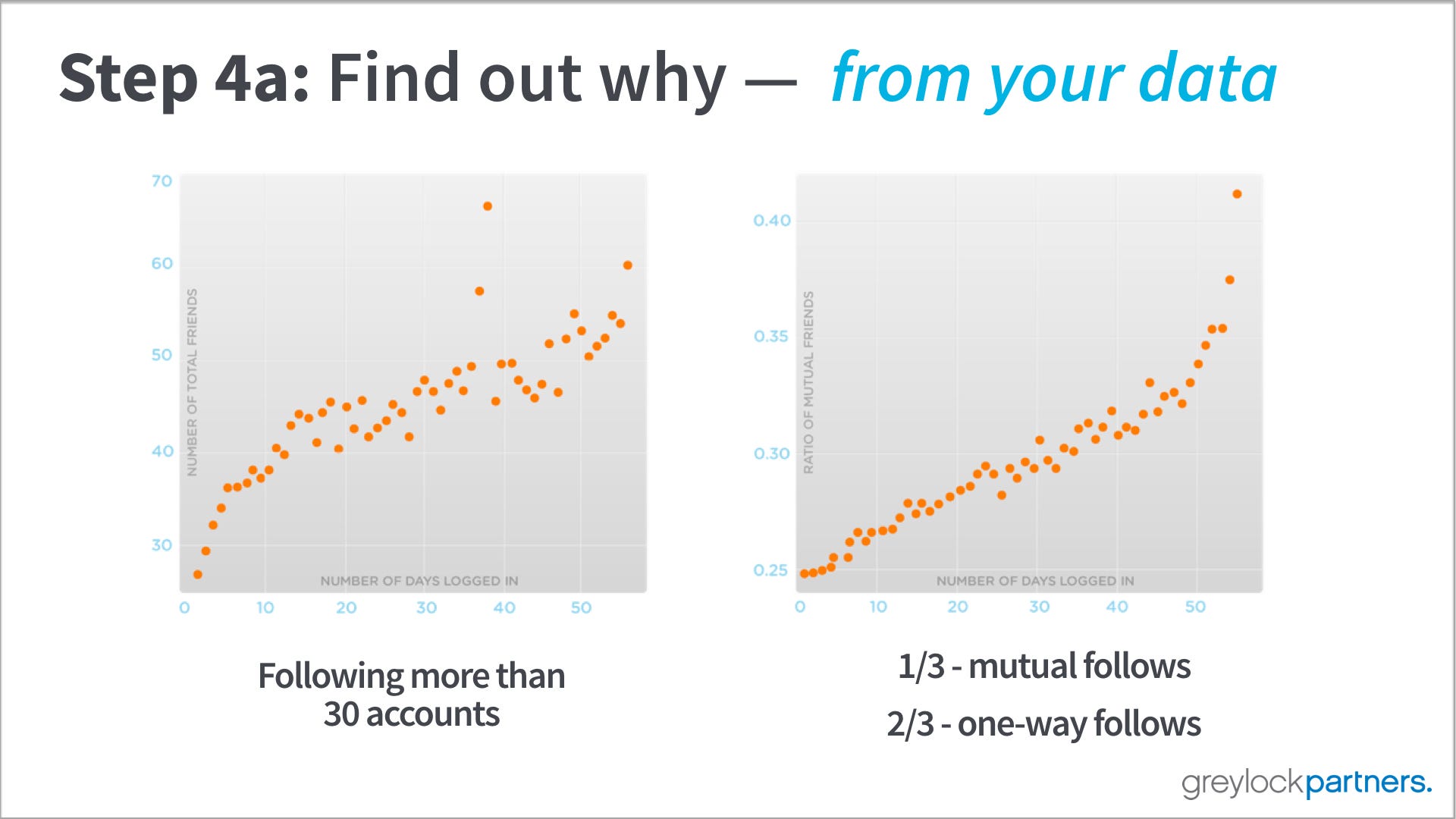
Step 4a: Once you can predict which users are core, try to do further analysis to figure out what things they did to increase the likelihood of being a core user. These two examples come from Twitter.

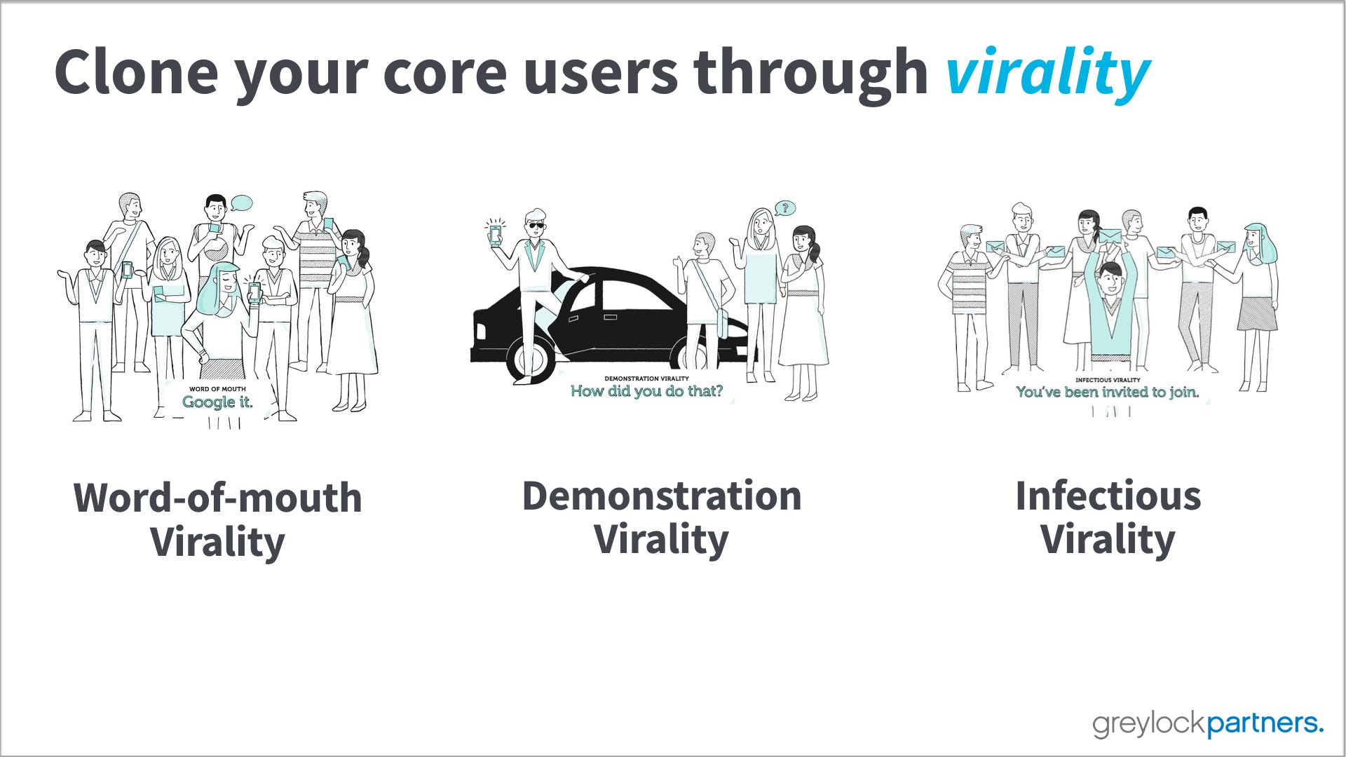
I shared a few more thoughts on the different types of virality in this post.
