Why Silicon Valley is all wrong about Amazon’s Echo Show
Why Silicon Valley is all wrong about Amazon’s Echo Show
So you think Amazon is a tech company? No, you’re wrong
So okay, I wrote a post about Apple’s AirPods last fall where I got a little… excited. (Maybe you remember? It was the one where I called the AirPods “sex sticks that fuck your ears?” (I stand by that line by the way, all the way). I couldn’t help but feel a similar assessment was in order this week.
On Tuesday, Amazon launched the Echo Show to great fanfare and consternation. I feel less riled up this time, but still want to add my 2c to put this device in the proper context—if only to make worthwhile the countless hours I’ve spent doggedly investigating the front lines in the battle over the future of conversational products and technology writ large.
To clue you into my process, one of my tricks is to peer into the vastness of negative space and try to piece together what the pundits, analysts, naysayers, and enthusiasts aren’t seeing and aren’t saying. Not that they’re intentionally hiding anything, but sometimes they’re so close they can’t see what should be obvious to anyone with a little more distance. For example, for this device to succeed, it needs to achieve scale and ubiquity, to change behavior and expectations, so people complain about the design, but it’s likely the result of keeping COGs low. Other times these folks fall back to their default assumptions in order to jump onto the hype train and use explanatory shortcuts to get avoid the more time-intensive work of committing acts of original thinking. For example, evaluating this device as a poor, immobile substitute for an iPad misses the point. That’s just a lazy brain barfing out last night’s garbage.
More accurately, to understand the Amazon Echo Show we must think more broadly about computing like Steve Jobs did, when, describing the differences between automobile types as a metaphor for computers, observed that they were just “a difference in emphasis”.

Let’s pretend we work at Amazon
If you know anything about Amazon’s product design process, you know that it is a literary one of epic proportions. I don’t know if this tradition springs forth from their origins in the book business, but every Amazon product starts as a pitch—not a pitch deck—but as a four to six page treatise.
Everyone involved reads these documents in the kick-off, not beforehand, not afterwards. This is so everyone starts literally on the same page, and everyone has time to read the same material. As a result, there’s no excuse for not being up to speed, nor for anyone on the team to not understand the value proposition for the end user. This process is also designed to force “better thought and better understanding of what’s more important than what, and how things are related.” This is from Bezos himself in 2004:

Regardless of the kick-off process, what got me thinking about this was the Echo Show launch video. It says so much and yet I’m not sure it’s really been looked at it closely enough.

What we learn from the launch video
First of all, the video is nearly five minutes long, easily a minute over the longest Apple product launch videos (contrast this with Apple’s Don’t Blink, 107 second spot for the iPhone 7 and 7 Plus). The length feels unique to Amazon, and is designed, it seems, to dispel any hesitations a motivated shopper might have—kind of like one those super long make-money-now webpages that seem to go on forever and ever… anyway, also important: the video dispenses with high tech mumbo-jumbo jargon and instead demonstrates the product in context, showing relatable human moments that are enhanced by the plain and accessible design of voice-enabled Alexa products.
Like the hashtag, you can learn to use voice commands just by listening to and imitating other humans doing the thing you want to do. This transparency is critical to the eventual success of any social innovation.
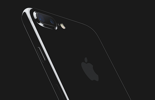
Second, Amazon eschews the robopornographic style Apple and Microsoft’s recent videos. I mean, I love tight bezels and an a-loo-mini-um chassis like everyone else, but the aesthetic Amazon was after here was more Sears than Saks Fifth Avenue. Even the post-production colorization invokes a Michael-Scott-creamy-office-beige motif.
Oh, and not to dwell on color too long, but did you notice that every actor in the video was white? I bring this up not to criticize (since Amazon is aiming directly at middle America with this product) but instead to highlight the contrast between more Millennial-focused social spots for Spectacles and Instagram that go out of their way (sometimes ridiculously so) to depict a future that is fun, inclusive, and multi-multi-multi-! (e.g. -ethnic, -cultural, -racial, -gendered, etc).
Anh, well, fine, since you’re asking, here’s the cast to prove my point:

In comparison, Echo Look launch video was decidedly more multi-multi-multi, so this is clearly an intentional choice, and it’s important one if we’re to evaluate the Echo Show’s merits from the perspective of that user demographic.

Thus the Amazon Echo Show is a product for families that want to stay in touch and are feeling overwhelmed (or overpowered) by having to keep a baby (or two!) in one hand while operating a smartphone in the other. Current technology products just aren’t working for them—but the Echo Show has an answer to their prayers.

“Drop In” is voice computing’s Facebook wall
I didn’t start to get shivers until I saw “Drop-in” in action:
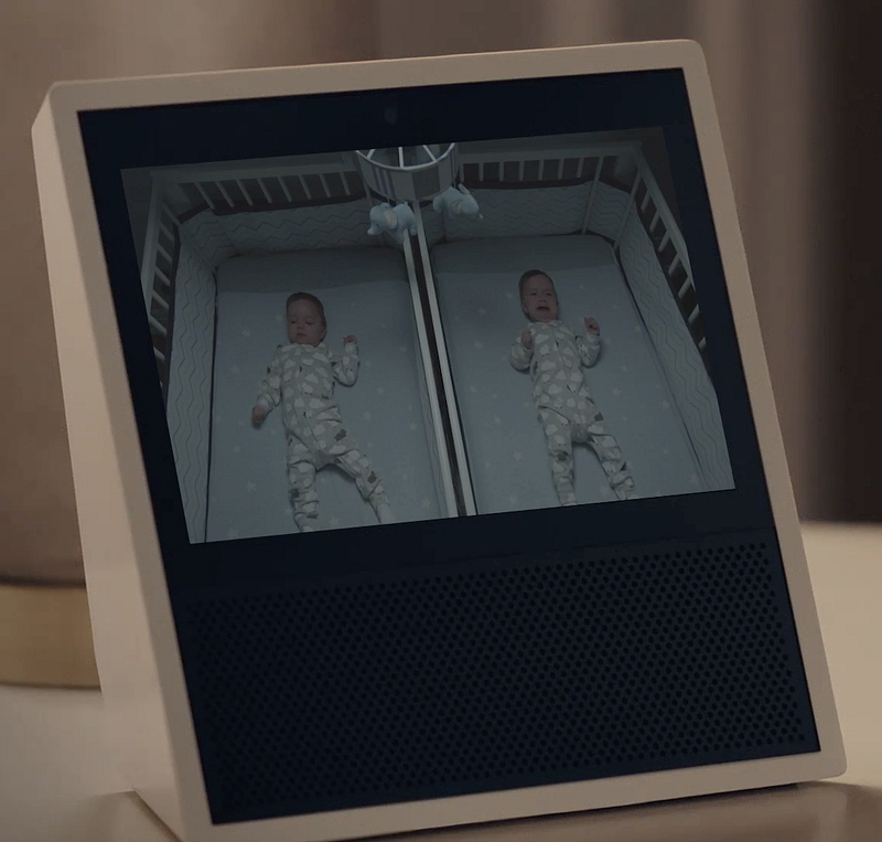
“…for the special cases when you want to connect with your closest friends and family. For example, you can drop in to let the family know it’s time for dinner, see the baby’s nursery, or check in with a close relative.”
Dropping in means remotely activating someone’s Echo Show video camera and mic to proactively start a conversation. This use case is more video intercom than video phone (and is ostensibly the same functionality as Nucleus, a suddenly very resentful Alexa Fund-funded competitor).
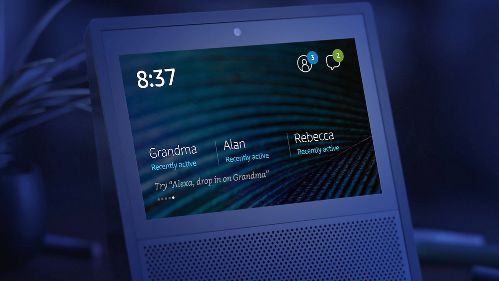
The importance of this feature can’t be understated, since like Facebook’s Wall and Snapchat’s disappearing photos before, it moves the goalposts on what normal, effective personal privacy needs to look like going forward. Just think of the angst people felt when Facebook tinkered with its privacy model back in the mid-2000s… people eventually adapted and Facebook was proven savvy and forward-looking. Drop In, from my perspective, has the same potential power to move people to a more comfortable context (not unlike Houseparty) with always-on, always-available casual, virtual conversations. Except this is based in reality, not just on the web.
Now, I don’t find this is creepy and I wouldn’t deck my family out in tinfoil bodysuits if I end up buying one. But yes, this design will inspire new questions and new behaviors and will certainly inspire users (and their friends) to revisit their preferred privacy boundaries in the home. Not a showstopper, but still important. And if you’re of the paranoid sort, here, I’ll let Amazon reassure you:
[Drop in] is the equivalent to giving grandma or your next door neighbors the keys to your kitchen door, so it’s meant for people you’re really ready to welcome in any time they care to stop by.
Alexa, the fifth family member
Speaking of the home, let’s talk about where this video is shot and in which room each of the five Echo Shows appear.
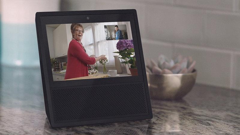
The first two Echo Shows appear in each kitchen of mother and son (0:25) (you can’t see mom’s Echo Show because she’s looking at it):
The third is on a table in the kid’s room (1:23)
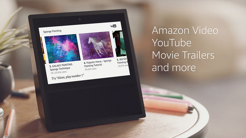
The fourth is on the nightstand in the bedroom (perfect for impulse buys and coin tosses in bed!):
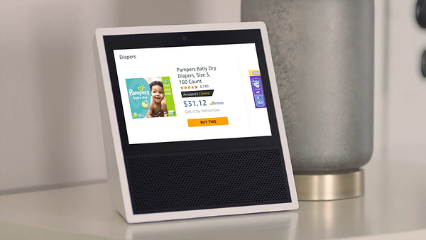

The fifth is in Grandma #2’s living room (Grandma #2 appears on the Echo Show in the kid’s room):
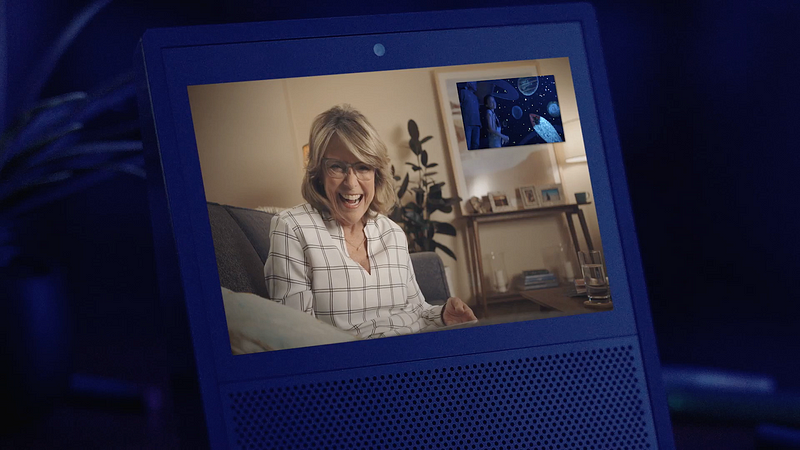
That’s five Echo Shows (totalling $1149.95, unless you spring for a 2-pack for $100 off with code SHOW2PACK) for a single family. (And curiously, nary an Echo Dot nor an Echo made an appearance.)
So: the Echo Show is designed to live in shared common areas with multiple household users (Amazon needs to catch up to Google Home’s multi-voice recognition!), and should be used (like the Echo) during tasks that require your hands: washing the dishes, cutting flowers, painting the walls, changing diapers, reading a magazine, and so on. Note that several of these activities could be completed with a handheld device, but if you apply the constraint that you must leave the smartphone in your pocket (or erase it from the picture completely), these human use cases are relatable and reasonable. Ok, I get it: convenience, access, and communication throughout the home. 👌

Being unremarkable: an aesthetic apart
The Echo Show is interesting not because it’s novel, but because it’s unremarkable and fits a familiar invisible technology pattern. As Matthew Panzarino points out, the form factor isn’t new, and that’s a good thing:
By being familiar, the Echo Show can become invisible. It’s purchase is a thoughtless act: literally, you really don’t have to think that hard about it. Does it address a few common problems for you? Okay, great. Buy it. It’s Kindle-simple.
To this point, and as others have pointed out, the Echo Show isn’t sexy:
These aesthetics aren’t an accident. In contrast to nearly anything Apple designs or that Google or Samsung chases after, by aiming for a less navel-gazy aesthetic, Amazon is targeting a very specific (but broad) kind of consumer:

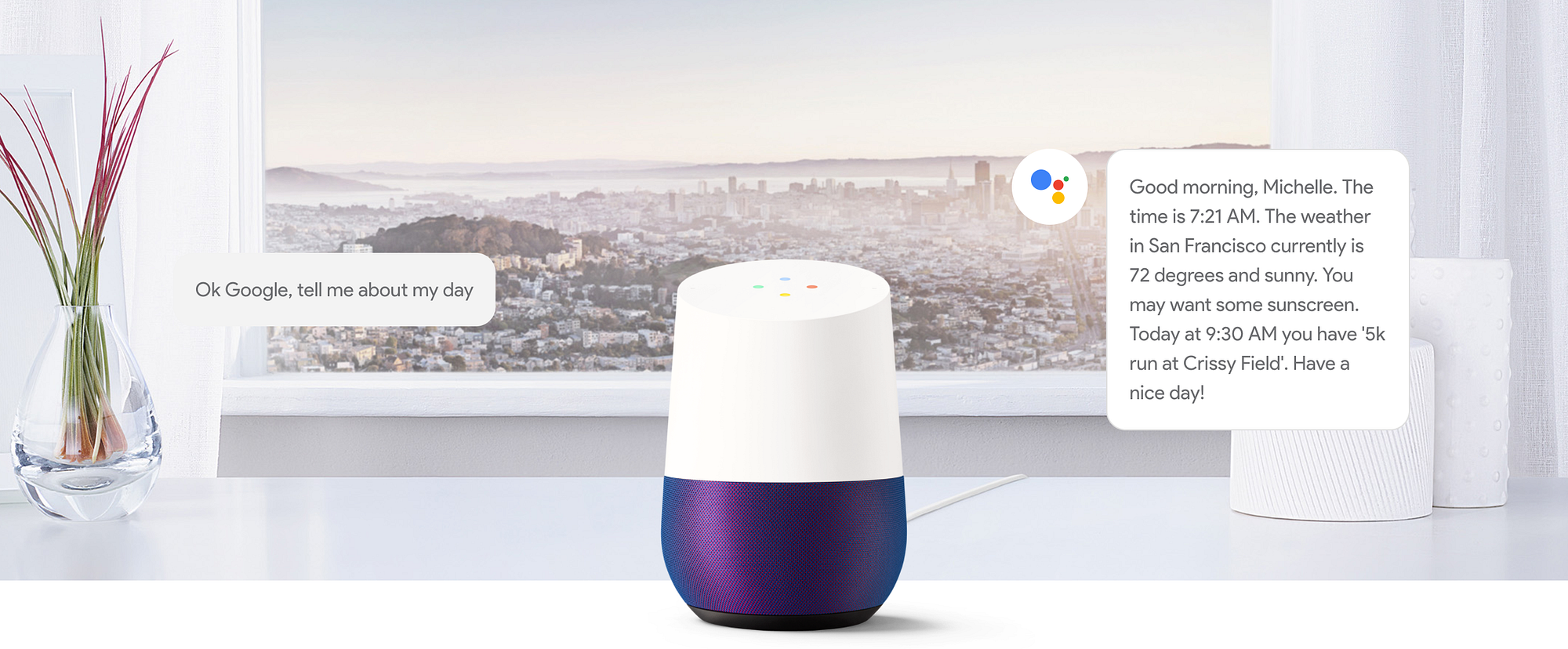
Contrast the understated Echo Show’s muteness to the Google Home, which was designed to be a showpiece:
Now consider Microsoft’s Productivity Vision from 2015 — in which its take on Drop In consumes an entire wall (like a portal to another world!):
Talk about ostentatious! As Steve Jobs once said: Yuck! Who wants that?!
And he’s right. Where future vision videos like Microsoft’s fail is in the centricity and importance of the looks of the technology, rather than how it makes the user feel (which, for Amazon’s user base, should be “not stupid”—indeed a low bar, but one that many products still fail at.)
The Echo Show looks common and unassuming because it’s meant to be common and unassuming. It’s the Myspace of product design, where the content (video calls, music, home automation) and the user’s confidence in using it will determine whether people will buy it—largely the opposite draw from an Apple device (like the AirPods).
This is at the heart of understanding Amazon’s strategy, and why we in Silicon Valley who have been obsessed with drop shadows and rounded corners and killing off skeuomorphism may miss the point: just like we saw with last year’s election, my sense is that there are a lot of people in the world who feel left out, left behind, or angered by the sharp increase in advances in technology, from AI to inscrutable #CameraFirst apps to untrustworthy newsfeeds, to the rest of it. As Joi Ito so astutely points out in his book Whiplash, change is hard, and change is coming faster than ever before in human history. We technologists are the liberal elites that deserve both the credit and the blame for advancing modernity while not doing more to bring the rest of the world along with us.

As it gets harder and harder to keep up as screens infuse every aspect of our waking lives, the rapid adoption of the voice-first computing paradigm is one way that people are fighting back. We see each other absorbed in our phones and we know something isn’t sustainable about the future this widespread behavior portends. We’re quicksand-sliding into Idiocracy, with less and less agency to choose an alternative path. Those who do risk being left behind as the divide grows between technology-haves (i.e. those who engage in choices about how and which technologies to incorporate into their lives) and technology-have nots (i.e. those who begrudgingly adopt technology due to peer pressure).
And so I want to leave you with one parting thought, and it’s a big one.

A tale of two futures
If Apple is a fashion brand that makes jewelry that connects to the internet, then Amazon is a meta-merchant that inverts the retail model by integrating the point of sale into your life. These two approaches determine how each company will spend the next decade, setting up a cultural dichotomy of epic proportions.

In Apple’s future, technology products should be luxury goods that give the owner an elite or exclusive feeling, even as they become increasingly ubiquitous. Apple sets the fashion trends by designing lustworthy devices that inspire awe and desire. In Apple’s world (like BMW’s before it), people have an enduring and emotional relationship with their technological accoutrements. The personal computing device (the iPhone, AirPods, and ᴡᴀᴛᴄʜ specifically) is the pinnacle of Apple’s achievements. Dieter Rams would be proud.
But Amazon’s approach to the future is necessarily different.
In Amazon’s future, its technology products are merely a means to an end: increased commerce. Be it drones, reading devices, voice cylinders, video intercoms, autonomous vehicles, its line of AmazonBasics electronics, or obsoleting the checkout process—these innovations aren’t designed to create more intimacy with its customers… they’re designed to decrease the time between the moment demand appears and how fast supply can respond. Amazon won’t stop until the entire supply chain has been absorbed and internalized.
What we see in the Echo Show video is Amazon scratching away at the sheen of today’s leading technology products and asserting a more utilitarian aesthetic. By reducing the importance of appearance, Amazon can emphasize function over form, keep its prices anticompetitively low, and drown the market with products that offer access to its AI voice assistant. Don’t be confused:


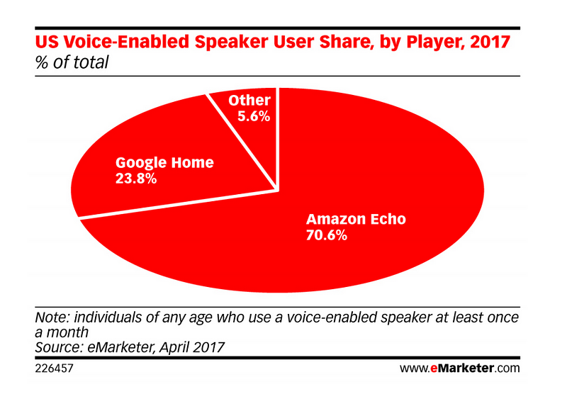
Like an army on the march, Amazon is marshalling all of its resources to succeed in this goal, and it’s already achieved a whopping 70% market share, according to eMarketer:

The stakes couldn’t be higher
The outcome of this battle may well bring about the end of the concept of the personal computer, at least as we’ve known it for the last 20 years.
In its place, we will start to live in a “field of computing”, where, yes, we may have certain digital accomplices that stowaway on our bodies and are used to notify and identify us, but the nose-to-the-phone model of personal computing may already be on its way out.
Doubt me? Just consider the eventual decline of other previous seismic advances like the horse and buggy, the locomotive, the newspaper, telegraph, radio, or TV. Each shaped the thoughts of a generation or two, but inevitability withered in the face of new advances.
The smartphone’s had a great run over the last decade and may yet have another 10 years to go, but trust me, computing is breaking out of the confines of metal and glass boxes designed as jewelry and meant to be “worn”. Computing is already becoming more diffuse, and if Amazon has its way, Alexa will become the primary conduit through which you reach the internet and connect to the world, wherever you are.

Soon we’ll see Alexa taking a ride with us in the car, saying hello on street corners, greeting us in hotels, and hanging out in our TVs and refrigerators. Make no mistake: Amazon is grinding the very concept of the personal computer into dust.
In its place it is positioning Alexa, an AI artifice that lives in the cloud and with whom you build a lifetime relationship. You will buy devices to gain access to her, for sure, just like at one time you might have bought a landline or a cell phone to call your family members—staying in touch was that important. Now you’ll do the same to stay connected to Alexa. You’ll buy technology not for its specs but for the access it grants you.

Maybe you think this isn’t such a big deal, but then again, maybe it’s just a matter of emphasis.


☞ Chris eventually reads every response on Medium or you can chat him up on Twitter. Do let him know what you think .
☞ To hear from him in the future, sign up for his newsletter or talk to his bot.
☞ As always, please tap or click “︎❤” to help to let Chris and others know that you appreciated this piece.


