Building instant image feature detection – Pinterest Engineering – Medium
Kent Brewster | Pinterest engineer, Product Engineering
Last month we launched visual search in our browser extension for Chrome. After we shipped it, we noticed lots of clicks to annotations that said “Web Site.” Closer examination revealed that these were always from searches originating with the context menu, which runs visual search on a generated screenshot from the browser window. (To try this out with Chrome, right-click on the empty space in any page and choose “Search.”)
Results and annotations for whole-window screenshots were pretty disappointing. Since they tended to match screenshots that were previously saved to Pinterest, we were showing results like “Web Site,” “Internet Site,” and “Wordpress Theme,” instead of the interesting objects inside the screenshots.
We don’t have a back-end API ready to look at a screenshot and return a list of interesting things inside. Even if we did, it would be unacceptably slow, delaying the user’s first view of the select tool by several seconds under the best of circumstances.
Instead of sending every screenshot back to Pinterest for analysis, we figured out a way to detect interesting things using nothing but JavaScript, inside the browser extension.
Convert screenshot to data
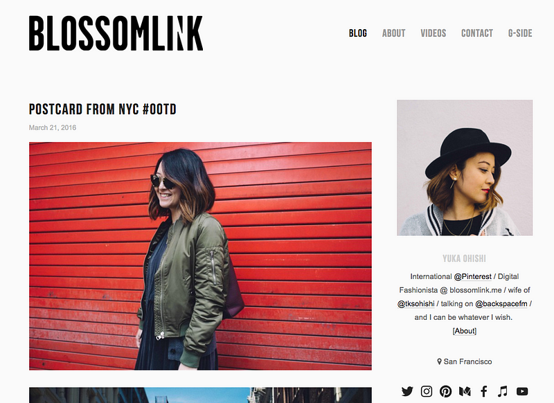
To search inside an image we need to look at individual pixel colors. This isn’t usually possible using plain vanilla HTML, CSS, and JavaScript, but because we’re inside a browser extension we have a higher level of privilege. Here’s an original screenshot, rendered to a <CANVAS> tag:
Downsample the original data
Screenshots can be huge and we’re going to be making a bunch of recursive function calls, which is a fine way to crash the browser with a Maximum Call Stack Size Exceeded error. So before we do anything else, let’s reduce the size of our statistical universe from 1100×800 (almost a million pixels) to a maximum of 80×80.
To do this, we take the larger of the two dimensions (height or width) and divide by 80 to get our swatch size. If our original is 1100×800 we’ll use 14×14 samples, converting our original image to something more like this:
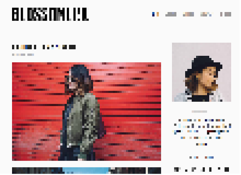
We’re not doing anything fancy like averaging out all the colors in each sample swatch; we’re just using the top left pixel. This seems to give us better results when the page being sampled has not scrolled; that top-left pixel on the top row and left column tends to be the main background color.
Count and declare the most popular colors to be “background”
Once we’ve downsampled we look at each sample swatch in turn and count how many times we’ve seen its color. When we’re done we sort by count and wind up with a list of colors like this:
[ “#ffffff”: 1321, “#ffeeee”: 910, “#ffeeaa”: 317 … “#a5e290”: 1]
Swatches showing the most common colors (here we’ll use the top three) are tagged as background.
Once we know our background colors we poll all foreground swatches again. This time we convert red-green-blue (RGB) values to hue-saturation-value (HSV) values, and find all swatches that have the same hue and value as the top background color. When we find these, we declare them to also be background swatches themselves. This catches many situations where we have a translucent background under a blown-up image, such as close-up views of Twitter images and Instagram posts.
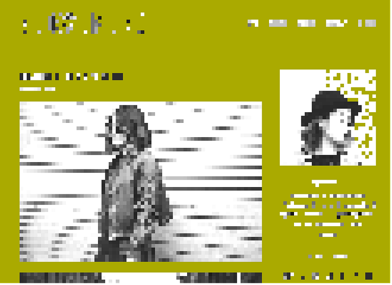
After counting and tagging background, here’s what’s left. Background blocks are set to green, so it’s visually obvious what’s going on. Leftover foreground blocks have been grayscaled, because their colors are no longer important.
Remove isolated pixels
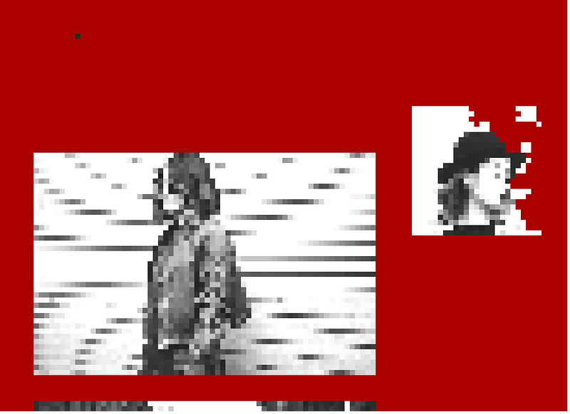
See all those tiny white and gray islands in the green? Those aren’t big enough to search, so we need a way to get rid of them. We run through the image one swatch at a time and remove any that have a neighboring block to the north, south, east, or west containing the background color. What’s left looks much simpler:
Flood-fill remaining foreground blocks, noting heights and widths
We’re down to just a few things. Now we need to pick the winner. Here’s how we do it.
- Scan each swatch, counting the total number of foreground swatches, so we know when we’re done.
- Scan again. This time when we encounter a foreground block, flood-fill it and all of its attached neighbors, decreasing the count of foreground blocks left to do with each one.
- As flood fill completes for each foreground area, note the minimum and maximum row and column for each. Each set of coordinates gives us a rectangular area containing any irregularities within the filled area. Convert to row, column, height, and width, and add to a list of interesting rectangles.
- Keep scanning until there aren’t any foreground blocks left to fill.
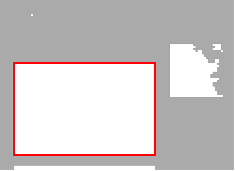
What’s left? Only interesting rectangles, shown in white here:

Find the most interesting rectangle in the world
A rectangle is more interesting if it’s:
- larger in area than 1/16 of the size of the canvas
- no more than 3x wider than it is tall
- portrait instead of landscape
- closer to the top left corner than other rectangles of the same size
A rectangle is not interesting at all if it’s:
- less than 100×100 pixels in size
- more than 5x wider than it is tall
Important: we’re not actually trying to find rectangles or any other shape. We’re just looking for distinctive difference in colors between neighboring pixels. If we have a fullscreen background image with an irregular yellow flower on a dark green background, we’d hope to wind up with our selector around the flower, even though it’s not a rectangle.
Once we have scores, sort and reverse to find the best area to select. The best rectangle not disallowed by the rules wins. If we don’t find an acceptable rectangle, select the whole screenshot as before. Either way, draw the select tool, run Search, and bask in the glow of much-more-relevant results!
Results
After the initial release of visual search in our browser extension we examined an anonymized sample of full-window screenshots that had been refined by Pinners with the selector tool. Instant image feature detection resulted in agreement to (or improvement on) what the Pinner had selected 85 percent of the time. In all cases where interesting things were detected, the search annotations were coming back with something better than “Web Site.”
These improvements are now out to everyone, and we’re detecting interesting things in screenshots 96 percent of the time, with a much higher rate of relevant search results appearing and being saved, all without the Pinner having to refine the initial selection.
Acknowledgements: Kelei Xu, Ryan Shih, Steven Ramkumar & Steven Walling
