Sequoia – Visualizing the Customer Experience
Creating a great customer experience is the highest priority at Airbnb and something that we’ve made a big part of our culture. One thing that’s really helped is a storyboard we created that depicts the different steps someone goes through from the time she first hears about Airbnb to the time she leaves post-visit feedback. We have 15 pictures that cover the guest journey and 15 more that show the journey for the host.
We always thought about our website and the steps someone goes through to book, but what the storyboard made clear is that we were missing a big part of the picture—the offline experience—that’s an even more meaningful part of using Airbnb than booking a property. We realized by looking at the storyboard that there are a lot of important moments where we weren’t doing anything.
The storyboard was a galvanizing event in the company. We all now know what “frames” of the customer experience we are working to better serve. Everyone from customer service to our executive team gets shown the storyboard when they first join and its integral to how we make product and organizational decisions. Whenever there’s a question about what should be a priority, we ask ourselves which frame will this product or idea serve. It’s a litmus test for all the possible opportunities and a focusing mechanism for the company.

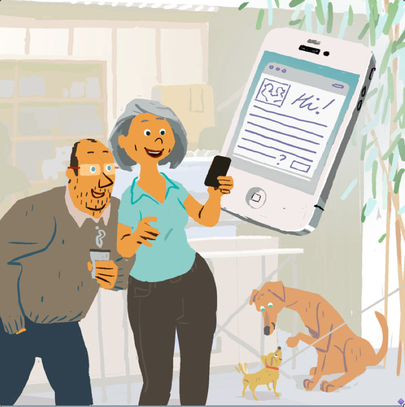
A frame from Airbnb’s storyboard: A host receives a reservation request.
My cofounder, Brian, came up with the idea over the holidays in 2011. He was reading a biography of Walt Disney and was inspired by the lengths Disney went through in order to make Snow White. It was the first time anyone had ever tried to make a feature-length animated movie and, to make the task more manageable for his animators, Disney created storyboards that showed the pivotal moments in the movie.
We started brainstorming what our storyboard would look like. We started with a list of many, many moments, grouped like ones together and refined them down into a concise set. If you have too many moments on your storyboard, it’s worthless. Fifteen seemed comprehensive yet manageable.
We hired an animator from Pixar to design the storyboard for us. Inside Airbnb, we call it “Snow White.” We wrote every idea we had ever talked about on sticky notes and arranged them under the most appropriate frame. What we found was that some frames were overrepresented. A lot of our ideas historically had been focused on our website, which makes sense because in the past, we might have just taken screenshots showing the steps people go through on the website and stuck those on the wall. There was less coverage of things that had to do with the offline frames.
We then had a roadmap for figuring out what a customer expects in each of those situations, what we were doing to meet those expectations and where we had an opportunity to create a “wow” moment. We noticed a lot of gaps. It became our number one priority to fix those areas where we weren’t doing what the customer expected of us.
One product we created as a result is our Neighborhood Guides. Our goal was to provide context on what different neighborhoods are like so someone can decide whether one is right or wrong for him. When someone is booking a hotel it’s usually in a touristy part of town and he can’t really go wrong. But Airbnbs are everywhere and that can create a lot of questions: What’s the neighborhood like? Are there things around that I’m going to enjoy? The Neighborhood Guides, which we now have for every single neighborhood in a set of cities, are very visual and make people feel more comfortable in that frame of the Airbnb experience.
The storyboard also helped us realize that we had teams focused on a dozen or more different product areas that were fairly narrowly defined, like search. Our search team thought about its goal in terms of search conversion. They did great work within that narrow scope, but we realized that there were a lot of things that were un-owned that were slightly outside the scope of search, but still related to the discovery process. There were opportunities there that we weren’t capturing.
Going forward, our teams are aligning as a frame or group of frames. So if you have an idea or there’s a problem, it’s very easy to map that to a frame and identify the owner. Most importantly, it’s obvious to everyone what the impact is on customers.
