These Design Inspirations Can Change How We Read The News

by Kent Mundle
The news industry has experienced tremendous turmoil in the past few years, and with tremendous turmoil comes new strategies, which put publications’ online experiences front and center. Websites are being redesigned, and mobile apps are being created left and right, which means the news industry is ripe with opportunities for designers with a vision.
Before you can have a vision though, you need a lot of inspiration, which is why we wrote this post. In it, we highlight and comment on the best news apps and websites from around the web. Some of the designs are captured from live products, and some are still in development.
Ready, set, find your vision.
Ukranian News Portal

Why it’s amazing:
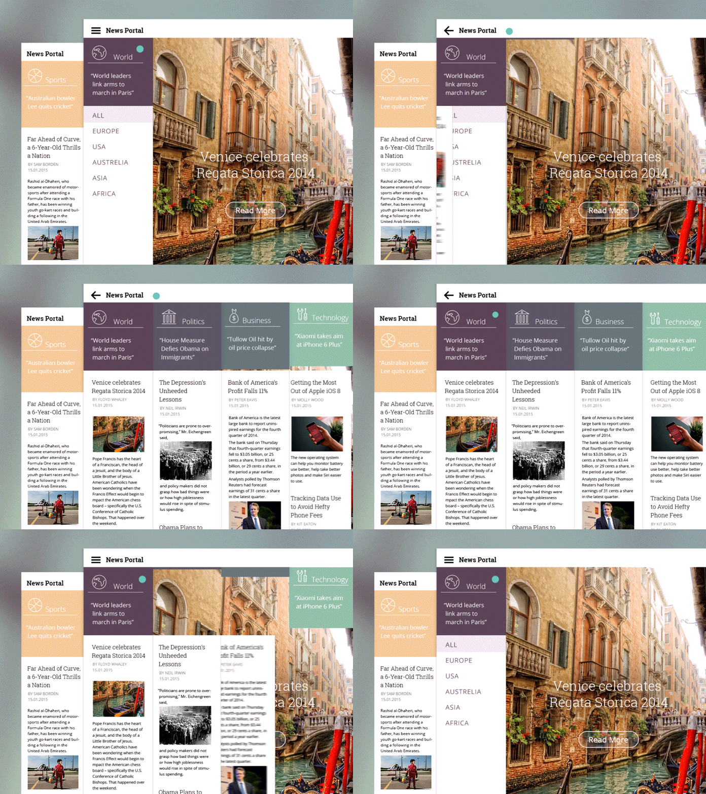
Tubik’s Chief Product Officer created this news portal. She illustrates a great way to display sectors and transitions between scales. Often news portals hide their navigation tools when entering and leaving content. This can leave a user disoriented and confused about where they are in the interface relative to the rest of the content. This interface always keeps its menu around, but nicely transitions into a full screen view as well.
Time and Health Magazine

Why it’s amazing:
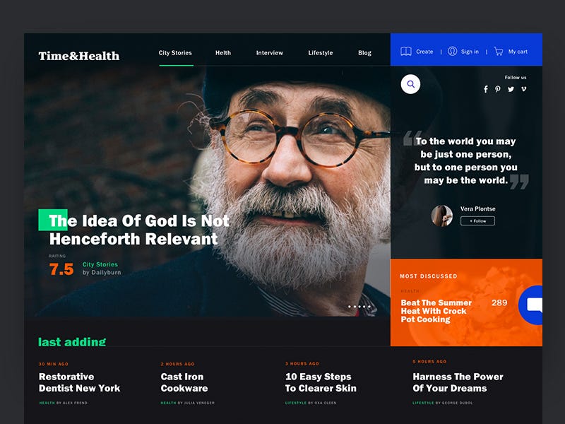
The idea of ranking content is not necessarily new, as many different platforms have utilized some sort of upvoting before. However, a rating system for articles — similar to Rotten Tomatoes — is interesting. In the age of content overload, readers appreciate knowing whether an article is worth a read or not. Upvoting systems reduce content overload, but this ranking system suggests an organizational structure for articles that will be worth reading well after they have been published.
Philharmonic Timeline

Why it’s amazing:
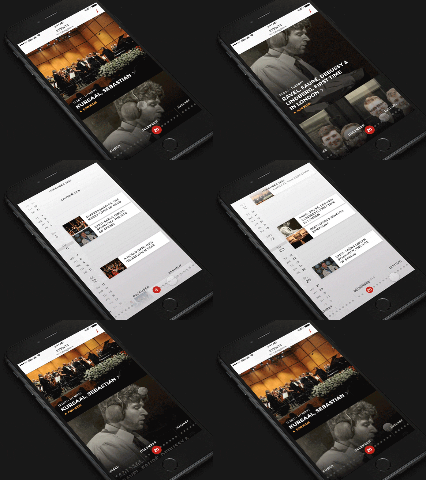
The transition between calendar and main headlines offers an alternative way to consume content. Although this is a news platform specific to a concert hall, it suggests how similar institutions might align news content with upcoming events. The headline feed offers the featured content quickly, while the zoomed out calendar provides a broader scope of other programming.
Newsstand

Why it’s amazing:
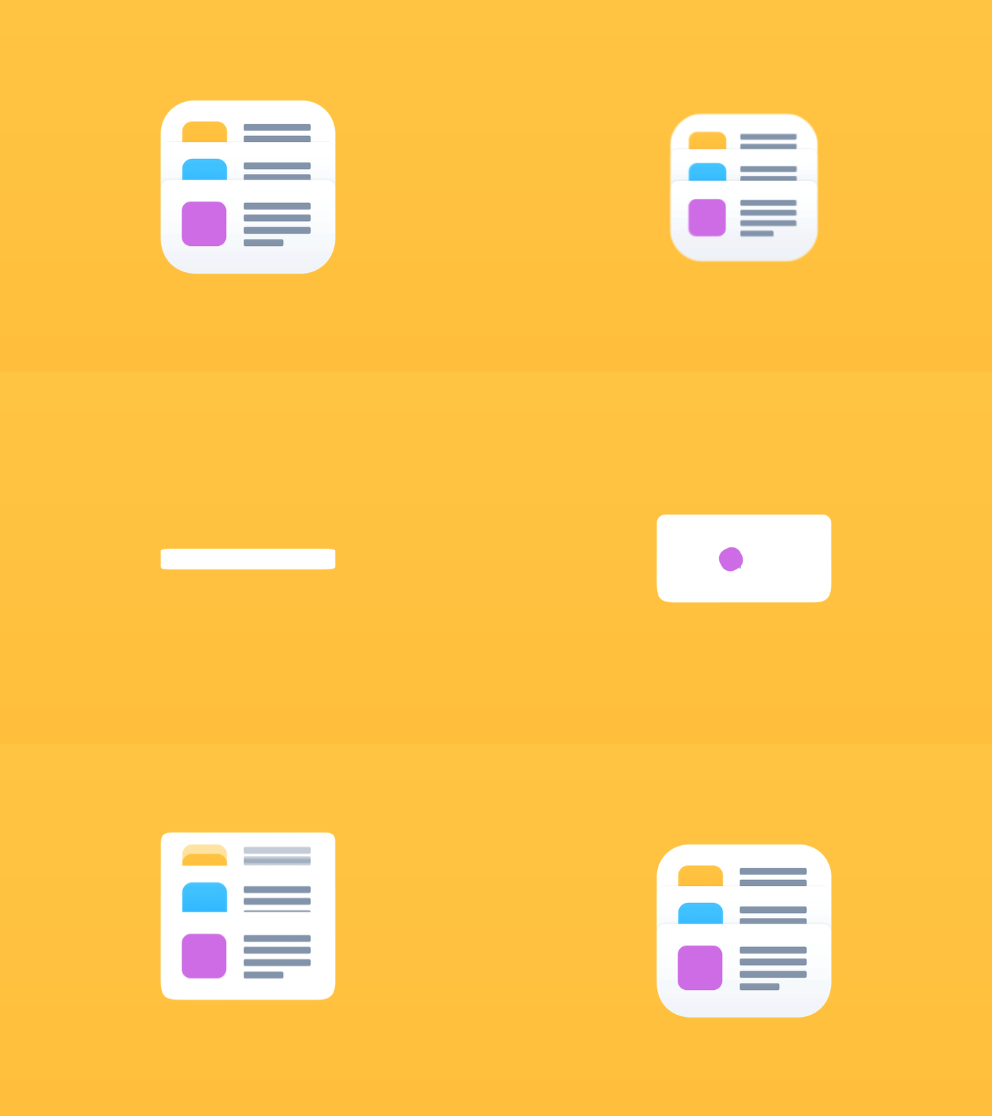
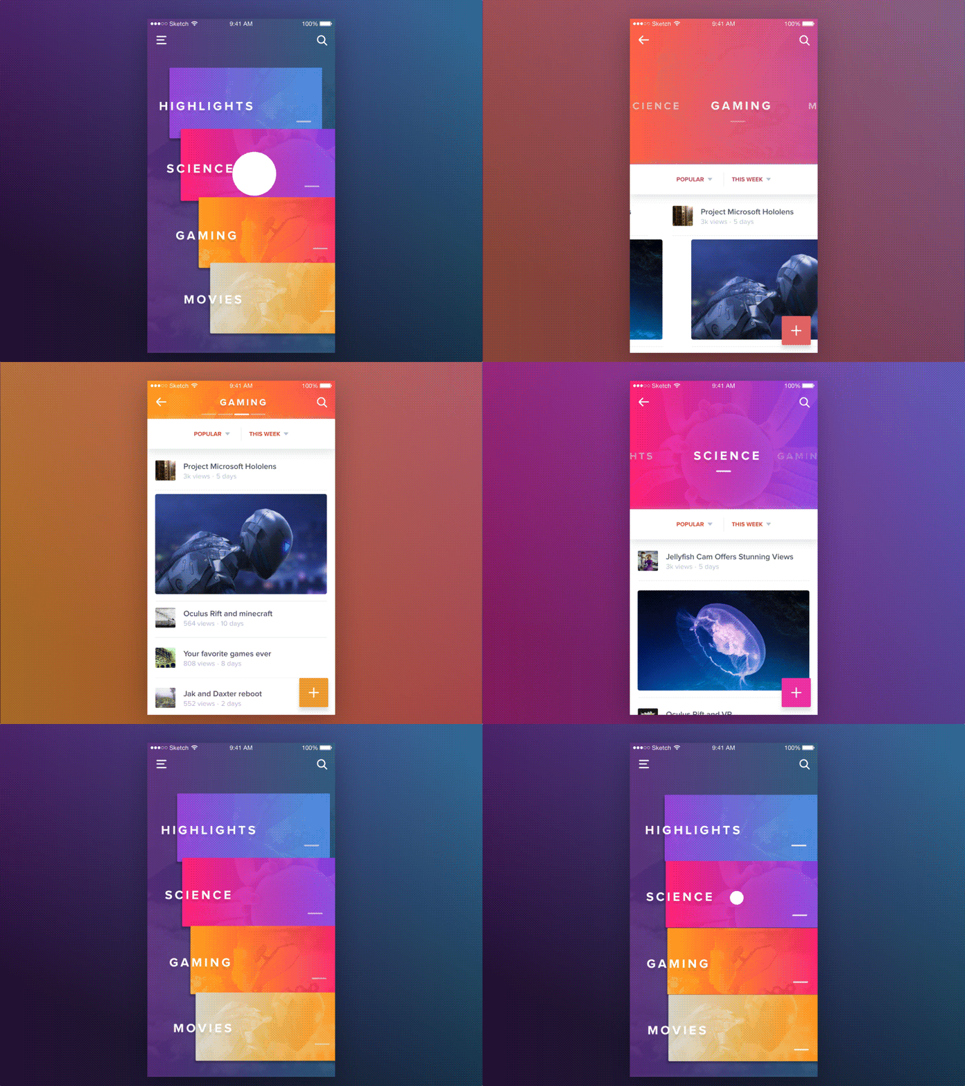
Both Google Newsstand and Trello cards inspired this design. Can you tell? Salomon’s intent was to reconsider the pull gesture. Typically, the pull gesture is used to refresh the page. Salomon instead directs navigation in multiple directions and scales all with the single gesture type. The result is a smooth transition between menu and content.
The Weekday App

Why it’s amazing:
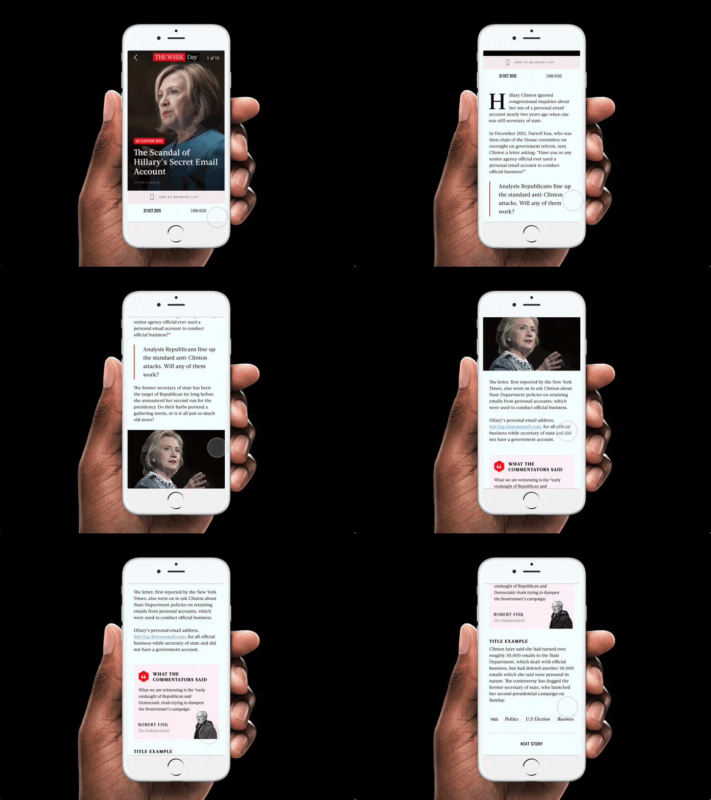
This editorial prototype focuses more on aesthetic design choices rather than architectural ones. The design harkens to the style of conventional print media, and as a result, it gives the content a serious tone, which many news portals lack. The serif font, which has suited mobile, is easier to read over an extended period of time than the serif fonts, which are more common in most digital interfaces.
Flipboard Interface

Why it’s amazing:
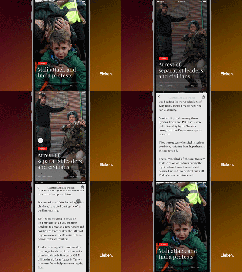
This is a relatively stripped down iteration of a news portal. In the context of often overly designed interfaces, this is actually somewhat refreshing. For users who just want to read, this interface does just that. The gentle contrast of the text on a light gray background provides a more comfortable reading experience for long form content, and images are removed from the article so readers can focus on, well, reading. The hero image provides the necessary visuals straight away, which removes any need for additional imagery set into the article.
News Portal Concept Application

Why it’s amazing:
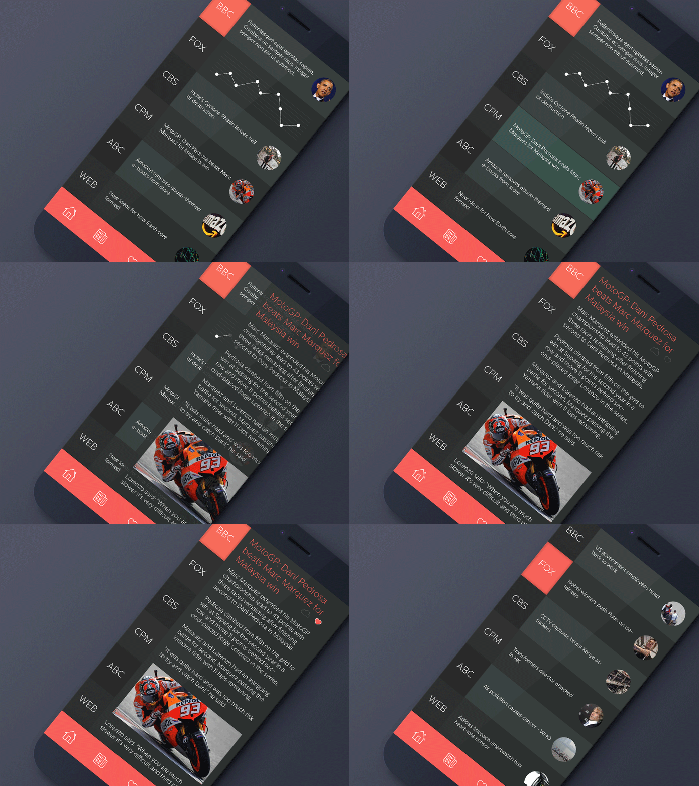
This interface is well suited for the user quickly scanning headlines, rather than someone interested in a long read. The permanence of the menu on the side suggests a need to quickly switch between each portal, as if to scan headlines quickly while in transit or between meetings.
Yahoo News

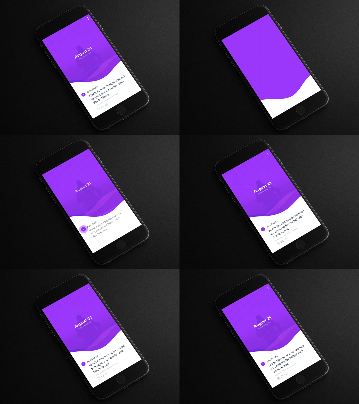
Why it’s amazing:
Yahoo’s news portal is unique because it automatically generates its content by sampling sources from around the internet. Yahoo extracts the essential pieces of information — images, quotes, maps — from stories around the web. Then, a small editorial team writes a brief summary. This results makes for an up to date and effortless reading experience.
Timeline App

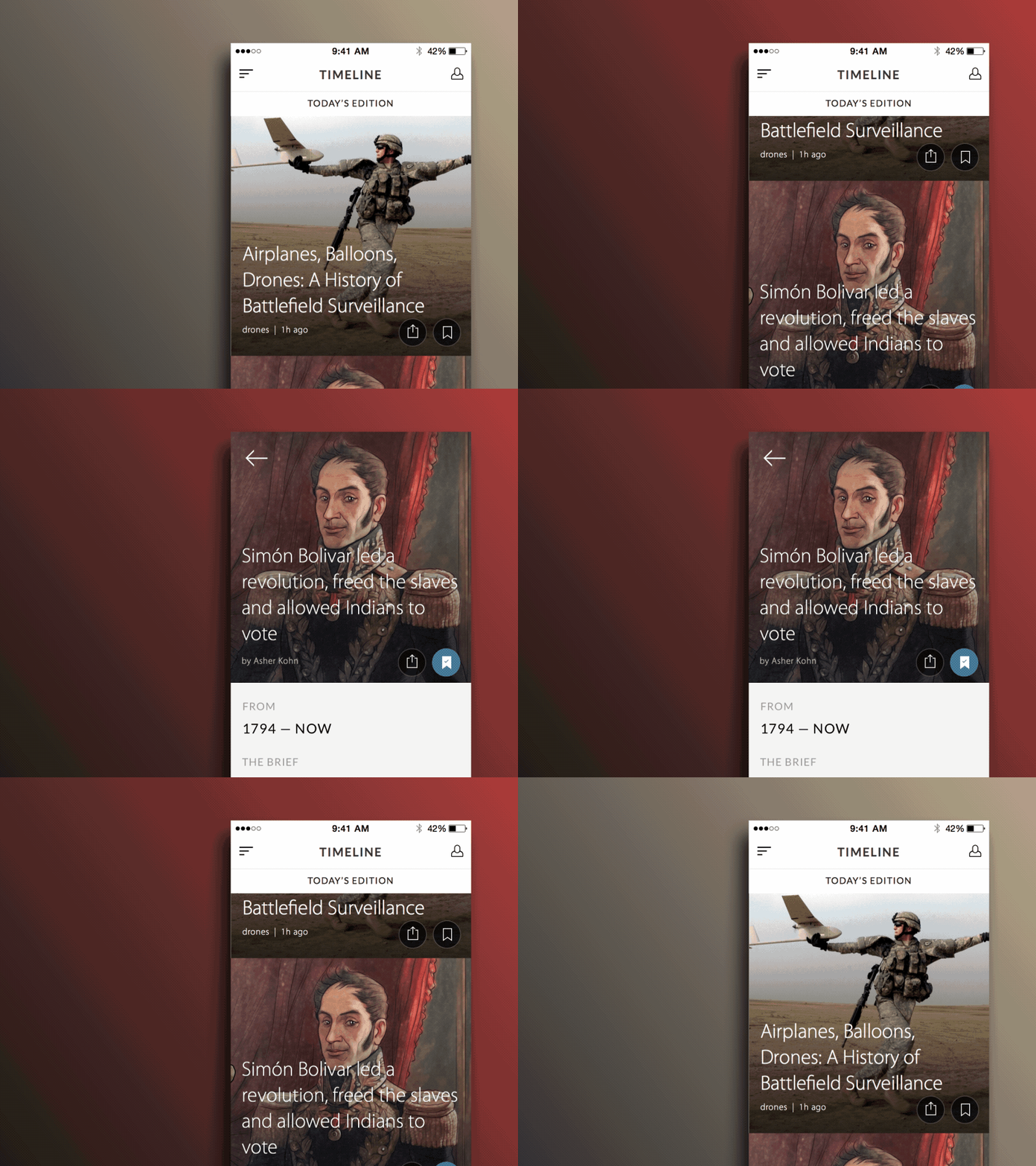
Why it’s amazing:
This app, Timeline, does not just provide news stories, but it generates additional articles as historical context to produce a more in depth reading experience. Timeline is the perfect app for those who want more meaningful news content. The app has its own award winning editorial team that produces exclusive articles.
The interface allows readers to scale between the details of a story, or zoom out to the historical timeline of a topic to scan other recent or related articles.
Daily News Interface

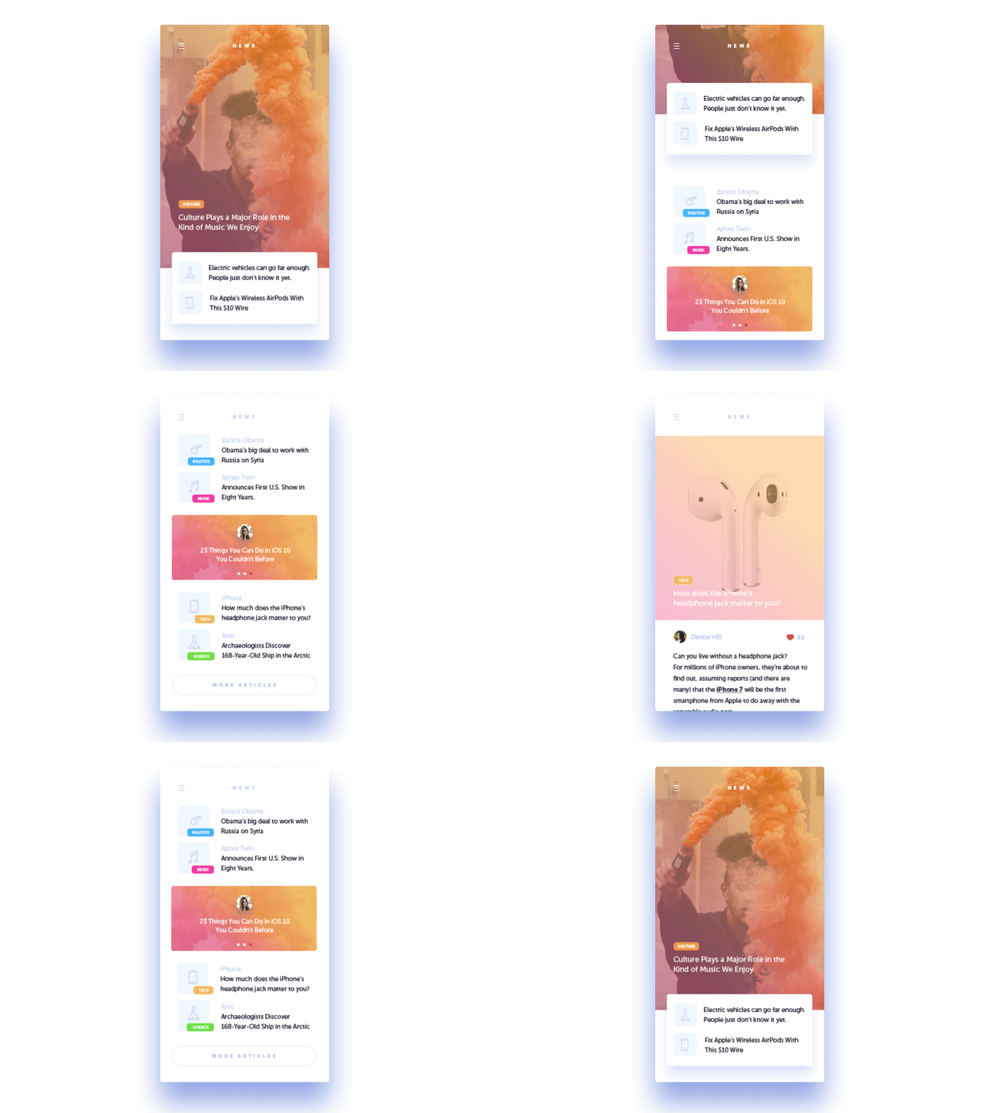
Why it’s amazing:
This interface removes category pages. In its place, the content is organized within a single news feed and each article is tagged by topic. As a result, users can personalize their feeds to fit their unique interests. Despite the mix of content in a single feed, the design nicely unifies the different topics by overlaying a vibrant color scheme. Often, uncurated newsfeeds feel illegitimate or disorganized. This interface solves that with its underlying tag system and well-considered color scheme.
Time to Sketch Out Your Vision
This wide-range of news UIs proves there are infinite solutions for designing a successful interface. Each UI offers a unique solution — whether it was to offer a clean organization method, a new way to generate content, or even just an intuitive reading experience. So, did you find your vision?
