Open Design Standards for Chat UX – Hacker Noon

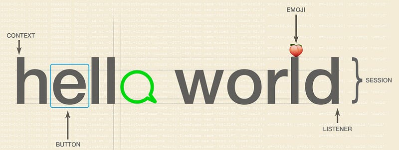
As the messaging space has emerged, startups have sprung up to tackle the challenge and complexity of developing chatbots across multiple messaging platforms. Startups such as Dexter, Reply.ai, Manychat, Pandorabots, Message.io and more are tackling technical development standards required to speed up deployment while open source markup like Rivescript have helped in creating richer interactions.
At Kip, our focus first has been users and designing the best UX experiences for large-scale. We propose a set of best practice design standards for conversation UX, with examples from our own experiences in conversation commerce on different platforms.
Our goal is that developers and designers alike can use this to further the design of chat UI elements to create great experiences with users.


Stickers as Conversation Landmarks
In chat, people talk in a single continuous stream. This can be confusing for users, as information in hidden within the constant stream of text. New users will have to scroll up to see previous responses or constantly type help to the bot which breaks the conversation flow.
Our design solution is to use stickers — a popular chat interaction — and use them as ‘landmarks’ in different parts of the conversation. This means that a user can leave the conversation, come back to it and quickly glance through the text stream to figure out where they are at.
An example of this is mode stickers. These stickers appear in the beginning of each type of conversation and lets the user know what kind of experience to expect.


For instance, Kip Café is a service shopping experience, where users can purchase a type of service — in this case, it’s a food delivery and food ordering service for a team.
Comparatively, the standard Kip Shopping is a items shopping experience, users can shop for different types of goods like packed snacks, electronics, books and more.
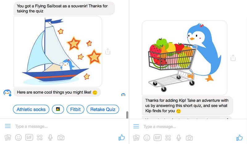
Stickers can also be used to transition from one experience to another. We use stickers in Messenger to show the end of the onboarding (which is built as a Buzzfeed-style quiz) into the shopping experience:

Poll with Conversable Forms
Chatbots are at early stages of usefulness. In order to develop better products, having a form or survey feature is essential to collecting feedback. To this, we designed Conversable Forms.
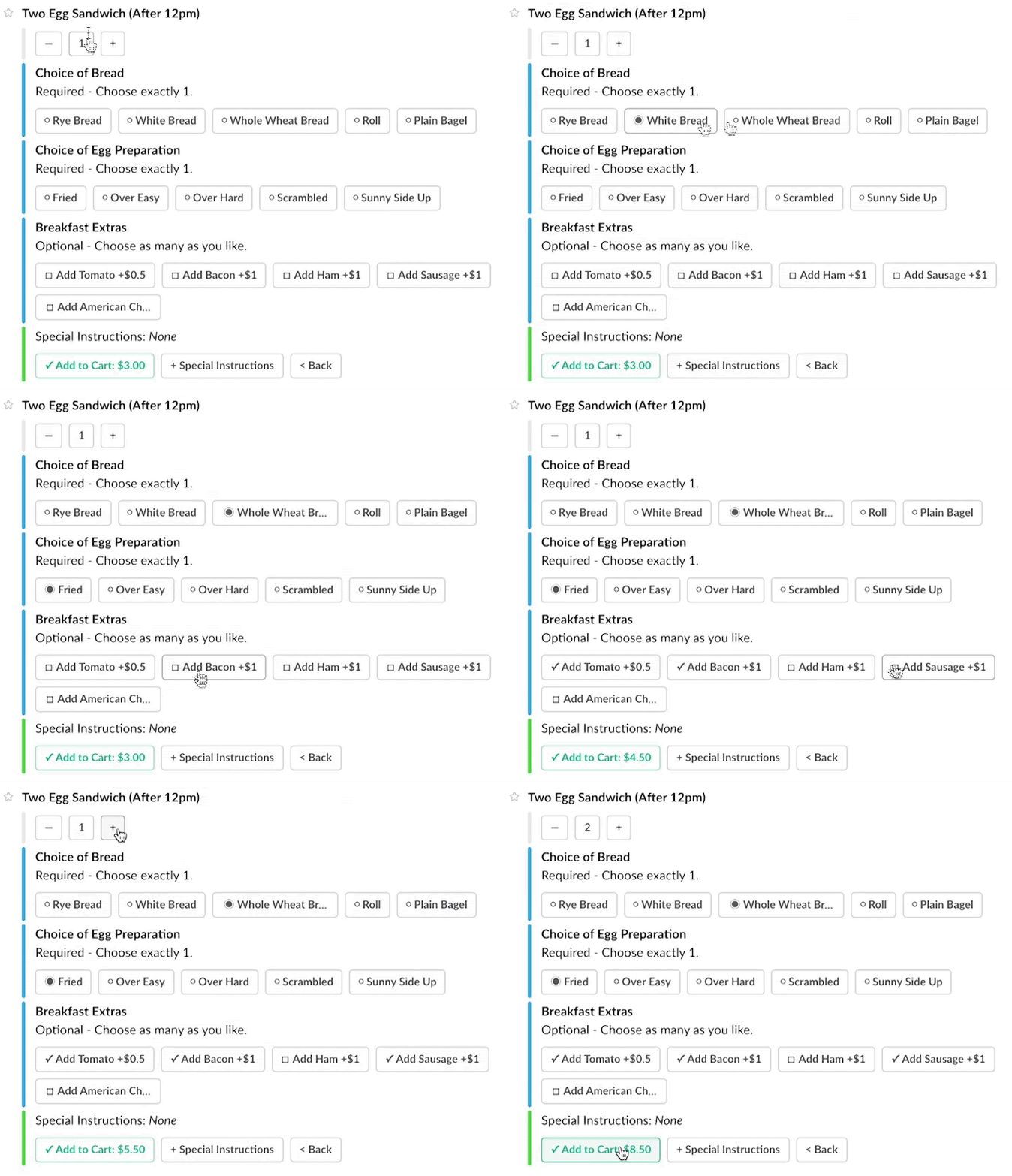

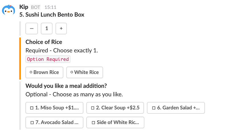
Conversable Forms are in-line updating chat conversations with HTML-like elements such as checkboxes, checkmarks, radio buttons and color coded error handling for required* fields in the form of conversation buttons.

In-line updating forms is an extremely important part of the conversation experience as most users don’t want to be bombarded with multiple messages and notifications.
Especially in something like a customer feedback survey, it’s much better to have it as a single message that updates within itself than multiple messages which sends a notification every time the user selects a response.
Persistent Menu Buttons
When you browse a website or app, there’s normally a hamburger menu, bottom tabs or some kind of directory to navigate around. You don’t have to remember as much, because you can always hit ‘back’ or ‘home’. In a conversation UI, you’re constrained and limited by the messages you can send back to the user. There is no menu.
After much trial-error and user feedback, we came up with a “Home” button. It’s a very simple design solution. At the bottom of each Kip message, we have a penguin emoji button that persists. When you tap on it, it opens up a set of menu choices: view cart, settings, members and back.

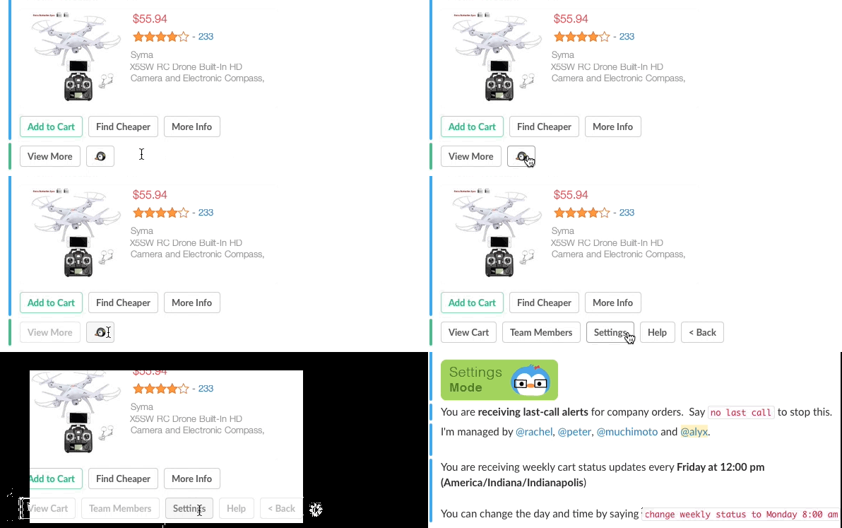
Having a button persist across all messages meant that users could change preferences anytime during any part of the conversation WITHOUT having to scroll up, sit through on-boarding or remember specific superuser commands.
For Facebook Messenger, they have a built-in persistent menu at the bottom left corner. Their persistent menu is a pop up that sits in the text area instead of within the message, so you want to be careful of the message content that is behind the menu pop when the user clicks it. As you can see in our example below, we have kept to a primary experience focusing on help, onboarding and view cart in menu while the emoji modification is hidden behind.

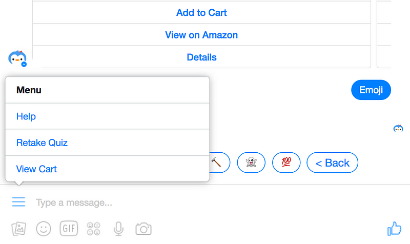
In this situation, you want to consider the information hierarchy. While the persistent menu is hidden (secondary interaction), it is also in front or above all continuous messaging information when clicked. So if you have a carousel of images with high call to action, you should ensure that clicking the menu pop-up will not ‘cover’ or move away from the primary call to action.
If you have any feedback or suggestions or have discovered a key UI element while building a chatbot, please let us know! We’ll love to update this document whenever possible, and let it be a helpful stepping stone in designing messaging experiences.

Kip is an AI penguin that helps you collect and coordinate shopping orders for groups. Try Kip for Slack by tapping the button below:

If you enjoyed reading, please recommend 💚
