Tactical Design Critique — Designing Medium — Medium
First, though, this Holacracy thing seems kind of weird, no?
It does! The name looks misspelled (why not “holocracy”?), there are weird words like “energizing” and “tensions,” and at times it all seems vaguely cultish. But the strange veneer aside, Holacracy delivers a set of thought-through tools that are not only useful and efficient out of the gate, but have also proved themselves to be easily customizable.
Our design team took and customized one of those tools — a tight and efficient meeting type called tactical meetings — and came up with Tactical Design Critique, or TDC. We call it this way because we really enjoy our PFT.
(PFT stands for “Penchant For TLAs.”)
TDCs allow us to quickly get a shared sense of how we feel about an existing design, what might need to be done about it — and also grow stronger as a team while we’re at it.
Tell me more about the format of this TDC thing.
- The facilitator presents the design on a big display, or prints it out and put it on the wall.
- We go around the table, over and over again. During their turn, each person can share one (and only one) tension she or he has with the presented design, elaborating on the tension to the extent they deem necessary.
- Tensions don’t have to be exclusive — you can repeat or add to another person’s prior tension.
- Or you can skip (pass) your round if you can’t think of a tension at this moment.
- Cross-talk (other people speaking out of their turn) is discouraged, unless it is used for clarification (“Wait, what did you mean by…?”).
- The whole thing is capped at 20 minutes, or whenever we run out of things to say (everybody in the room skipped their round in sequence). The facilitator takes care of the order and keeps the meeting running smoothly.
Can you share a specific example of a TDC meeting?
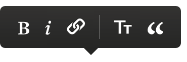
Sure! At one of the TDCs, we took a look at what we internally call the highlight menu — a contextual menu tied to a selection, with a few different modes. It’s one of the designs we’re proud of, and many of us miss it when using other platforms. (If you are reading this article on the web, highlight any passage to see the highlight menu in its full transient glory.)
For that one particular TDC, the facilitator prepared a set of most common states of the menu, including the most useful edges of that design:


(Note that the menus above have a few options that are internal experiments and will look different to Medium in the wild.)
So what kind of tensions did people have about the highlight menu?
Exercise for the reader: If you want to try, look (and/or use) all the above, and come up with your tensions before reading ours. What don’t you like about these? What could be done better?
In our meeting, these are the tensions that were raised:
- The bubble icon is too big, hollow, and pointing in the wrong way. Basically Sadness Central.
- Top highlight doesn’t include the count of people.
- All of these highlight menus are dark and scary.
- When you have a block quote, you have to click “ twice to undo it, and you have to go through a big scary quote mode (pull quote) every time you do it.
- The editor menu has too many options and is too wide. Maybe H1/H2/H3 could be combined into TT like in the small editor menu.
- Spacing and alignment feel a bit off generally, should be reviewed.
- It’s weird that Twitter is there as an off-platform logo.
- Text shots (tweeting an image of a quote) are cool, but the Twitter icon alone doesn’t represent the awesomeness of text shots.
- The pipe divider is nice, but not used consistently. One idea: separate internal services and external services (like Twitter).
- The “paste link here” state looks like it was never actually designed.
- Note and highlight response [an internal option we’re testing] coexist, even though they are effectively two identical options with two confusingly similar icons.
- The action when you pile on [add on to someone else’s highlight] feels very satisfying. Can we add animations or transitions to make other actions in these menus feel nicer?
- The highlight icon (marker) feels a bit off. Maybe the space between its two parts should be adjusted.
- Why only Twitter, but no Facebook or email?
- The link icon seems complex visually, compared to others.
- In the editor, highlight menu moves in annoying ways as you keep clicking to change styles. It should be more tied to mouse cursor.
- There’s no hover state for icons. Hover state could make them feel more cohesive.
- Drop cap icon could be cleaner, more unified right next to the center icon (both have three lines, inconsistently).
- Most icons need visual refresh.
- In the editor, tooltips (or some other UI) could be used to communicate keyboard shortcuts.
- Some editor options are missing (bullet points, ordered lists).
- The highlight menu for the inline (small) editor is at the same size as the highlight menu for the big (classic) editor. It should be scaled down since the fonts are smaller.
At this point we ran out of time. There might have been more tensions, but given that people are likely to start with things that bother them most, we probably went through all the important ones anyway.
Boy, that sounded awful. Is there anything good about the highlight menu?
In the TDC sessions, we don’t specifically focus on the good things, although some usually come up. In the highlight menu session, there were a few: adding to someone else’s highlighted passage is satisfying, the menu fast and always close to where the action is, and we felt it still actually is a good design, despite all the problems we have with it.
But by talking about what is wrong with a given UI, we implicitly also focus on what could take it from good to great. Or, at least, what wouldn’t allow it to deteriorate too badly. Because good design doesn’t stay good forever. It needs constant attention. Atrophy breaks everything over time — new options quietly make things complicated (Hick’s Law), new code and design contributors can result in inconsistencies, and code or markup changes can result in visual or interaction bugs. And even if the UI itself doesn’t change, the interface or concepts around it might, rendering the UI problematic in the new context.
But a lot of those tensions were contradicting one another!
Welcome to design. We’ll be here all week.
What’s next, then?
After a TDC session, we often spend some informal time just chatting about what happened, and those originally involved in the design process can provide more context about design decisions, bugs, etc.
Ultimately, airing grievances might be therapeutic, but it is not terribly actionable. If the tensions and their scope during TDC point to some sort of redesign effort being necessary, it’s good to have concrete next steps that happen after such a critique. (For example: “Marcin will file some UI clean-up issues and work on fixing them with a front-end engineer” or “Brad will talk to product design leadership about a redesign being part of next quarter’s effort.”)
What do you like about TDC?
TDC allows us to capture a list of tensions around the current design that the team can then tackle either tactically (incorporate improvements as we touch this design during subsequent updates), or strategically (schedule a bigger effort around a more serious redesign).
The scripted format of TDC allows that list to be captured quickly and effectively, and it gives everybody a chance to voice their opinions.
Is that it?
Not quite. A big part of TDC is actually about improving the team as much as it is about improving a given design:
- We build a shared understanding around parts of our UI that have been around for some time, and likely touched by many designers at Medium — including context that surrounded their creation.
- We come up with an understanding of urgency — or lack of urgency — around fixes needed to be made to a given UI.
- We get to know the team’s interest and expertise better. (“If Marcin focuses on typography in his critique, that means Marcin might be a go-to person on typography.”)
- We get to understand the landscape of design better. (“If Sasha and Tyler focus on accessibility in their critiques, that means accessibility might be worth paying more attention to as a whole.”)
- We practice the very important skill of pointing to flaws in things without criticizing people who designed or implemented them.
All of the above make TDC sessions useful even if nothing obviously actionable takes place.
Cool. Is there anything else?
Not really! Try it yourself: run a TDC session if you want, or customize it. And let us know how it works.
And what’s happening next with the highlight menu?
TBD. BFN!
