Material Design is design science. — Medium
Material Design is design science.
Why Material Design is our best attempt (yet) for a unifying theory of design.
In 2013 Apple launched iOS 7 and the world fell in love with flat design. Apple by no means invented flat design (in fact Microsoft championed flat long before Apple), but they brought it to the massses. And they did it well.
As a designer I set down a very familiar path.

It begins with obsession.
Every time I saw flat design executed seemed to be better than the last. I was lost in seas of negative space. Before this, I had always had this tacit notion that negative space needed filling. I never wanted to fill it, but it always seemed to get cluttered up with something along the way. Clients would target negative space and pour crap into it. But I felt like it was finally going to be popular to be minimalist. I felt free from clutter. It was easier to think. Clients were going to start wanting more open space in their designs, giving each element a bit more clarity and focus.
Death to the skeuomorphic design that Apple had been inspiring for
so long!
We were dragging its body through the streets. Designers and Creative Directors alike were lining up to spit on its corpse. They chanted “Death to the gradient! Blur the background image!”
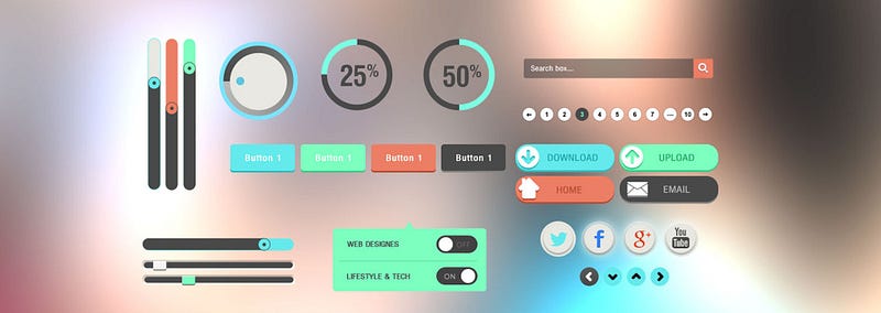
Next is practice.
Any design that crossed my desk after this was flattened. Stamped down until only the fill and stroke remained. Apple made it look easy, so it took months of fettling to get to a place where I was comfortable with my flat design skills. With everything stripped away there was a lot more focus on placement and proportion. My bad designs could no longer hide behind drop shadows and gradients. But it was liberating, exhilirating to lay a design down to bare bones.
Last is the realisation.
After all the dust had settled a lot of designers started to look around at the, desolate, post-skeuomorphic landscape we had created and wondered “Where do we go from now? How are these designs going to get better or keep evolving based on these design principles?” And the answer is they were not. Once the novelty wore off it became easier to see that there was a problem here. We were using tactile devices but our interfaces lacked any sense of tactility. Variations in colour could only solve so many usability questions.
The whole process reminded me of when I first learnt how to use Photoshop. I plastered every image with effects and filters. I desaturated absolutely everything.
“Does this image need lens flares?” I asked myself.
“You bet!” I replied.
“How many?”
“A fucking hundred”
But as my skills caught up to my taste, my taste had realised that it was fucking drunk and this shit looked bad. The novelty wore off and I started looking for more subtle ways to make the photo stand out.
Enter Material Design

While the world had been turned into a barren, flat wasteland, Mountain View rose up as an oasis.
Google released Material Design with Android L at its 2014 I/O conference and what became immediately apparent is that they had put a lot of thought into it. It wasn’t just a design language. It was a governing set of principles that guided design and interaction. Much like physicists set out to find the simplest possible theory to govern everything, Google set out to find the simplest set of rules to govern the base of all interface design and interaction.
“So what is different about Material Design? What is stopping it from becoming a novelty” I hear you ask.
Well it’s simple. The answer is
Space Time
Material Design utilises both space and time as elements of design.
Space
The history of GUI’s has been one of trying to replicate something recognisable to us in the physical world. Traditionally this has been done visually — recreating how an object might look in the physical world. Drop shadows and gradients were created to mimic light sources and give flat elements some depth. In this sense Material Design is not re-inventing the wheel.
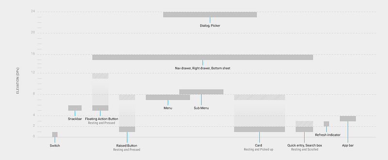
Instead it simply provides a rule set that governs the spaces in which elements can live. It imagines the screen as a 3-D plane that echoes the physical world. It echoes paper — something so tactile and familiar I bet you are imagining feeling a piece of paper right now.
Each element occupies its own space on the z axis, giving us the impression that they actually exist beyond the pane of glass, inside the device. Like little sheets of paper sliding over each other.

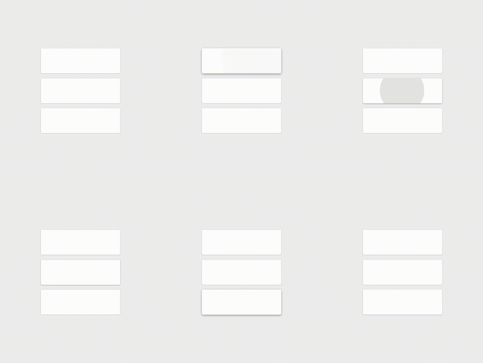
The elements can behave in ways that have no direct parallel in the material world without breaking physics — without feeling unnatural. Creating spatial relationships that are uniquely electronic and digital without being alien. Familiar, but still delightful and surprising.

Time
Time is a heavily neglected aspect of user experience. Humans don’t just experience states of a device, they experience the transition between states too. States with hard cuts between them are jarring for the the user.
If an actor in a play were to exit stage right and re-enter moments later from stage left, the audience would notice the lack of continuity. It would be jarring. It would release the immersion.

A screen is a lot like a stage. When something magically cuts between states or enters the field of view with no clear entry point we become immediately aware of the device. It feels electronic and alien. The illusion is shattered and the immersion fades.
At this point you are thinking, “Okay cool, I’ll just add animation to everything.” It’s not that simple. Animation needs to feel real. It has to appear to be at the mercy of some real forces, just like objects in the world.
Material design uses assymetric eases to simulate mass and weight. Linear motion lacks this inherent feeling of being subject to external forces.
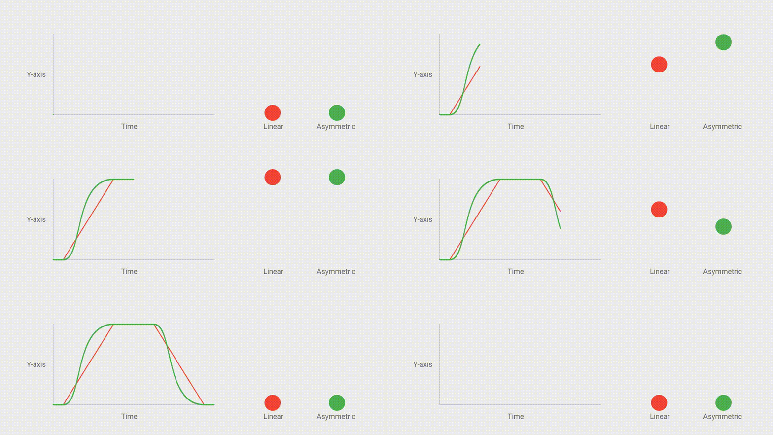
Material Design doesn’t just employ animation, it prioritises it. Animation is not relegated to the “Nice To Have” column — instead it promotes meaningful animation. Using it to aid usability.
One of the problems with flat design was it was difficult to illustrate the hierarchy of many competing objects. Colour, size and spacing could only go so far. But time can be employed as a powerful element to establish importance. If an object arrives on screen before others, we will focus on it first and attribute it more importance than the objects that follow it.

So what?
“So what?” I hear you say. “What is stopping Material Design from being relegated to a novelty like every other design trend we have ever seen?” Well the visual components that comprise and characterise Material Design might fade into the annals of design trends. The bold colouring and distinctive FAB will certainly age.
The difference is the underlying design philosophies and theories will live on. The thinking behind the delightful animations and material elements will evolve and shape the next generation of user interface design.
Like Newton’s first understanding of gravity was challenged and overtaken by relativity, Material Design’s principles will be examined and improved upon. But the credit will still go to Material Design as being the first attempt to provide a design framework for Human/Device interaction.
(It’s been pointed out to me by Joshua Ulm, Head of Design at Adobe, in an eloquent tweet that “Google didn’t do shit first”. This may be true, so let me rephrase: Google weren’t the first to create a frame-work that guided interaction design but they did it so well that they might as well have been.)
I can’t recommend the Material Guidelines enough, if you haven’t already checked them out. They are super comprehensive and considered.
If you enjoyed reading this, please click “Recommend” below.
Check out my other post about explaining your design job at parties.
For more general witty banter and some tutorials, follow me here and on twitter @danhollick
