7 future web design trends — Medium
7 future web design trends
Too many articles will tell you what is cool in web design. I’m going to take you past the obvious to make some real predictions.
1. Gestures are the new clicks
We forget how hard scrolling webpages used to be. Most users would painstakingly move their mouse to the right edge of the screen, to use something ancient called a ‘scrollbar’:
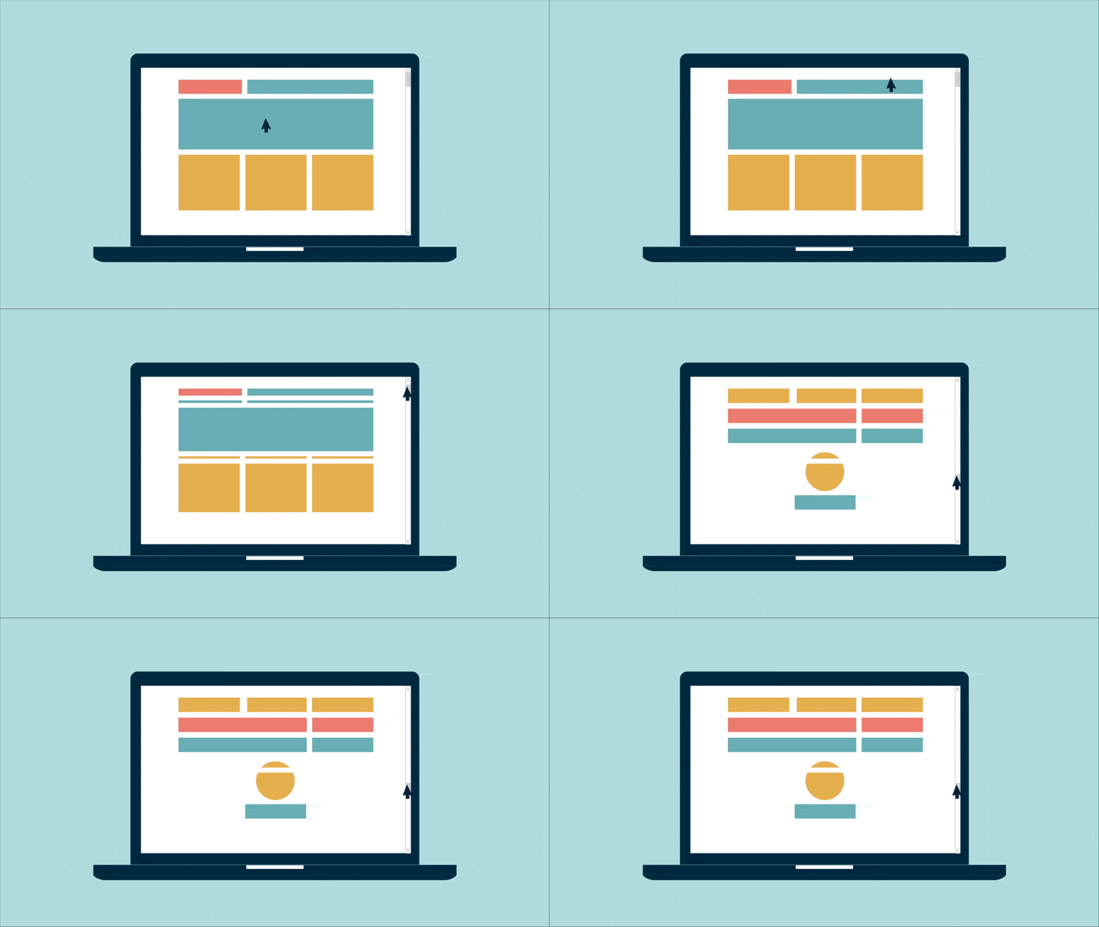
As a pro, you probably used a mouse wheel, cursor keys, or trackpad, but you were way ahead of most users.
In 2015 it’s far easier to scroll than it is to click. On mobile, you can scroll wildly with your thumb. To click on a precise target is actually more difficult — the complete opposite of what we’re used to on the desktop.
As a result, we should expect more and more websites to be built around scrolling first, and clicking second. And of course, that’s exactly what we’ve seen everywhere:
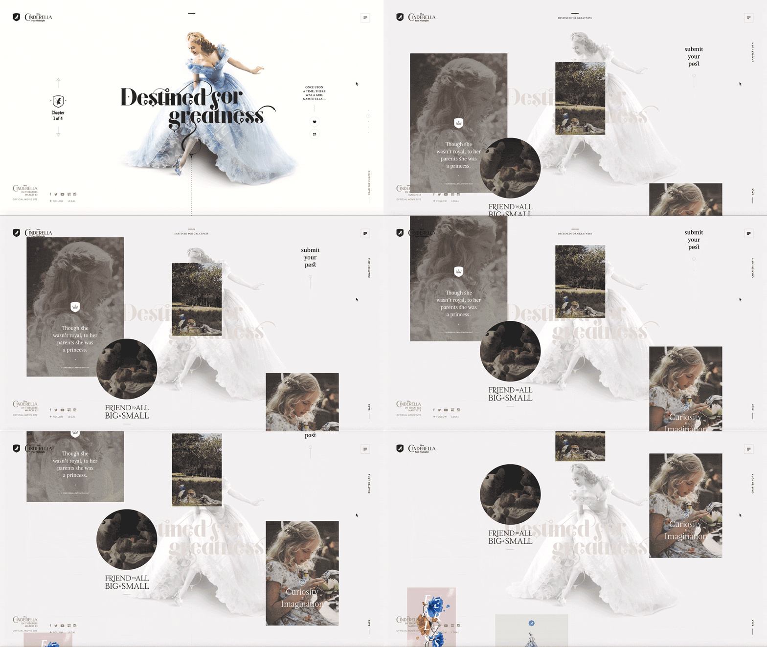
There’s every reason to expect this trend to continue as mobile takes over more of the market. Modern sites have fewer things to click, and much more scrolling. We’ll see fewer links, more buttons, bigger ‘clickable’ areas, and taller pages that expect to be scrolled.
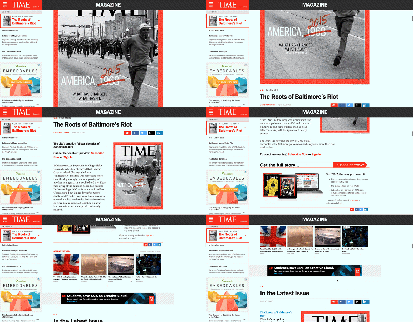
Websites which spread their articles onto multiple pages will soon learn this lesson. Expect these to turn into longer single pages or even, like TIME magazine, into infinite scrolling pages:
It’s too early to know if the web will expand itself onto devices like watches, but if it ever does, you can bet it’ll be almost entirely driven by gestures.
2. The fold really is dead this time
Now scrolling is so cheap, and devices are so varied in size, ‘the fold’ is finally becoming irrelevant.
Designers are increasingly free to not cram everything at the top of a page. This leads to a design trend popularised by Medium — full-screen image titles, with no content visible until you start scrolling:

With tall, scrolling pages, designers have the chance to do what magazines have taken for granted for years: fill their pages with big beautiful images. In 2015 expect to see more designs that take up much more space — especially vertically — and a lot of larger imagery like this.
3. Users are quicker, websites are simplifying
Today every young adult is an expert web user. And even the amateurs are acting like pros: using multiple tabs, and swiping to go back a page.
The result is that everything is faster. And we’ve all learned to become impatient. If you want to make a mild mannered person explode with annoyance, just make their Internet really slow for a minute.
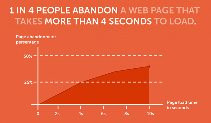
Now websites are forced not just to become faster (a technical problem), but to become faster to understand. Designs which slow the user down have the same impact on their audience as these websites which don’t load at all.
Simpler designs are easier to scan, which means they’re faster to appreciate. It’s easy to see which of these two designs is newer, and it’s because it’s the one that user’s can enjoy the fastest:

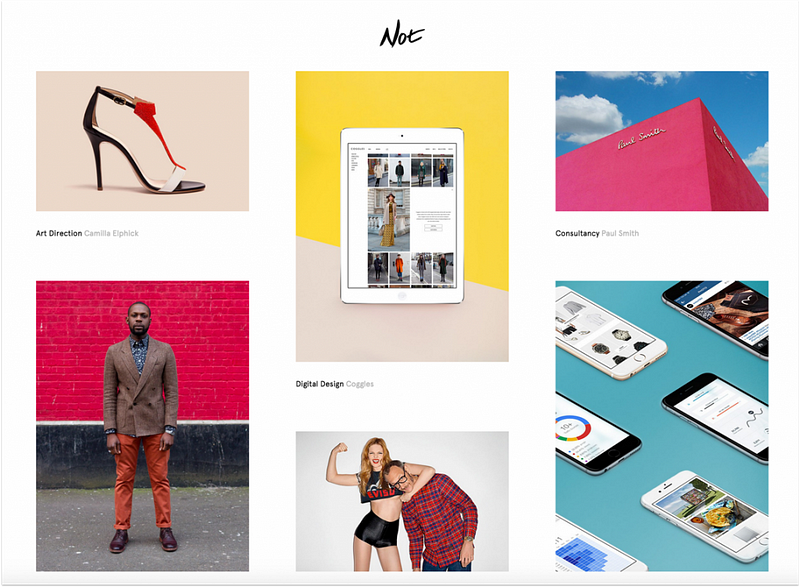
This is the biggest reason for the death of skeuomorphic design: users are more perceptive, less patient, and clutter only slows them down.
Apps put most websites to shame with super-minimal, beautiful interfaces. And they’re doing this because minimal interfaces perform better.
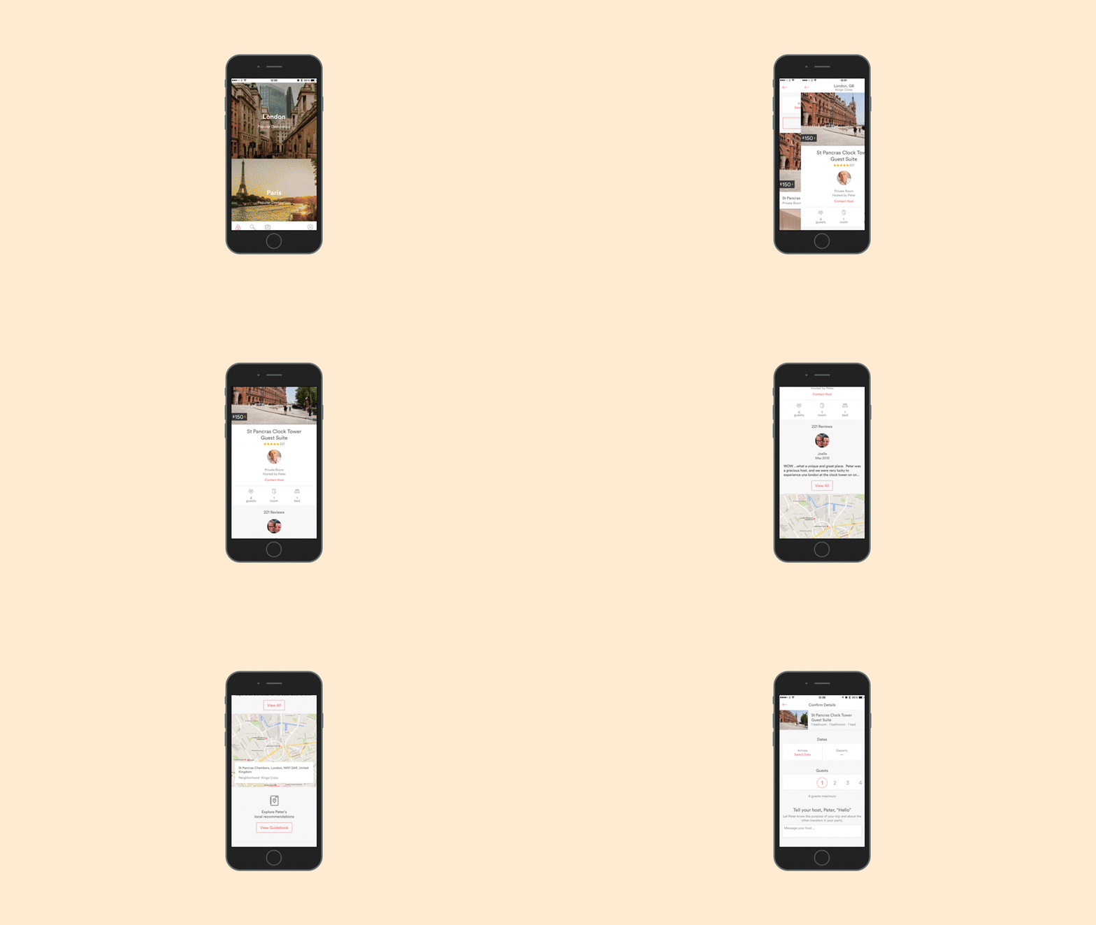
Flat design is just the beginning. The real trend is towards simplicity and immediacy, and we expect that to go further than ever in 2015.
4. The pixel is dead
On a desktop, a pixel was a pixel. You even had an idea of how many pixels made up an average inch: 72 dpi. Nowadays very few people know what a pixel is.
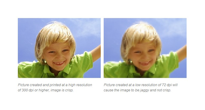
With responsive design, we’ve seen a move towards grids and percentages. But one huge area remains still unchallenged: bitmap images.
Almost all of the web is built with images that have half the resolution of a modern display, and they don’t scale. With Retina displays and modern browsers, the time is right for vector images to become more popular in 2015.
We can see this trend already happening with the font-based icons and Google’s Material design. The website loads faster and scale the icons to any size without losing quality. That makes them ideal for designers and modern web browsers.
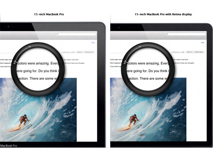
The technology exists now, but it will take time for professionals to change their habits to create for higher quality displays. Once the average desktop display becomes Retina-grade (like the new iMac), we expect designers to follow suit.
5. Animation is back
If you want to make a website look dated, cover it with animated “Under Construction” GIFs and Flash animation. But several things are coming together to make animation a rising star in modern web design.
Flat design can end up looking too consistent, boring even. Animation helps a website to stand out and to pack more information into less space.
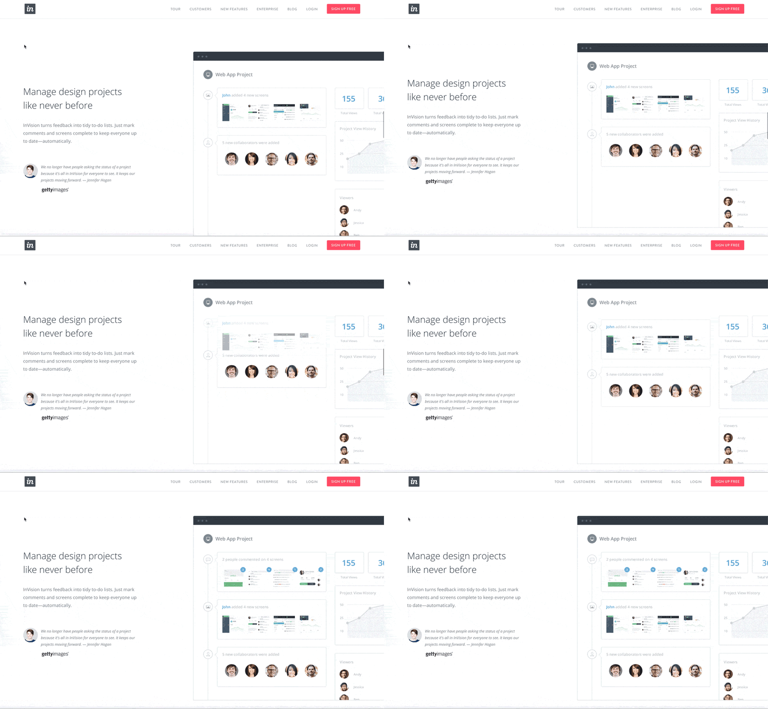
Mobile apps have redefined what a user expects. Mobile apps use motion to convey meaning, and websites are just starting to do the same.
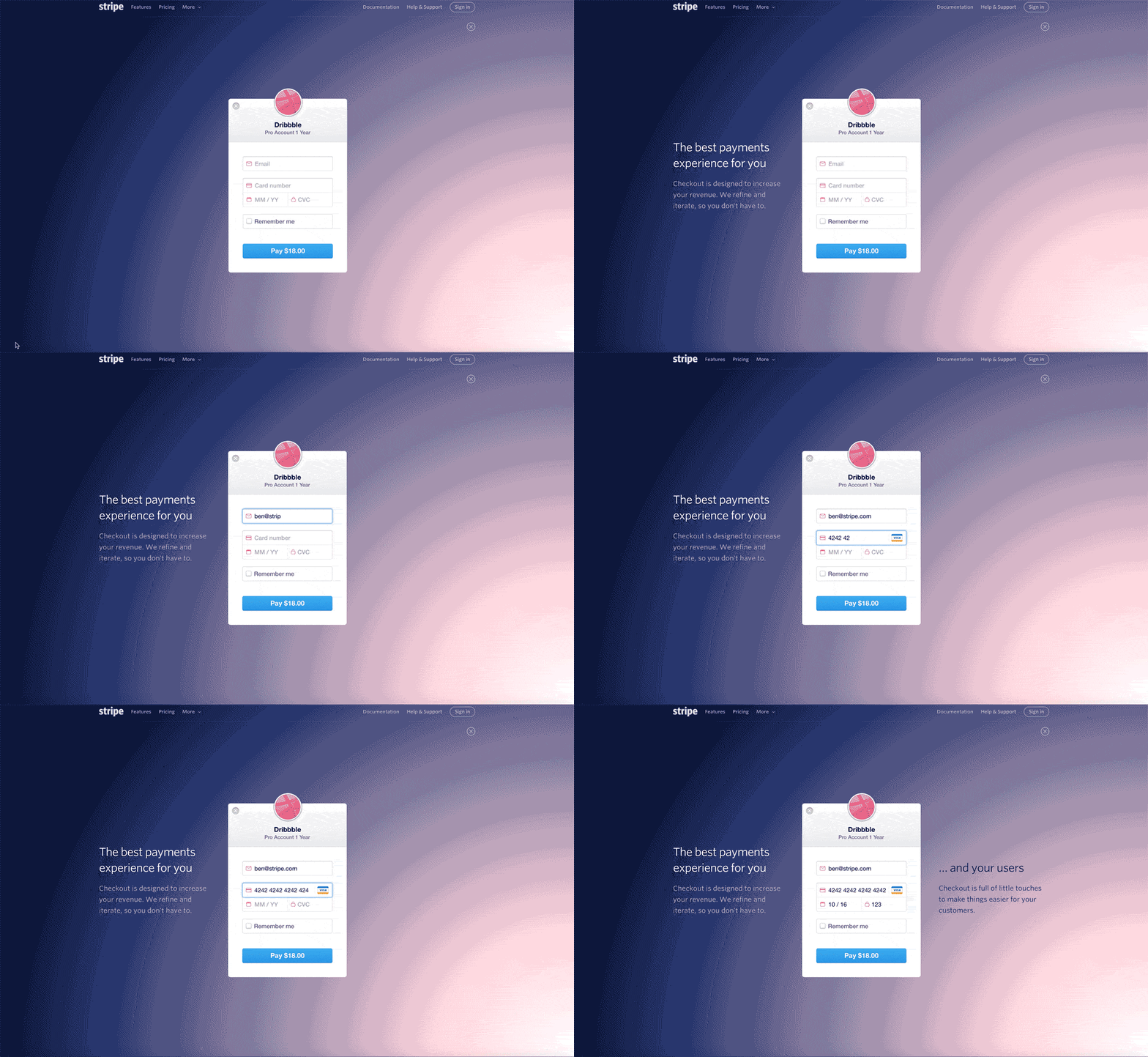
New technologies like CSS animation make it easy to enhance designs without plugins, speed or compatibility issues. And Web Components (#6, below) will only accelerate this.
GIF animation is back, and surprisingly effective. You’ll notice this article makes extensive use of GIF animation (if it doesn’t, you should view this version), which has never been easier to create or share.
6. Components are the new frameworks
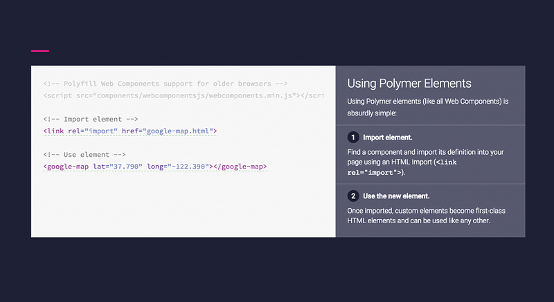
Web technology continues to get more complicated, and less semantic. Designers must embed messy code onto their pages for simple tasks, like including Google Analytics or a Facebook Like button. It would be a lot easier if we could just write something like this instead:
<google-analytics key=”UA-12345–678″>
And we can with Web Components, which aren’t quite ready to be used by most designers yet. 2015 is looking like their year.
Google’s Material design is here, and it may just be what gets this movement started. Powered by Polymer, and supported by all modern browsers, it provides the rich animation and interaction components from Android apps, with simple tags like these:
If that takes hold, it wouldn’t be surprising to see more component based frameworks appear in 2015. Perhaps Bootstrap 4.0?
7. Social saturation and the rise of direct email
Social media has been a huge success for consumers, but many content producers aren’t so happy.
The problem is saturation. With billions of posts every day, Facebook learns the posts that users are most likely to enjoy and shows only those. Unfortunately that means over time, what you post is increasingly seen by a smaller percentage of your followers. (A problem you can solve, conveniently, by paying Facebook).
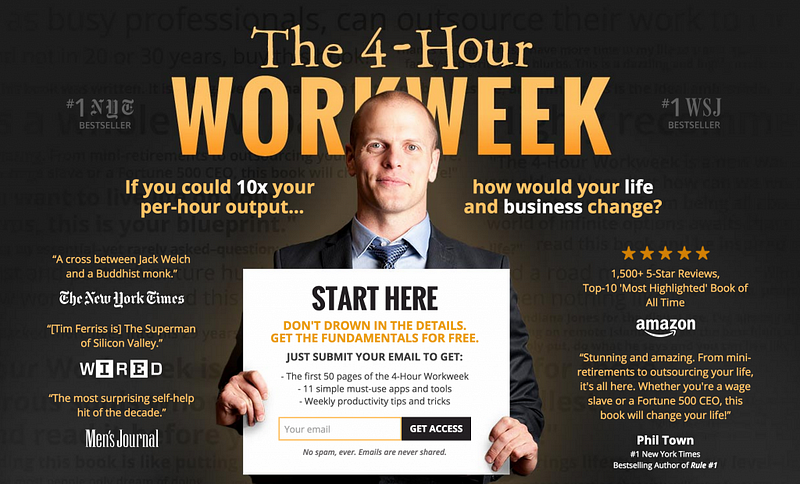
Social isn’t going away, but in 2014 we’ve seen a lot of prominent bloggers like Tim Ferriss move their focus away from social and into good old fashioned email lists. They’ve realised that email has one significant advantage over social: a much higher percentage of people will see what you send them.
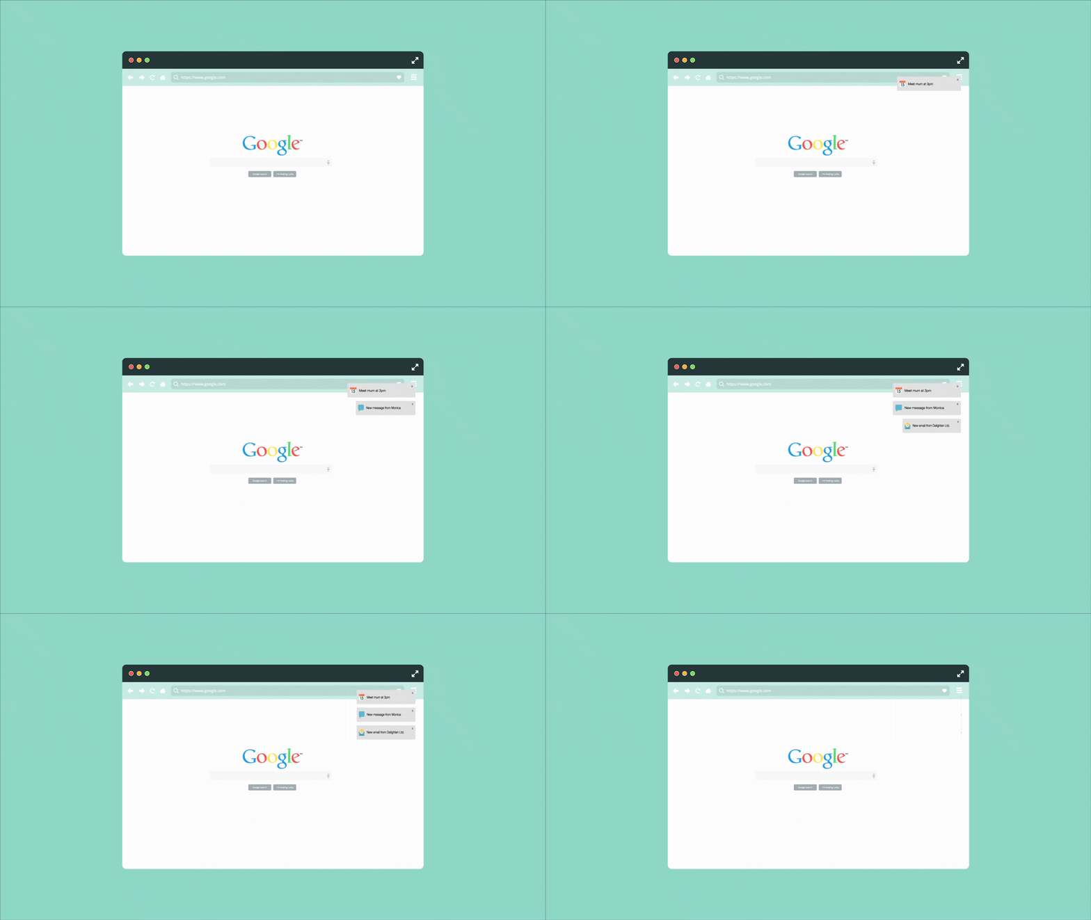
I expect this post-social trend to continue into 2015, with the under-appreciated trend of Web Notifications (which work much like notifications in a mobile app).
Bonus non-prediction: CSS shapes
This cool technology won’t get noticed, except by designers. CSS shapes allow you to flow layout into shapes, like circles:
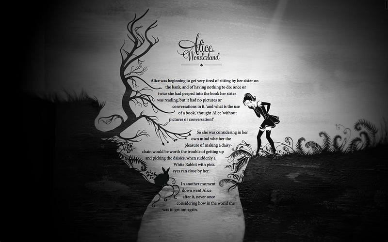
It’s incredibly cool, but until browser support is guaranteed, this is likely to be too risky to put time and effort into it you’d need almost two complete designs, for old and new browsers. And outside of designers, we don’t think many users would notice.
It is really cool though.
What to expect in 2015
In 2014 we saw mobile use overtake desktop, but the general public hasn’t caught up. Most organisations still commission a website to look good on their computer first and work on mobile second.
In 2015 that strategy is likely to look out of touch and unprofessional. As the mobile becomes the main device for browsing the web, “mobile-first” will become less of a buzzword and more of a requirement.
Flat design may be everywhere, but when you look beyond ghost buttons the real trend is that simpler sites are faster at gratifying users.
Simplicity is not just a fashion: it’s the future. Expect it to only continue.
It will become more and more common to embed animation into blog posts, and for motion to signify both premium quality (for those who can afford it) and to support the user experience.
Pixels and the fold will slowly be set aside making more room for scrolling and click-second experiences. Web Components will make it easier to deliver app-like experiences in our websites.
Right now you see the best of mobile app design appearing in web design. With enough time, the difference between an app and a website might almost entirely disappear.
