User Experience for Product Designers — Medium
User Experience for Product Designers
Five simple steps product designers can use to build better web apps.
On small teams where time resources are limited user experience can often be overlooked. Over the past few months I’ve tried to develop a low impact UX cycle that designers and project managers can use to improve the quality of web apps without adding a lot of bloat to a project. This article will be written from the viewpoint of an app that is currently in-use. The UX process will vary slightly for a new product but the same basic principles exist. Below is a five-step process going through a development cycle that defines a detailed look at best practices in the UI/UX discipline.

Step One: Preplanning
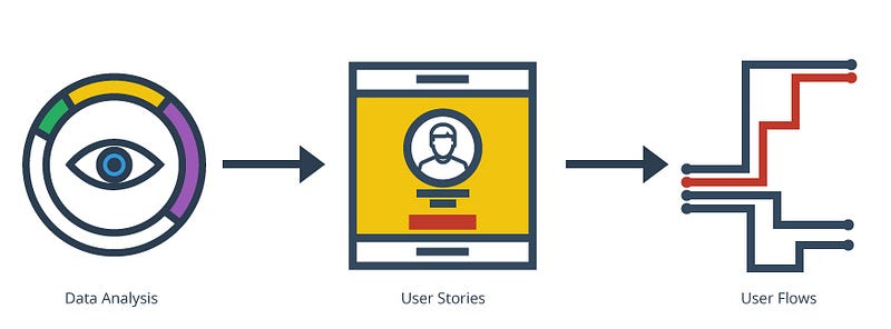
Preplanning can be broken up into three main areas: data analysis, user stories, and user flows. This is the point in which the UX designer identifies both who the current users are and the issues they may be facing. The UX designer explores current flows, red routes, and user personas to identify current issues before introducing new features and/or redesigning the user interface to resolve pain points in the app. When introducing new apps as MVP’s you wont have current users or beta testers and will need to gather this data through internal testing or controlled user testing.
Data Analysis
Data Analysis is a key first step and one of the most important steps to assure that new features and/or redesigns are in sync with what users want and need. This step includes but is not limited to:
- Google Analytics to understand traffic, where users are coming from, and page load times.
- Heat mapping to learn about user habits and dead spots in the design.
- If user testing is in the budget, it’s a great way to setup a controlled group and discover user habits.
- Adding behavior based surveys to get users opinions on the usability of the current system.
- Record screencasts of real users using the current app with software like Appsee.
- Use of tools like Flurry to collect behavior based analytics.
There are a lot of ways to collect data, these are a few of my favorites. After collecting this data you will have a good foundation to build user stories and user flows off of.
Tools to consider: Google, User Testing, Heatmap.me, ClickTale, Usabilla, Appsee, Flurry
User Stories
User stories are the critical next phase in the preplanning step. The most important part of creating user stories is to create user personas. User personas include characteristics such as age, location, internet usage, title, and personal interests, among other things. One of the best ways to develop personas is through phone interviews with current users or through app profiles, if possible. After this information is gathered, the UX designer can begin creating user stories and use cases. These contextualize the user’s needs and find knowledge gaps that could be creating frustrations for end users. With this information the UX designer can begin creating user flows, which walk through tasks, step-by-step, to create an accurate understanding of how users will be using the app.
User Flows
Now that the user data has been collected, the UX designer can begin creating user flows. This is really the first step in the design process. Once common workflows are mapped, red routes can be established. Every app has one or more red routes. These are the primary flows a user would take through the app to complete a task. These are important because they represent the primary focus of the app and should be prominent in the design. Note that although red routes are important, there is also a subset of tasks that need to be accounted for. Once the user flows are complete, they can be stacked together and joined with user stories to create real world user flows for different use cases. Taking account for all the users flows in a app can be a bit tedious but the more detail you account for in this phase the easier it will be to create your information architecture in the next.
With the preplanning step complete, the UX designer now has the necessary information to make educated decisions on design patterns.
Step Two: Exploration
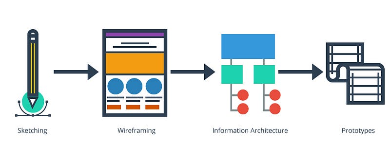
Step two consists of: sketching, wireframing, information architecture, and prototyping. At this point, the UX designer uses the data collected from preplanning and begins to explore how users will interact with the app. This consists of identifying the layout, developing visual hierarchy, and deciding what belongs in each view. This is also a good point to start working with prototypes to build an understanding of how features will react and animate when users interact with the app.
Sketching
Sketching allows for the quick and easy exchange of ideas in a group setting. This is a time when the UX designer, project manager, and developers can explore outlandish ideas without sacrificing much time or effort. Sometimes the most innovative ideas can arise from group sketching.
Wireframing
Wireframing is an important step in the design process. Wireframes act as the blueprint for the design, connecting the IA to the visual design. They explain behaviors and flows — what goes where and how features interact with each other. A wireframe is helpful for all parties involved, and serves different purposes for different people. For designers, it explains the UI and contributes to the mockup process. For developers, it explains functionality and can assist with backend architecture. For clients/stakeholders, it provides reassurance that everything is being accounted for and the app is on track. Wireframes are typically grayscale or bluescale and, with the right tools, can be created relatively quickly.
Tools to consider: Sketch, OmniGraffle, Adobe Illustrator
Information Architecture
Information Architecture is simply the structural design of shared information environments — the art and science of organizing and labelling. IA and wireframing go hand in hand. This is the point at which visual hierarchy is important and deciding the correct layout of content, copy, images, and icons is key.
Prototypes
Prototyping is the first step to getting the app in motion. Many UX designers prefer to build prototypes in the exploration step rather than the design step. When wireframes are in motion, they may not function as expected. This can cause the UX designer to reconsider decisions that were made in the wireframing/IA process. Addressing these issues early on can prevent a lot of time consuming changes later in the development process. The complexity of the animation directly affects the tool that would be suitable to use. If there are complex javascript or css3 animations, it is best to consider tools like Adobe After Effects or Framer Studio. If the app has basic animations, it may be better suited for tools such as Marvel or inVision.
Tools to consider: After Effects, Framer js, Marvel, inVision
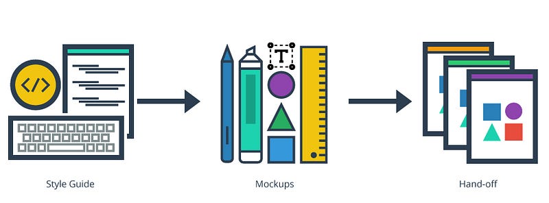
Now that the exploration step is complete, the UX designer can take the notes, wireframes, and animations and begin creating style guides and high fidelity mockups to hand over to the developers.
Step Three: Design
At this point the app really comes to life — colors and fonts are chosen, branding and/or brand guidelines can be introduced, and mockups start to take shape. The processes within this step tend to vary from company to company. Sometimes, UX designers focus solely on design and hand over everything else to frontend, backend, and mobile developers. In other companies, the UX designer holds the role of UX developer. In such cases, the UX developer builds coded UI elements into style guides and builds out web views and mobile storyboards while backend and mobile developers are working. Depending on the size of the company and team as well as the scope of the project, this can be one of the most time-consuming steps in the development process.
Style Guides
Style guides can be handled multiple ways. They can range from simple sets of visual guidelines — like a brand style guide — to in-depth guides that act as a front-end framework — like foundation or bootstrap — with UI widgets, SASS mixins and variables, and even page templates. The line between style guides and mockups can easily be blurred, depending on how the project is run. Good style guides usually exist in a portal, as a website, or in a github repository.
Mockups
Mockups are slowly becoming a smaller and smaller part of the design process. As wireframes and style guides become more detailed, the need for developers to see mockups becomes less important. The best use for them at this point is presentational. A mockup can help demonstrate the app to a client, stakeholder, or potential investor; it can also help get sign-off and show that milestones are being met. If time and budget allows and high fidelity mockups were created you may want to consider animating mockups to help non technical people visually understand the way the app will present information to an end user.
Tools to consider: Adobe, Sketch, Affinity Designer, Pixelmator
Hand-off
Hand-off, a critical part of the design process, has now become more complex than simply sending an email with sliced-up images. It can include data URIs, SVGs, custom icon fonts, and much more. It’s important that the UX designer understands the load of the design assets and the best practices when applying them to the app. This is a good point to work with a developer and devise a plan.
At this point, the project is in development, and the designers and developers are working together to build the app and integrate the user interface with the backend architecture without compromising the experience.
Step Four: Quality Assurance (QA)
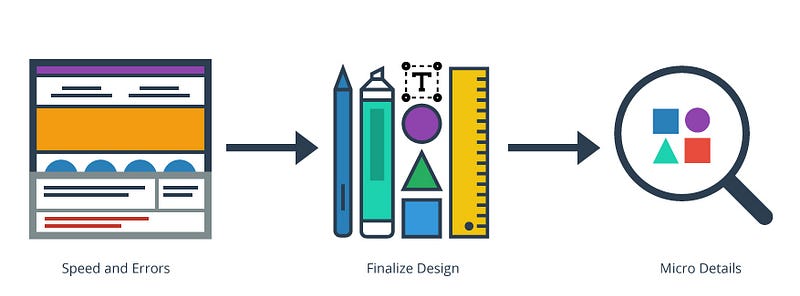
Quality Assurance should occur throughout every step of the app development process. At this point it’s important to discover any weak points in the design and possible user error issues that can be resolved before a beta release. QA provides confidence that quality requirements will be fulfilled. QA consists of two core concepts: “fit for purpose” (the product should be suitable for the intended purpose) and “right first time” (mistakes should be eliminated). QA includes management of raw materials, products, services, and components related to the production and management processes. This article will focus on speed and errors, finalizing the designs, and micro details as it pertains to the UX designer.
Speed & Errors
The app should be close to completion, and testing can start internally. The UX designer should be testing every user flow to find errors, testing load/stress performance, and finding the most effective way to handle user errors. If the app is large and handles a lot of data, creative perceptions of speed can be introduced — an example includes giving instant feedback through mini wins while data is being updated on the backend. Updating the view or starting an animation can also reassure users that the app is working, even if it’s displaying a progress bar or spinner. Background tasks that anticipate the user’s next action are also helpful in creating the illusion of speed. A lot has been written on this subject lately, and addressing these issues can be the difference between user retention and user churn.
Tools to consider: Speed Test, GTMetrix, New Relic, Apache JMeter, NeoLoad, Selenium, SpringTrax, BrowserStack, AgileLoad, and many more.
Finalize Design
Finalizing design coincides with speed and errors. This is a good time for the UX designer to discover ways to make things faster, identify features unnecessary to the user experience, convert icons to icon fonts, or clean up the presentation of visual elements to ensure font and color visual hierarchy is intact.
Micro Details
Micro detail is a newer concept that has emerged from Google’s user experience research for its material design concept. Smashing Magazine coined this as the “personality layer.” This utilizes branding guidelines to help set a tone for the copy in the app. Another detail becoming increasingly popular is the creation of small animations that react to users’ actions.
“The most basic use of animation is in transitions, but an app can truly delight a user when animation is used in ways beyond the obvious.”
At this point the app is ready for beta release, and the UX designer can collect user feedback to identify issues with speed and functionality that may have been overlooked during internal testing.
Step Five: Feedback
Feedback is similar to preplanning and focuses on user feedback. If this was a new application, this would be the first time the UX designer is getting real feedback outside of controlled user testing. This step is critical to the app’s success. There are a lot of ways to gather good feedback. Below is an example of one:
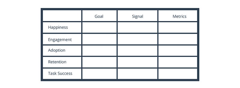
KPI with the HEART framework
KPI, or key performance indicators, are set up to help understand the impact of UX changes on the end user. Basic traffic metrics like Google Analytics and New Relic are helpful in tracking baseline page load times and how long a user remained on a page, but are less useful when evaluating the impact of UX changes. Google created a way of measuring UX impact on large-scale data analysis using two methods: the HEART framework and the Goals-Signals-Metrics process. The HEART framework is comprised of five key points:
Happiness
Measuring the user’s attitude via surveys and net-promoter score.
Engagement
Level of user involvement, typically measured via behavioral proxies, such as how many times a visitor has used the app in a week or how many photos or posts someone has added.
Adoption
May include the number of accounts created over a certain period of time or how often users are utilizing new features.
Retention
Simply refers to how many people return to the app after the initial visit without falling off into churn.
Task success
Where a tool like New Relic is effective in measuring how long someone was on a certain task, whether it was completed, if a new one was started, and so on.
If these data points are applied to the Goals-Signals-Metrics process, they can provide deeper insight into the user experience as opposed to just tracking unique visitors.
The Goals-Signals-Metrics process, when used with the HEART framework, provides UX designers with real metrics from the user experience. Goals can actually go back to the initial user flows and red routes. These were the key tasks that were intended for end users to accomplish. Monitoring these flows can give you insight into what end users need and like as well as what may be irrelevant or uninteresting to them. Signals are where goals are measured. A goal might be a user searching for documents in a portal — perhaps that goal is complete, but how long did he or she search? How many searches were made? Were any of the documents downloaded? That is the signal. The metrics are gathered over time and/or used for comparison in A/B testing. Going back to the portal example you test how long users spend searching for documents against how many documents were downloaded to see if users are struggling to find what they’re looking for. To gather metrics its best to normalize the data to get more meaningful feedback.
In Conclusion
Making the overall experience of a person using a product better is all the UX designer sets out to do. This is why I created this process. It’s fairly lean but I truly feel that if implemented correctly it could be the difference between your next project being a success or being another victim of user churn. If you have any questions or want to reach out to me directly you can connect with me at:
Twitter: @paulhershey
Behance: Paul Hershey
