The Future of Web Design is Hidden in the History of Architecture — Medium
- They serve as places where other people go.
- They’re engineered to do this pragmatic job.
- The evolution of technology limits this engineering.
- And yet, they’re definitely still art.
Within these constraints, both have progressed along remarkably similar paths, building on the past and reacting to it in similar ways. If you want to know where web design is heading, just look at where architecture has already gone.
I. Neolithic
Simple, limited structures
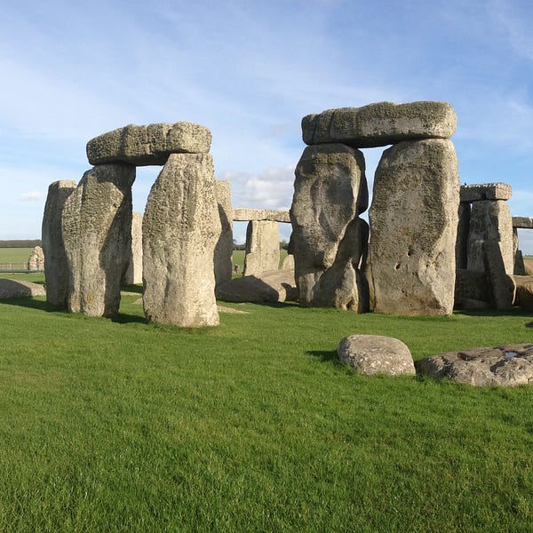
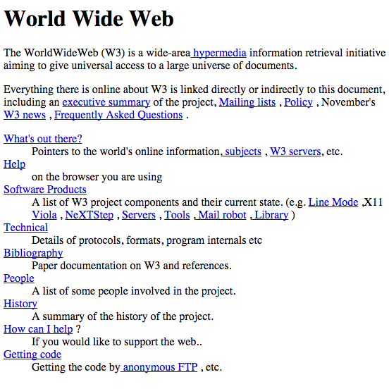
Aside from playing a bit with size and position, it was a feat just to get something in place.
II. Classical
Order and proportion, with some embellishment
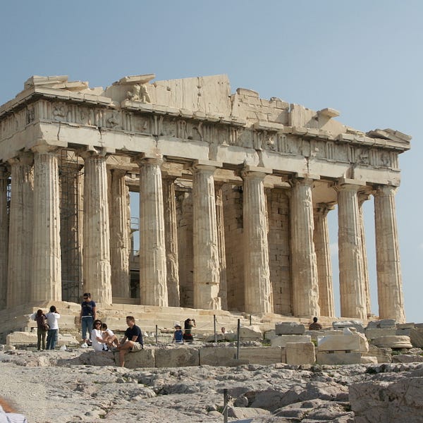
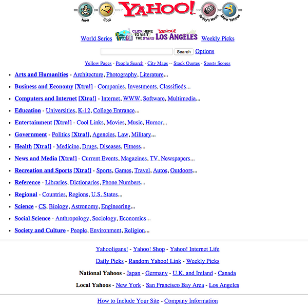
The Classical period refined proportions and hierarchies, introducing clearly-divided sections that served different purposes. The mediums (stone, pixel) were also stylized to mimic prior materials: the stone triglyphs represented wooden beams, just as the 3D buttons represented physical buttons.
III. Romanesque
Thicker forms and rounder edges
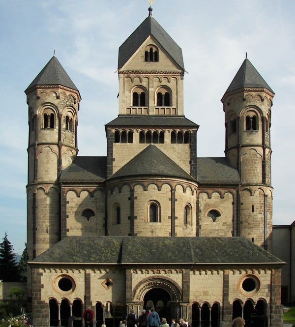
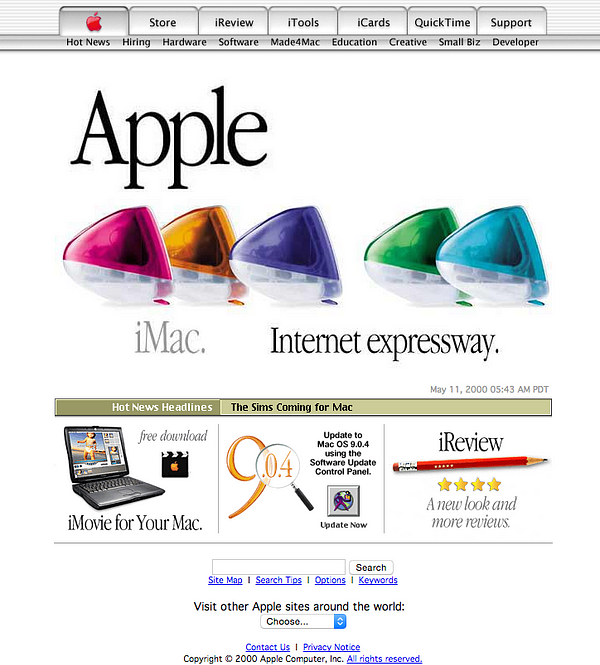
While softening the edges, the Romanesque period also thickened the walls and dividers — and menus, and buttons — to produce bulkier, heavier, more clickable forms.
IV. Gothic
Ornate and mesmerizing
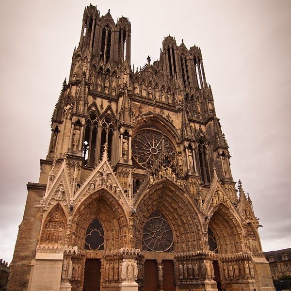
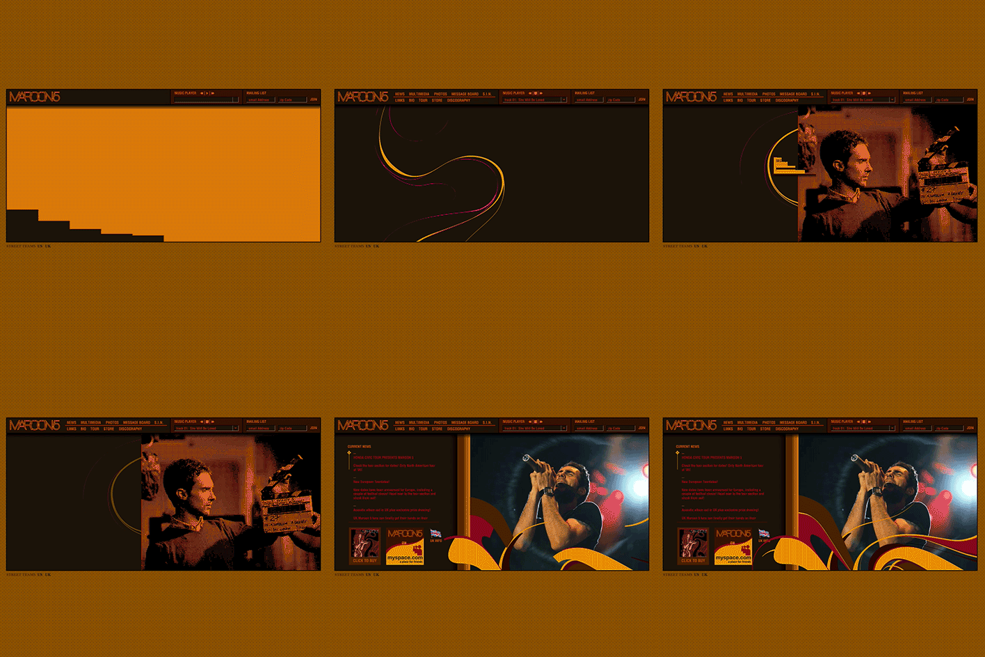
CSS and Flash were the stained glass of web design. With the fundamentals in place, we began pushing materials beyond the limits of what seemed possible. Gothic architecture transformed stone into gravity-defying spectacles that took your breath away. And though it’s hard to remember now, those early Flash and CSS sites amazed us just as much with pixels.
And yes, I did just compare an old Maroon 5 website to Reims Cathedral.
V. Renaissance
Clean, logical, and precise
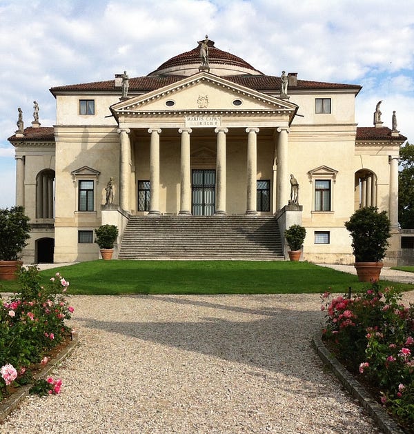
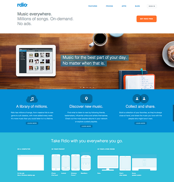
This is where we are today. It’s uncanny how similar the recent “flat design” movement is to the Renaissance. Renaissance architecture called for a return to Classical logic. Simple geometric forms replaced ornate complexity. Designs became cleaner. People started publishing treatises with the new rules, and it all got a little more meta.
And then we start getting into the future…
VI. Baroque
Twisting all the rules
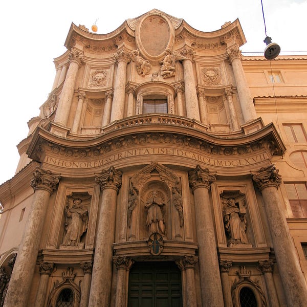

Being so logical and precise is fun for only so long. Eventually we’ll just start breaking rules. In architecture that meant literally breaking apart Classic elements and twisting them into complex forms. Compared with the Renaissance intellectualism, Baroque designs were emotional and theatric.
How will we do this with web design? It’s hard to say. But wait for it — it’s coming in a couple years.
VII. Neoclassical
Harkening back to the past
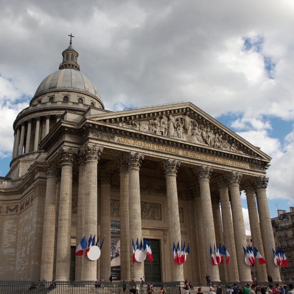

Everything comes full circle. Once we progress enough, we start to glorify our Classical beginnings and go full retro. It just takes time. Neoclassical web design is a ways ahead — that old Yahoo website still looks pretty lame to us, not sacred. But six, seven years from now? It’ll be cool again.
VIII. After that, who knows?
Well, we kinda know. It will likely be some form of Neoromanesque or Neogothic. Something neo. Art continually repeats itself in the form of revivals. But eventually? A new technology and a new world view will arrive that we can’t even imagine today.
Then things will get weird.
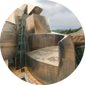
Image Credits: Stonehenge by jborsboom; The Parthenon by AJ Alfieri-Crispin; Maria Laach Abbey by Berthold Werner; Reims Cathedral by Archigeek; Amazing animated Maroon 5 GIF by Nick; Villa La Rotonda by Timothy Brown; San Carlo alle Quattro Fontane by wsifrancis; Panthéon by Marko Kudjerski; Guggenheim Museum Bilbao by Wojtek Gurak
