Slack’s $2.8 Billion Dollar Secret Sauce
Slack’s $2.8 Billion Dollar Secret Sauce
How Slack stole a multi-billion dollar market by becoming everyone’s favorite sassy robot sidekick.
“So what’s the secret behind Slack? What did you guys do that was so special?” the voice crackled over my car’s Bluetooth, “I want you guys to do whatever you did for them.” I was on a call with a prospective client, the CEO of a successful SaaS app who wanted to hire us to redesign his product. I launched into a story that I’ve told hundreds of times.
I’ve been asked this question almost every day for the past year by clients, investors, and fellow designers trying to reverse engineer the secret behind Slack’s success. It seems like Slack is taking over the world these days, now sporting a mind-boggling $2.8 billion dollar valuation, hundreds of thousands of users, and a break-neck growth rate.
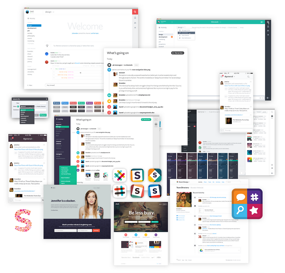
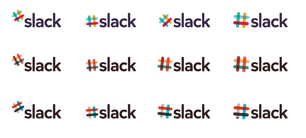
Why ask me about Slack? I run a design agency called MetaLab. You may not have heard of us — we usually work behind the scenes — but I can pretty much guarantee that you’ve used something that we designed. In late 2013, Slack hired us to help them turn their early prototype into a polished product. We did the logo, the marketing site, and the web and mobile apps, all in just six weeks from start to finish. Apart from a few tweaks here and there, much of the product remains unchanged since the day we handed our designs off to the team at Slack.
In almost ten years of business, Slack is, without a doubt, our most successful project to date — and we’ve worked with some big names. It’s now valued at $2.8 billion, has over 200,000 paying users, and our favourite part: people can’t stop talking about its great design. But I wouldn’t have predicted that going into it.
In July 2013, I got an email from Stewart Butterfield. I recognized his name immediately. I was a big fan of Flickr, which he co-founded and sold to Yahoo, and we were both based in the Pacific Northwest. He had big news: he was shutting down Glitch, the game he’d started in 2009, and was working on something new. He wanted us to design his new team chat app.
I groaned to myself. We were avid users of Campfire, and had tested out the many copycat products that had come out over the years. I felt the problem had already been solved. It was a crowded market and knew it would be difficult to make his product stand out from the crowd. Regardless, I was excited to get a chance to work with Stewart, and thought it would be fun to solve some of the issues that we’d had with Campfire. We shook hands, kicked things off, and rolled up our sleeves.
When he pulled back the curtain and shared their early prototype on day one, it looked like a hacked together version of IRC in the browser. Barebones and stark. Just six weeks later, we had done some of the best work of our careers. So, how did we get from hacky browser IRC to the Slack we all know and love?

Figuring out why something is successful in retrospect is like trying to describe the taste of water. It’s hard. We aren’t big on process. We prefer to just put our heads down and design stuff, iterating over and over again until something feels right. Slack was no different — there wasn’t any magic process we used — but looking back, I’ve identified a few key things that helped make it the huge success it’s become.
When you hear people talk about Slack they often say it’s “fun”. Using it doesn’t feel like work. It feels like slacking off, even when you’re using it to get stuff done. But when you look under the hood, it’s almost identical to every other chat app. You can create a room, add people, share files, and chat as a group or direct message one another. So, what makes Slack different? Three key things.

It Looks Different
To get attention in a crowded market, we had to find a way to get people’s attention. Most enterprise software looks like a cheap 70’s prom suit — muted blues and greys everywhere — so, starting with the logo, we made Slack look like a confetti cannon had gone off. Electric blue, yellows, purples, and greens all over. We gave it the color scheme of a video game, not an enterprise collaboration product.
Here’s HipChat next to Slack:

Which would you rather use? They both do exactly the same thing, but one feels dull and the other feels electric and playful. The difference? Vibrant colors, a curvy sans-serif typeface, friendly icons, and smiling faces and emojis everywhere.
It Feels Different
Slack is also chock full of fun little interactions. The logo animates in a burst of colors as it loads; modals slide down from the top of the screen; changing teams flips the screen around like a deck of cards. Throughout the entire product, everything seems to playfully jump around and pop off the screen. Each of these interactions is designed not only to help the user understand what’s going on, but put a little smile on their face.
“We gave it the color scheme of a video game,
not an enterprise collaboration product.”
Have you ever walked into a house and had an indescribable feeling that it just feels cheap? A professional builder would walk in and give you a laundry list of shortcomings: uneven drywall, gappy hardwood floors, hollow-core doors, and cheap hardware. But most people just have a gut reaction. Like a well-built home, great software focuses on giving its users hundreds of small, satisfying interactions. A great transition in a mobile app gives us the same feeling we get from using a well-made door handle on a solid oak door — you may not be able to put your finger on it, but man, does the house ever feel well built. Slack is really fun to use. It feels like a well-built house.
It Sounds Different
But it’s not just how Slack looks and feels, it’s also about what it says. In Slack, every piece of copy is seen as an opportunity to be playful. Where a competitor might just have a loading spinner, Slack has funny quotes like, “Need to whip up a dessert in a hurry? Dump a bag of oreos on the floor and eat the oreos off the floor like an animal.” A strange little injection of fun into an otherwise boring day. Slack acts like your wise-cracking robot sidekick, instead of the boring enterprise chat tool it would otherwise be. Like Interstellar’s TARS, compared to 2001: A Space Odyssey’s HAL9000:
Slack:
TARS: Everybody good? Plenty of slaves for my robot colony?
Their competitors:
HAL9000: I can give you my complete assurance that my work will be back to normal. I’ve still got the greatest enthusiasm and confidence in the mission.
Even Slack’s Twitter account sounds more like an emoji-loving comedian than a billion dollar enterprise software company:

We humans have a tendancy to anthropomorphize just about everything, from our pets to inanimate objects. We think cars look like they are smiling, or that a lamp “looks lonely over there”. With Slack, a bubbly, bright UI, delightful interactions, and hilarious copywriting come together to create a personality. A personality which has triggered something powerful in its users: they care about it. They want to share it with others. It feels like a favorite co-worker, not a tool or utility.
“Slack acts like your wise-cracking robot sidekick, instead of the boring enterprise chat tool it would otherwise be.”
As a kid, I used to love this burger chain called White Spot. It started out as a tiny shack at a baseball stadium and over the past 85 years it has grown into a huge chain with locations all over Canada. The secret to its success? The “Triple-O” secret sauce that they put on all their burgers.
I used to bug my parents to let us go to White Spot instead of having another gross lovingly home-cooked meal. That is, until my Dad dropped a bomb on me. “We should just make burgers at home,” he said “you know that sauce is just mayonnaise, ketchup, and a bit of relish, right?” Sure enough, we made it at home, and confirmed that their so-called secret sauce was a bunch of grocery store condiments mixed together. Anyone could make it, but few people knew how or bothered. Instead they chalked it up to a some crazy secret recipe.
Slack’s secret sauce is no different. Sure, it’s hard to get the mix of ingredients just right, but it doesn’t have any features that Hipchat and Campfire can’t build. It’s the same enterprise chat client underneath, but it’s playful, fun to use, and all that comes together to make it feel like a character in your life. It’s TARS, not HAL9000.
Over the past couple months, their competitors have caught on. They’ve all started using casual copy and trying to bone up on design, but it’s a little like your uncle trying to do the macarena. It’s too little too late. Everyone has picked their robot sidekick. Slack has stolen the show.
Andrew runs MetaLab. You should follow him on Twitter.
