Your Content Feed is Broken — Medium
Your Content Feed is Broken
Sadly it has been since 1997.
The current state of content feeds.
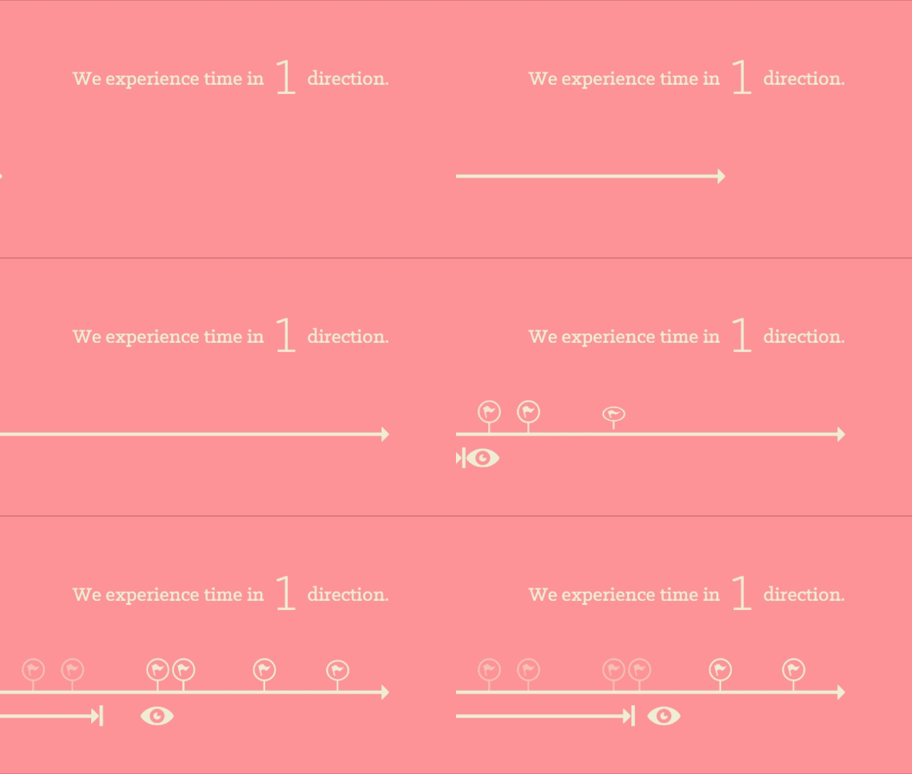
All of our content is delivered to us in some type of feed. On TV it’s through a visual display of persons or media that tell a story. We sit in a passive way to consume the constant stream of information.
On our devices where we take a more active role in controlling our Point of Acknowledgement along the feed’s timeline. As we scroll/tap/swipe we are telling our content feed what to present to us and over what period of time.

Our Point of Acknowledgement is the moment when we (the user) understand what we are viewing and can then recall that this information has been consumed. It is a continuous moving variable that helps us track where we are in time. It’s our present state, in a content feed.
How have we made a mess of this.
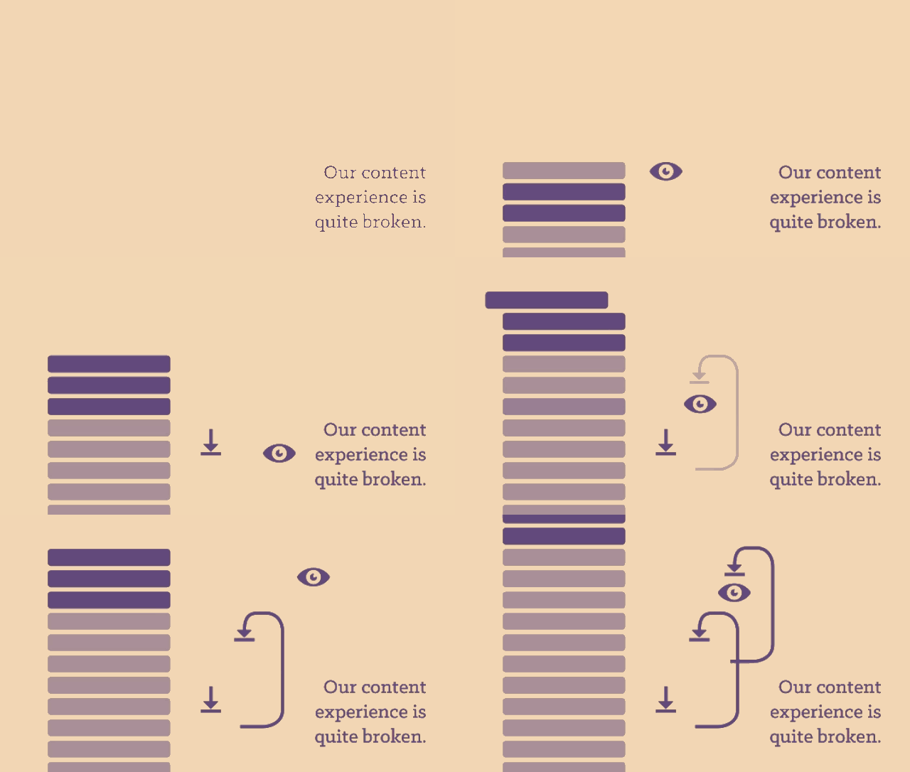
Let’s imagine you are scrolling through your Instagram feed, delightfully viewing your content feed as each new image is a joy to receive. Then you eventually hit the image where it all stops. You’ve seen this one before.
Now, you have no choice but to retrace all you steps and return to the top; in hopes there are new images.

This is broken. What would it feel like to read a chapter in any book, then flip back to the front, hoping to find that new chapters have shown up?
Think about watching a movie scene, then rewinding to the beginning to find the next scene.
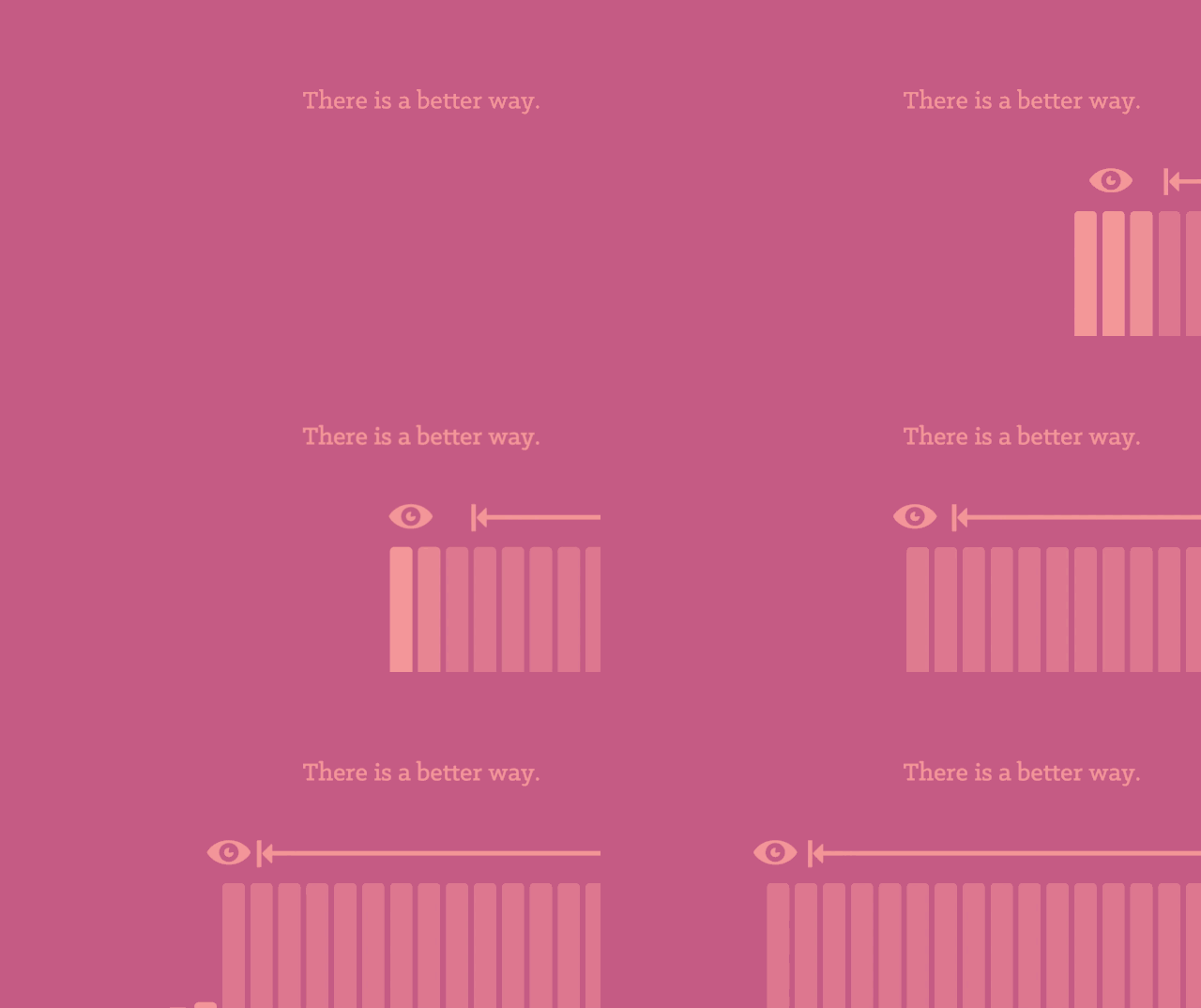
There is a better way.
Regardless of the history or reasons why we have ended up here, we can move forward. We can correct this erroneous error in our common user experience.

First, let’s return to a linear consumption of content. It doesn’t have to be in the same direction for everyone. Up, or down, left, or right, It can be in any direction as long as we are not asking our users to return to the beginning to refresh their content feed.
Second, we will need to track our users Point of Acknowledgement. This means that we will need to retain where the user has last left our content. I know, I hear all the development implications, all the cookies, save states whining as loud as the rest of you. I know this is more work.
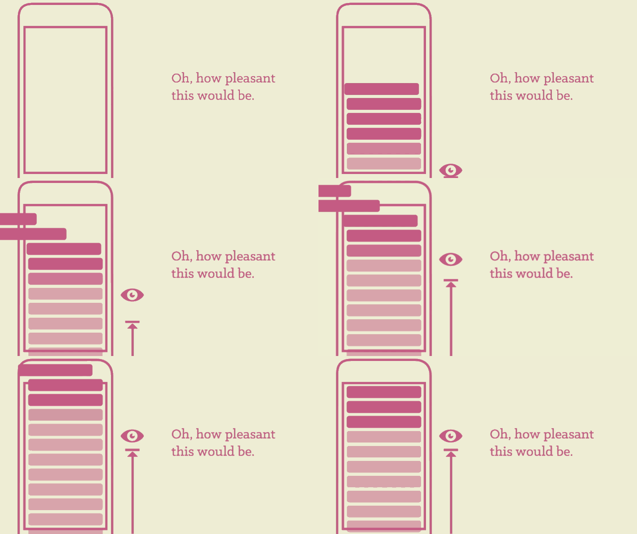
Just stop and consider the enormous change to our content experience. Never having to scroll up and down, up and down to check for new content. The complete removal of the “jump to top” button.
Our content feeds should be experienced as stream of information to be consumed over linear time.
What could this look like.
Our friends over at Digg have nearly put this together. I say nearly because their implementation falls apart if you are not a very frequent user. It will throw you foward in “time” if the last stop you viewed is “too” far in the past. Hence, when you return to the app you are unfamilar with your location as a whole.

One of the most important parts of this solution would be to keep track of where the user has been. Your content feed will need to know that the user has viewed up to a certain location in your feed. Then after they return, place them at the previous Point of Acknowledgement. Much like returning to a book. You return to the page and paragraph of your last visit.
One key difference in a book and the web would be that the content feed is continuous. You will eventually be so far behind, that starting where you left off will not be a good idea. Here we can improve as well. We can put the option on the user to select if they want to return to their last location, 1 day back, 1 hour back or current. There are many options to try out.
A few considerations
There are a few points that will be the first obstacles in a cohesive experience for our new content feed.
New user entry point.
Each feed will need to choose an appropriate location to place new users. For some, i.e. a tumblr image blog, the first post might be a nice place to start. You know, the beginning. There are some blogs, i.e. The Verge, that might choose to place you at the first story of the day.
This entry point will need to be handled per your type of content and frequency of posts.
Return user after a long absence entry point.
This is an issue with which Digg suffers. They dump users to a random location, or what feels random, if the user has been absent for an extended period of time.
We could present a module. “We see you have been gone awhile, heres what happen….” or “Thanks for coming back, where would you like to return…” Many options other than random. Tell me where I am going, or where I can choose to go.
The handling of viewed content.
The infinite scroll is awesome the first time to a blog with many, many posts that are short. You can get content for days. Eventually, your browser is trying to track thousands of items in the DOM. Not good. How about we remove viewed items after they are so far past the Point of Acknowledgement.
TL:DR
Dear content providers, your feed is broken. You are asking your users to bounce back and forth over your content. Review the above gifs, then fix your blog/app/site. We will all thank you for it.
