How The New Yorker Finally Figured Out The Internet: 3 Lessons From Its Web Redesign
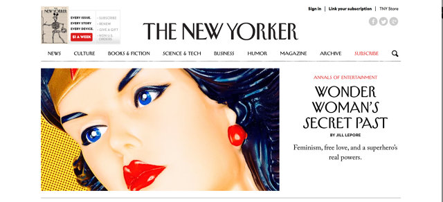
In late July, NewYorker.com unveiled a slew of changes aimed at modernizing the site. The update included a responsive design that’s meant to work just as well on smartphones as it does on desktops and free (if temporary) access to an archive previously only available to subscribers.
The new direction seems to be working. Since the July relaunch, traffic on NewYorker.com is averaging 10.4 million monthly uniques, up 23% from a year ago. In the same period, the average time spent on the site is also up 23%. And traffic on the weekend, which is typically a rather barren time for most websites, has exploded: the NewYorker.com’s weekend audience has grown by 25%.
Not all of that is through design alone, of course; the open archives have been a big draw. But the New Yorker is such a singular magazine—better known for its print property than for its sometimes half-hearted forays into digital—that we were curious if there were any design lessons other companies and publications could learn from the relaunch. We spoke to NewYorker.com editor Nicholas Thompson, and the New Yorker‘s creative director Wyatt Mitchell to find out.

The biggest change to NewYorker.com might not actually be its look, but what’s going on behind the scenes. Previously, the editors and producers of NewYorker.com worked on an unholy mash-up of two clunky, outdated content management systems, TeamSite and Movable Type. As a result, the New Yorker staff couldn’t actually handle the workload of publishing more than a handful of stories every day.
With the relaunch, NewYorker.com runs on WordPress, a more robust, user-friendly CMS. “We’re looking at almost total upside there,” Thompson tells me. Because the tools are no longer getting in the way of producers doing their job, NewYorker.com is now able to publish a greater volume of stories every day. The site used to top out at 10 or 12 stories each day: now, it publishes around 20 per day. “It’s a lot easier to be productive now, and we can now make the site fresh a lot more quickly than we used to,” says Thompson.
“It’s weird, but when I started at the New Yorker, my knee-jerk reaction was to think that the people who read the magazine are the same as the people who read the website,” says Wyatt Mitchell, New Yorker creative director. “But that’s not actually true.”
Different types of readers have different metabolisms, Mitchell says. A person who reads the New Yorker in print might primarily do so on weekends, while someone who reads on the tablet might only read it in bed at night. The smartphone New Yorker reader might just be getting a skim here and there in between trains. And all of these different types of readers need to be kept in mind when you’re designing.

For example, in print, the New Yorker uses two typefaces: its signature Irvin typeface for headlines, with all articles set in Adobe Caslon. But on smartphones, Irvin simply doesn’t work, so NewYorker.com introduced a new sans serif font with an Art Deco feel, Neutraface, instead.
“With the redesign, we were trying to take a brand that is most well-known for its print iteration, and develop it so that it had the same connective tissue on all platforms,” Mitchell says. “That doesn’t mean that every version should be exactly the same, or that every reader is the same: web readers want more photography, more interactivity, and louder typography, for example. But no matter what platform they read NewYorker on, we still want it to be a peaceful haven where you can read anything from an 800-word blog post to a 17,000-word story.”
The most important design lesson other publications can learn from NewYorker.com is simply to respect your content enough to put it first, and to let people enjoy it.
“Right on down to the font choice and page breaks, every decision we made, we first asked ourselves, ‘How will this affect whether or not people will read a story from beginning to the end?'” Thompson tells me. And while that might seem obvious, it’s a surprisingly secondary concern for many online publications, which are more concerned about getting readers to hit a “share” button than sitting down to read something from beginning to end.
Sure, the New Yorker wants people to share its content. That’s why NewYorker.com has opened up its archives to everyone, after all—a move Thompson says has resulted in some unexpected stories going viral since July, such as this story about a 12-inch-tall pianist. But while the new design has its requisite social media buttons, they are quiet and understated affairs, not big flags screaming “Click Me! Click Me!” on all sides of the content. That’s very much by design.
“We had good data that showed that if people get through a story from beginning to end, they’re more likely to talk about it, and therefore more likely to share it,” Thompson says. And that means designing a site where everything besides the content fades into the background. Sure, the new NewYorker.com could have gotten more aggressive in a play for ad dollars and social media traffic, but it would have been at the expense of not just readability, but the New Yorker brand itself.
“Even if I didn’t think making our stories as readable as possible was good for traffic and subscription numbers, I’d still do it,” Thompson says. “We put in mountains of work editing, and fact-checking, and copy-editing, each and every story. What’s the point of this job if you’re not doing your best to get people reading them, from the first word to the last?”
