How Google Unified Its Products With A Humble Index Card | Co.Design: business + innovation + design
If you hadn’t noticed, every Google service has been trending toward a certain understated elegance. The company’s infamous era of championing 41 shades of blue is long over, as the company has learned to embrace clean lines, airy typography, and liberal white space across their platforms. But amidst implementing these long-established good design practices, Google rediscovered an old idea: index cards.

Just like index and business cards of yore (or at least the late ’90s), Google’s cards are plain, white rectangles peppered with nothing more than a little bit of type and maybe a photo. Are cards the epitome of flat modernism, or are they subconscious skeuomorphism? Even Google’s designers debated this point when I posed the question. Either way, these piles of pixels are revolutionizing the way Google simplifies increasingly deep information. Google’s cards represent the biggest of data in the smallest of packages.
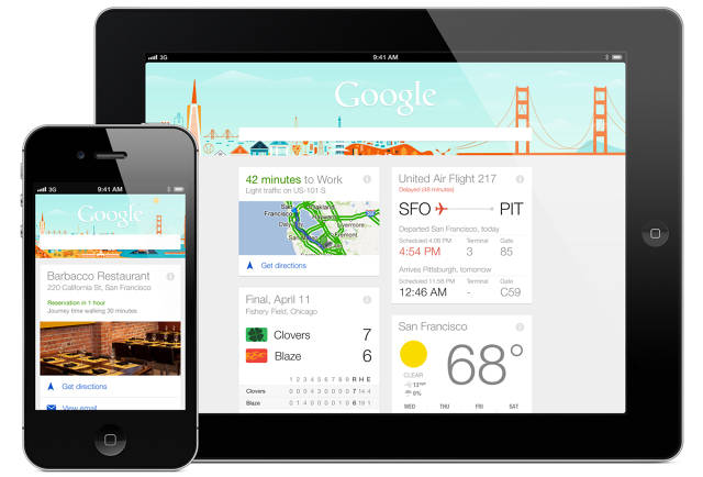
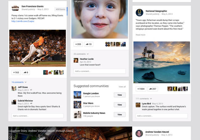
We first saw cards returning results through Search’s Knowledge Graph, as Google began summarizing Wikipedia entries into condensed blurbs. But the aesthetic was solidified with its personal assistant, Google Now, which uses cards to provide a list of searches Google has made ahead of time for you (like weather and directions). Then, as we all held our breath expecting glowing augmented reality in Glass, Google instead gave us—you guessed it—more cards! And just this week at Google’s I/O conference, Google Maps and Google+ each received massive makeovers. Spoiler: The Google+ feed is now three columns of cards, that, through a fantastic sleight of hand, flip over to reveal backsides of information.
Yes, Google is even developing cards on cards.
“It’s not like we’ve invented a new way to organize information,” admits Matias Duarte, UX director for Android. “We’ve actually tapped into one of the oldest pieces of graphic and information design around—business cards, calling cards, greeting cards, playing cards. They all have the same embodiments because they’re all reflections of a similar set of design problems.”
Those problems were rooted in mobile, I’m told, even before touch screens existed. (What is a business card besides a pocketable, clear piece of information?) So when Google began searching for a user interface to convey the bite-sized, diverse data stream in Google Now, designers realized that what they really needed was a “tangible physical container,” a flickable, stackable chunk with the flexibility to contain any thread in the entirety of Google thought. The way Duarte tells the story, the card was, in essence, a foregone conclusion with an unforeseeable benefit: It practically iterated itself.
“The restraints of the card actually made it easier to do the rest of the [Google Now] design,” Duarte recounts. “It forced us to focus. It forced us to realize [things like], you can’t have a card that feeds two or threee images at once, that just gets messy.”

In digital form, Google’s cards are an amazing tool pulling off a variety of simultaneous stunts: They literally frame information for your attention and eliminate the need to click into a link. They not only summarize pertinent data but counteract data overload via an inherent crop. And cards are equally comfortable on any screen, from a 9-inch tablet to the tiny window in Glass.
But the more I talked to the designers behind very disparate products through Google’s empire, the more I realized that for as obvious as cards may seem as information curation, they’re actually tackling a variety of complex UX beyond mere summarization. No doubt, a Google Maps card looks different from a Google Now card, and the variety we see stems largely from Google’s organization: Cards are customized on a team-by-team basis to meet specific product needs. I’m even assured (though I’m skeptical) that there’s no internal mandate for cards to be used at all.
“Cards work to make content come forward, thanks to minimal, visual cohesion,” Google+ design lead Fred Gilbert explains, referencing the, not one, but more than 30 styles of cards the social network has added to its redesigned interface. Even as Gilbert points out the different cards on the screen, I barely register the subtle distinctions between the ones shaped for sharing photos versus those for status updates versus those for links versus those for links that originate from a particular social circle.
Then again, I’m not supposed to notice the minutiae. Rather, these custom cards are crafted specifically to ensure that a party invite doesn’t clash against vacation photos in your feed. Diverse content becomes a homogenous mixture. And thanks to the fact that cards fit well into columns, Google+ can scale from laptop (three columns) to mobile (one column) without fundamentally changing the experience.

Even still, to pigeonhole cards as a “just” a clever visual idea is to overlook their grandest UX coup, the ability to make data truly feel good. It’s a concept best encapsulated by one word that came up again and again during my interviews: tangibility. “We’ve given cards the barest minimum of physicality,” Duarte says. “If you were to imagine, it’s just a few pixels thick. It’s not a heavy thing. It’s not an overwrought thing. But it is tangible.”
While Google’s cards are digital illusions trapped behind glass, their familiar frame of reference brings with it an implied physical logic that urges us to touch, flick, and rearrange data.
For the Google Maps team—who just debuted a redesign at I/O—cards didn’t just offer a means to display restaurant addresses, directions, both user and Zagat reviews, and, sure, even ads with grace. Cards solved the core interaction problem behind displaying a rich map and a list of malleable information at the same time.
“We didn’t want to cover up the whole map, so we had this panel that was expanding and collapsing,” explains Jonah Jones, UX designer for Google Maps. “The problem was, when it was expanded, it didn’t really feel like it could collapse. And when it was collapsed, it didn’t really feel like it could expand.”
Because cards feel tangible, living at the halfway point between lauded minimalism and dreaded skeuomorphism, Jones and his team discovered that cards on Maps could be very naturally stacked, just like cards in real life. And by arranging the tip of any given card to peek out from the next in the pile, users can parse lists with ease without losing precious real estate for the map itself.
Yes, cards really are just humble white rectangles, modeled after cheap slips of paper that can fit in your pocket. But as they’ve permeated most of Google’s biggest products, cards have become the company’s new voice for data, imbued with a seemingly effortless tangibility that seems to scale to any interface on any hardware.
For a company known for neither product design nor product focus, the importance of cards cannot be overstated: They are nothing less than a multiplatform panacea. And as Google mines deeper into our lives than ever before—unleashing their algorithms to read our emails, spot our locations, and predict our preferences—cards will serve as an important buffer between a company that knows too much, and people who understand so little.
