From Wayfinding to Interaction Design — Design/UX — Medium

The underpinning principles of the systems we designed were always the same, and we could draw on a great depth of research and academic study to inform our design; Kevin Lynch’s work on the mental models that people form when navigating the city goes back to the early 1960s. Of course the act of wayfinding is as old as the hills, so solutions were usually found in supporting innate behaviour rather than inventing new ones.
While I won’t go through all of the principles in this article, there are a few I’ve found to be useful in my move from wayfinding design to interaction design. I realise that it may not seem that a train station and a website have much in common, and so before I share some knowledge from the world of wayfinding, here are some of the similarities between the two:
1. Helping people get around complex spaces
If you break down a website, a city, a hospital, or an app, they can all be thought of as complex spaces that people travel through — spaces that are generally so complex that without some help users wouldn’t be able to navigate them confidently. A book, on the other hand, is not very complex — which is why I’m not comparing wayfinding to graphic design.
Interaction design and wayfinding design both seek ways to make it easier for people to understand these physical and virtual spaces.
2. Supporting journeys
When moving through complex spaces we make journeys made up of a sequential series of decision points — going from point A to B to C. But both interaction designers and wayfinding designers need to think in terms of journeys and not isolated points of interaction. Journeys are complex and sequential: the decision I make at point A will affect the rest of my journey (it might become impossible to get to point C for example). A journey could be the series of screens I encounter when viewing and retweeting a message on Twitter, or it could be a walk to the train station.
3. Creating solutions for a wide range of people
When you’re designing information for a transit authority, your potential audience is everyone. When designing Vancouver’s public transit system, we didn’t focus on demographics or market segments because everyone rides the bus, or at least anyone can. People with physical disabilities, young people, tourists, daily commuters, elderly people — the list is endless. For interaction designers — and the digital world we design for — the audience can be just as demanding. Though most projects and clients have a particular audience segment in mind, viewing the full spectrum of users and balancing their (often) contradictory needs is a daily challenge.
4. Prototyping and piloting
Related to all of the points above, prototyping and piloting are crucial to the design process. (I’ve also written about the importance of prototyping here.) When I talk about prototyping I’m talking about a range of different levels of detail, from the rough-and-ready cardboard mock-up to detailed near-final working versions. Problems and solutions are often so complex that you’ve got to make it real for people to be able to join the design process.

What Can Interaction Designers Learn from Wayfinding?
Hopefully you’re with me about the similarities. What are the lessons to be learned from them by interaction designers? Below are some of the more interesting principles and methods that I’ve found applicable to both fields. Hopefully, for the designers out there, they will trigger some thoughts about how to improve their designs. For non-designers they should give you a glimpse into the difference between good and bad design.
1. Progressive Disclosure
If you give me every detail of a journey at the beginning, the chances are I won’t be able to process, store, and retrieve it. For example, when you ask for directions, after the fourth of fifth instruction you start to glaze over and struggle to remember what the first instruction was (Do I take the third left or the second left?).
Progressively disclosing information helps the end user by reducing the amount of information they have to deal with. The flip side is that we need to do a lot more work as designers to make sure everything fits together.
2. Consistency vs. Monotony
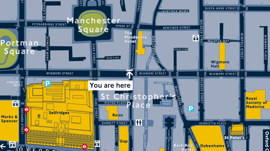
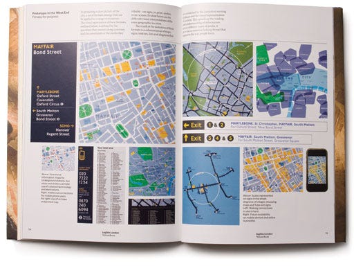
One of the best weapons for tackling complexity is consistency. As soon as I spot a familiar pattern in an environment, I can spend less time analysing and more time navigating. This is quite intuitive to most designers: uniform design means less “visual noise.” This becomes really important when you think about the baseline noise in a city. One of the key principles of the Legible London scheme (on which we collaborated with Lacock Gullam for TfL) was to remove signs that were made obsolete by the new system – rather than adding more and more.
But. There is a flip side: monotony. It’s a delicate balance to strike, but it’s good to remember that people may be using the service or tools daily or even hourly. So if there’s room for a little variation or even humour, then don’t be afraid of it.
3. Glanceable vs. Queriable
When I’m confirming I’m going the right way I only need to glance at information, but when I’m lost I need to query on a deeper level.
If your users will be shifting between these modes, then your interface should support them. This is the antithesis to “one size fits all.” Generally, serving up the most pertinent information in a digestible format requires a lot of analysis of what the user might actually need.
Wayfinding and Interaction Design
I expect that these points will already resonate with interaction designers, and that’s because much of the thinking involved in wayfinding is instinctive, based on the way human’s brains are wired up. Hopefully you’ll find something useful in the observations above, and at the very least they should give you some useful analogies when trying to explain your interaction design job to your friends.
